Matrix Plots and Node-link Diagrams/Dendrograms
Historians looking to analyze trends and connections between several scatterplots and compile clusters will need to utilize both matrix plot graphs and node-link diagrams/dendrograms to represent their datasets. Node-link diagrams, dendrograms, and matrix plot graphs are all ways of compiling smaller samples of data to analyze broad trends.

Matrix Plots
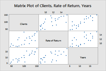
Matrix plots in their most simple form are combinations of several scatter plots that allow the reader to analyze trends between several variables at once. While scatterplots comprise two variables (one across the X-axis and one on the Y-axis of a graph), matrix plots compile several variables along the X and Y axis’. For example, figure 1 shows a combination of several scatterplots that use the number of clients, rate of return, and number of years in business as the variables. In each instance, the general trend is a positive increase in clients and rate of return over time.
Matrix plot graphs are useful when dealing with data-sets that have several quantitative variables that you are looking to compare. All of the data for a matrix graph is based in two-variable relationships that are compared to each other to look at much larger trends. Matrix plot graphs are useful for historians with several scatter plots that are looking to visualize patterns within the same data-set to show how their data correlates. For example, if an historian has data for the wages of men, the wages of women, and year, they can plot out how each variable correlates with the other. Wages of both men and women may follow the same trend, but a direct comparison might show how they increase at different rates.
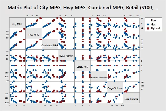
The main drawback with using a matrix plot graph emerges when you are dealing with a large number of variables. While the graph can show comparisons between quantitative data relatively easy, larger groups of data can be easily overwhelming. For example, figure 2 compares eight different variables for a single dataset. While several trends can be identified, the actual scale of the data is scattered across the X and Y axis’ and can be confusing at a first glance.
Node-Link Diagram/Dendrogram
Node-link diagrams and dendrograms are visualizations used to show how clusters of data relate to each other. While node-link diagrams show simple relationships via connections between data points, dendrograms are more effective at showing hierarchical relationships between different clusters of data.
Node-link diagrams are representations of how data points are interconnected by using lines and nodes to reconstruct relationships within a dataset. Node-link diagrams are particularly useful when interpreting the structure of data, particularly analyzing specific clusters or relationships.
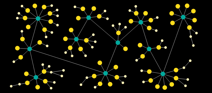
For historians, the simplest use of node-link diagrams is to showcase how different groups of data split and relate to each other. In figure 3, each cluster and sub-cluster represents how nodes relate to each other and how sub-nodes spawn off the primary nodes. A direct example of how historians could use node-links is the relationships between family units. In figure 3 the blue nodes might represent a specific family unit, while the lines between nodes are familial connections. Each orange node connected by a line is a new family unit created by the original blue node. While this representation can showcase relationships generationally, it usually loses specificity due to its focus on how data groups relate to each other rather than how those connections are represented in other quantitative representations.
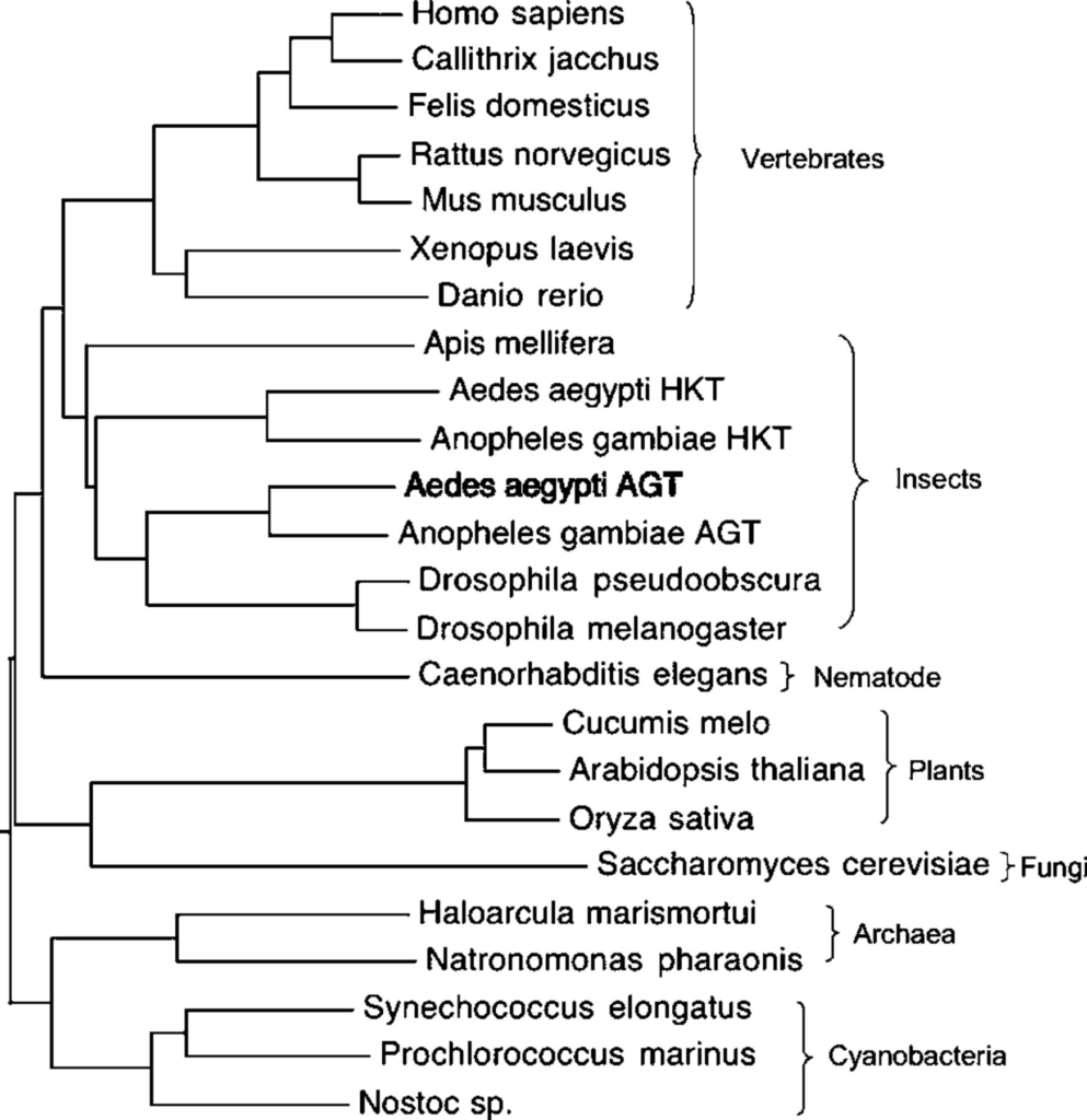
Another related form of node-link diagrams is dendrograms. Dendrograms are representations used to show clusters of hierarchical data. Instead of the free-form organization of node-link diagrams, dendrograms are based on an X and Y axis where the Y axis determines the distance between clusters. An example of this relationship is figure 4, where the closeness of datapoints is based on height. The height of the variables determines which clusters were created, with A/B, C, and D/F/E forming the main clusters.
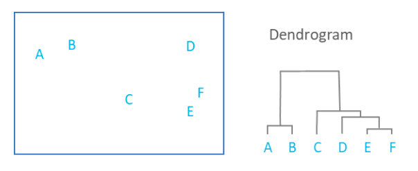
Dendrograms are most useful when being used to represent taxonomic data for genetic and epigenetic systems or for generations within a specific family unit. While figure four shows quantitative data clustered in a hierarchy, the dendrogram representation misconstrues the distance between several points. C is the same distance from B and D but is shown to be much closer to D due to how the creator of the graph has chosen to cluster their variables. While dendrograms can skew the relational distances between specific points, their representation of data can be useful for historians looking at hierarchical splits for a common ancestor. For example, an evolutionary historian might use figure 5 to show how human beings and mosquitos (aedes aegypti and anopheles gambiae) developed from a similar ancestor that separated from plants, fungi, cyanobacteria, and archaea at an earlier point in their evolution. Each different cluster represents how plants and animals correlate to each other and developed into evolutionary family groups.
The main benefit of node-link diagrams and dendrograms is the ability to represent either quantitative or qualitative relationships. Socio-cultural relationships as well as economic clusters can be related through node diagrams equally. The main purpose of each is to map correlations and show hierarchies of clustered data that might not be clear from a basic dataset.
One thing that historians need to be cognizant of is that matrix plots, dendrograms, and node-link diagrams can easily be confusing for larger data sets. When comparing different variables and relationships you need to choose the most relevant factors from the dataset. Instead, it is up to the historian to figure out which pieces of data are the most relevant and important on a case by case basis.