Trees and Circles
Imagine that you walk into a pet shop and you are tasked with organizing all the animals into categories. How would you represent that data visually? Maybe bar graphs to show there are more dogs than cats. However, what does each bar represent an animal or a general type of animal? And you want to show your readers how the proportions of mammals and reptiles, something a simple bar graph cannot easily express.
Enclosure Diagrams
Enclosure diagrams are data visualization aids that use filled shapes within larger shapes to designate the relative size of each data set and subset. In enclosure diagrams, each shape represents the hierarchical relationships between different elements of data and are particularly useful for revealing the dimensional relationship of data. The shapes can be either circles or rectangles.
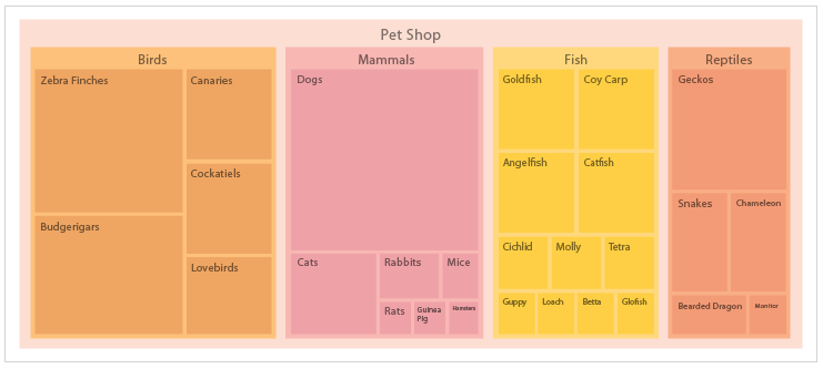
There are two types of visual representations that would work best for the pet shop scenario; Treemaps and Circle Packing. Figure 1 is a treemap of the scenario, as you can see this treemap categorizes each animal into a general sub-category (birds, mammals, fish, and reptiles) and each animal type is organized in a rectangle relevant to the number of animals in the pet shop. Now we can quickly scan the treemap and notice there are more birds than any other animal as well as see how many other animals. Enclosure diagrams, specifically treemaps and circle packing illustrate the relationship between
Treemaps
As we see in Figure 1, treemaps assign data into categories and those categories are illustrated as rectangles (parent rectangles or parent branches). Within the parent, rectangles are smaller rectangles representing subcategories of that data (child rectangles or child leaves). The size of each rectangle is equivalent to the quantity of the data being represented as well as the parent category. Treemaps show a part-to-whole relationship. If no
A tiling algorithm is used to divide and order the child rectangles within the parent rectangles. The “
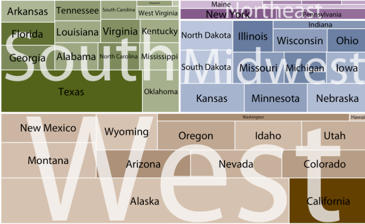
To create a meaningful treemap, beyond parent rectangles and child rectangles, other elements are added including colors and labels. Figure 2 treemap is a visualization of U.S. states, where each state is categorized by region. The area of each rectangle is proportional to each state’s land surface area. The color of each state is proportional to the state’s population, the darker color the denser the population.
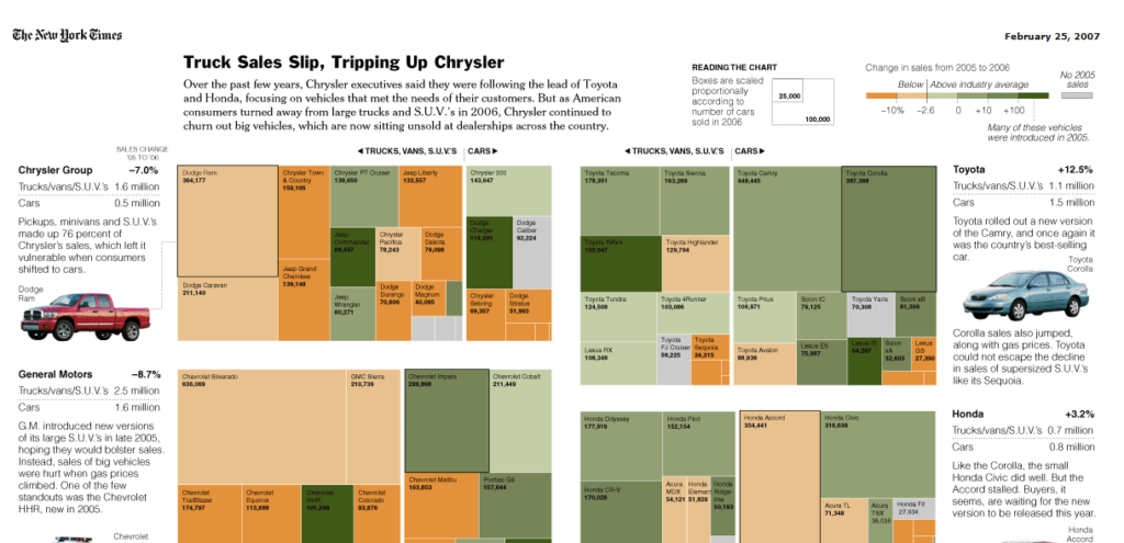
While treemaps illustrate a quick glance of proportional information (parts-of-whole) without actual counts or percentages on the plot readers cannot verify their intuitive interpretation of the shaded rectangles. Therefore, when using a treemap it is wise to include counts, percentages, or a legend map for readers to use alongside the treemap. Figure 3 shows multiple treemaps of automobile sales created by the New York Times with a legend map.
Circle Packing
A variation of a treemap is circle packing which uses circles instead of rectangles. Like treemaps, each circle represents a level in the hierachry; parent circles and child circles. Size and color can be used to represent variables of data. Unlike treemaps, circle packing
Circle packing is a more effecent way to compare data, however if the data needs to be precisely compared a circle pack cannot accomodate that illustration. Like a treemap, circle packing shows how groups are organized in subgroups with a neat illustration of hierarchy, neater than treemaps. Figure 4 is a circle packing of world population of 250 countries.
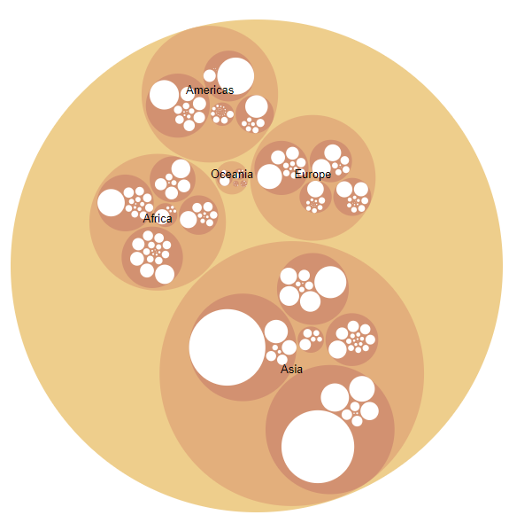
In Figure 4, it is easier to see the hierarchy of each continent (parent circle) and each country (child circle). Notice how each continent circle is a different size and each country circle is also a different size. The difference is size is relative to population size. Colors are used to differentiate continent and countries and labels are used as well. This circle packing is also interactive, allowing the reader to choose a continent and country to better see the proportions of the populations, Figures 5 and Figure 6. However, notice how the labeling for smaller countries in South America get cramped together and are illegible.
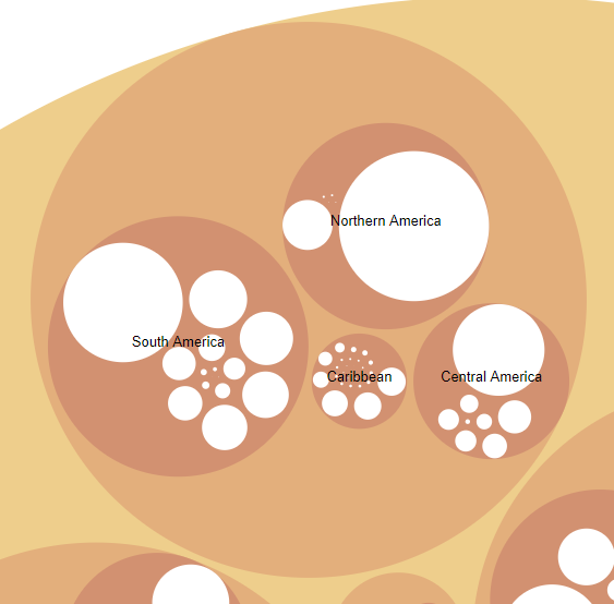
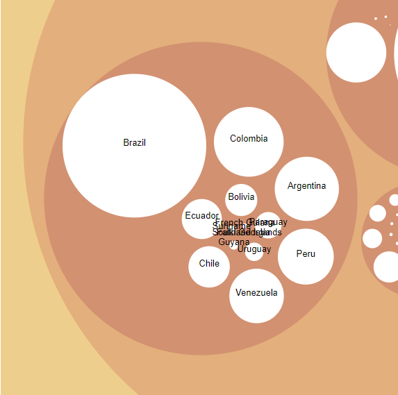
Labeling is tricky in circle packing. While both treemaps and circle packing are great illustrations of hierarchy and proportion, both diagrams need extra elements to express the data. Treemaps need a legend map and circle packing needs to be interactive.