-
Identifying Archival Silences in the Attica Uprising Collection
“…Any historical narrative is a particular bundle of silences, the result of a unique process, and the processes required to deconstruct these silences will vary accordingly.”
Michel-Rolph Trouillot, Silencing the Past: Power and the Production of History, p. 27 -
Dynamic Images on Tableau

I’m having difficulty getting the images to appear on my dashboard. I’ve been able to get individual images to show using the Dropbox URL so that appears to work ok.
-
Dashboard Filters in Tableau
Here is my in-progress dashboard. As we briefly talked about in class, I’m trying to make the bar graph interactive with the map filters.

-
Wireframe: Mapping the Attica Collection
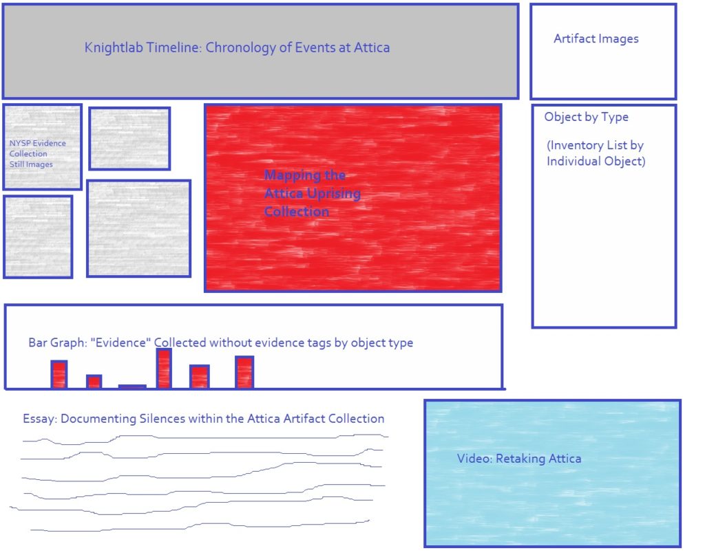
Concept Design for Potential Dashboard for the Mapping Attica Collection project. -
Final Project Proposal: Mapping the Attica Prison Uprising Collections at the New York State Museum
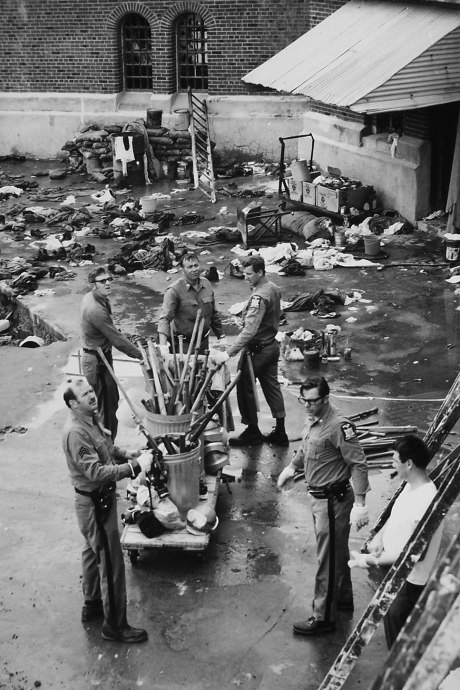
New York State Police investigators collect evidence in D Yard at Attica State Correctional Facility on September 13, 1971. Courtesy of the New York State Archives -
Text Analysis Assignment
The terms examined in the following discussion of text analysis visualizations include: slaves, master, man, children, people. These particular terms were chosen for analysis in order to explore ways in which the potential humanization of enslaved peoples may (or may not) be found within the corpus of slave narratives.
-
Networks Assignment
How does the network change over time as you add more years? Who are the major connectors who bring small sub-networks into connection?
As more years are added, the number of connections increases as more individuals are brought into the network. This results in an increase in not only the number of connections that exist but also in an increased visual complexity of the relationships between individuals. Initially, there are smaller, independent networks that exist in proximity to one another. As years are added, these separate networks are brought within the larger network as new relationship connections are added. As this occurs, certain individuals emerge as major connectors. By as early as 1736, Anna Clement, Thomas Sewatsese, Aron Oseragighte, and Esras Sr. can be identified as significant points of interconnection within this social network. As more years are added to the network, additional individuals emerge as major connectors, such as Mary Quackenbus or William Prentop Jr. Of these initial people, some remain central to the network throughout the years while others, such as Thomas Sewatsese are overtaken as major connectors by other individuals.
-
Data Visualization: Cartograms & Histograms
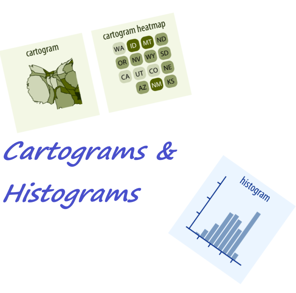
One of the challenges posed to historians working with data is determining how to visualize one’s information in ways that are both able to be interpreted, but also aesthetically pleasing or useful to other researchers. Among the many types of data visualizations that historical scholars may opt to utilize in representing their research are cartograms and histograms.
-
Data Critique Assignment: Eastern State Penitentiary Admission Book Records (American Philosophical Society Library)
The data set from Eastern State Penitentiary (ESP) in Philadelphia, Pennsylvania available from the American Philosophical Society Library contains information retrieved from the admissions ledgers for prisoners admitted to the penitentiary between April 24, 1830 and May 24, 1843. The collection description from the American Philosophical Society Library indicates that the records from which this data set are derived were recorded upon a prisoner’s admission into ESP.
-
Review: Mapping Violence
“Mapping Violence.” https://mappingviolence.com. Created and maintained by the John Nicholas Brown Center for Public Humanities and Cultural Heritage, Brown University, Providence, RI (https://www.brown.edu/academics/public-humanities). Reviewed February 1 to February 4, 2019.