-
Final Project: A Sketch of The City of Albany, 1850 to 1940
The title of this project is to show that this is to highlight some features that Census records show about the citizens of Albany, yet it is not a complete picture. There is a 30 year gap between 1850 and 1880 and a 20 year gap between 1880 and 1900 resulting from a lack of Census records.
-
-
Wireframe: Albany Census Data
The main question this project asks is “Where were people in Albany coming from?” The biggest part of this project will be a map. I’ll break it down into each year on the census from 1850 to 1940. I would like to have a world map where a viewer can highlight a certain country or region and be able to see how many people were born in the selected area.
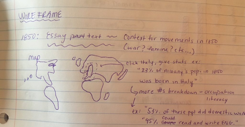
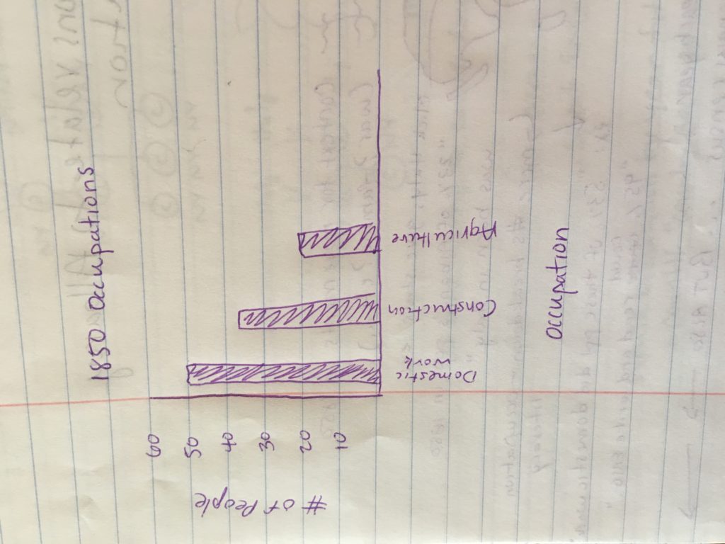
I would also like to show the information about people once they were in Albany such as literacy and occupation. I will probably do this using a graph to show different occupations and literacy rates. I think I will use both absolute numbers as well as percentages for this information, as well as the birthplaces of individuals.
There will be some essay text included. This will serve to add historical context to the movements of people to Albany from their birthplace. For example, political or social conflicts in certain regions in certain years.
-
City of Albany Census Data, 1850 to 1940
The Census records dataset contains information on sex, age, race, birthplace, mother’s and father’s birthplace, literacy, occupation, and relationship between a person and the head of household if one exists. The US Census Bureau categorizes all people who are not in housing units as living in group quarters. Examples of group quarters include prisons, missions, and college housing. If a person on the census is not part of a household, their group quarter is listed. Information for these are the type, funding, and details of the group quarter.
-
Networks
Over time, the network gets bigger and more connections are added. Some major connectors I’ve found are Esras Sr., Anna and Joseph Clement, Cornelius Thanighwanege, Abraham Canostens Peterse, and Seth Sietstarare Karihoge.
The network compared by betweenness seems to have less connections than the one sized by degree. There are two main groups which only have a few connections between them. There are also a lot of smaller groups that have four to ten people in them, and they don’t connect to either of the larger two groups.
There seems to be a lot less large nodes when sized by betweenness. The network filtered by year provides a lot more major connectors than when it is filtered by betweenness. Many of the larger nodes when sized by betweenness are the same people as when it’s filtered by year.
The patterns formed by clustering seem like that don’t have much that is similar with individuals with high betweenness centrality. The only person in common that I saw was Anna Clement. This could have been because I missed some of the other major individuals when they were grouped in other ways, or that they weren’t as major when grouped differently.
The patterns formed by clustering look similar to the ones formed when the data was filtered by year. While the patterns compared by betweenness had two major groups that were clearly split, the patterns with clustering overlap a lot and don’t have any groups that are clearly split. It looks very similar to the way the patterns were when it was filtered by year.
-
Data Visualization: Histograms and Arc Network Diagrams
Histograms
Histograms are a good way of displaying information as they are very intuitive. It is easy to understand histograms without having much experience with visualization. They are good for showing the relationships between quantitative measures, especially single distributions Histograms show the frequency of specific data types . Visualizing multiple distributions can be harder to do with histograms. It can be difficult to tell where each bar begins and ends when using a stacked histogram. However, histograms can be misleading. The parameters on the axes depend on the data, meaning that looking at different trends within the same data can be misleading.
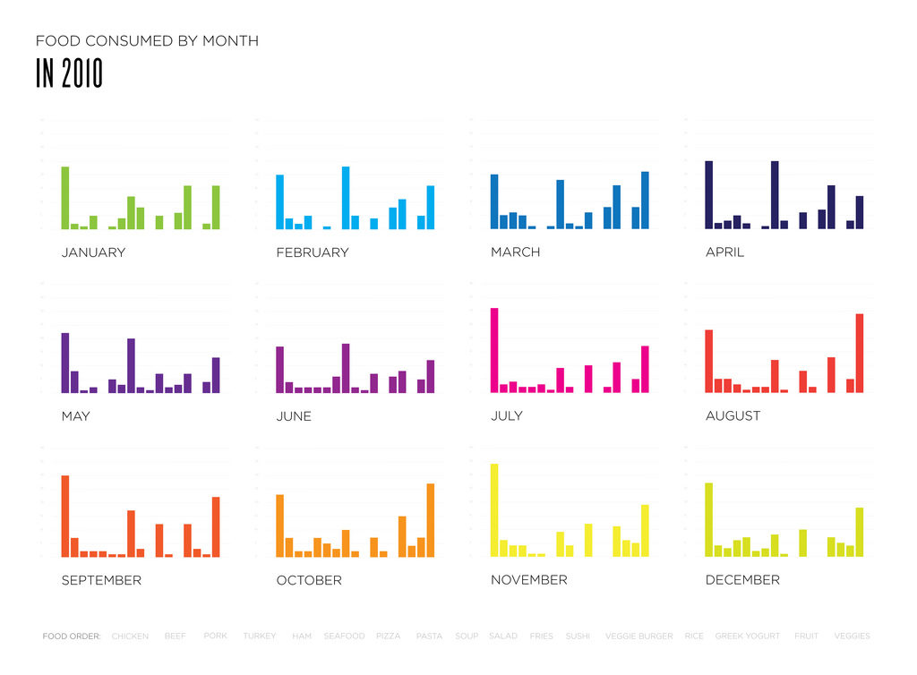
This image was posted on the DataViz project website. The histograms above show how much certain kind of food were eaten in a month. Each bar per month represents a different kind of food, with the foods being listed at the bottom of all the charts. This chart is useful for seeing the relationships between each food in an individual month. However, it is difficult to compare the trends over the entire year based on the setup of the image.
Arc Network Diagrams
Arc network diagrams are good for finding co-occurrence in datasets. However, they don’t show connections between nodes as easily as 2D models do. They can also become easily cluttered and hard to read with an increasing amount of data. Arc network diagrams are good for showing the relationships between qualitative and quantitative measures. They are primarily used to show correlation in data.
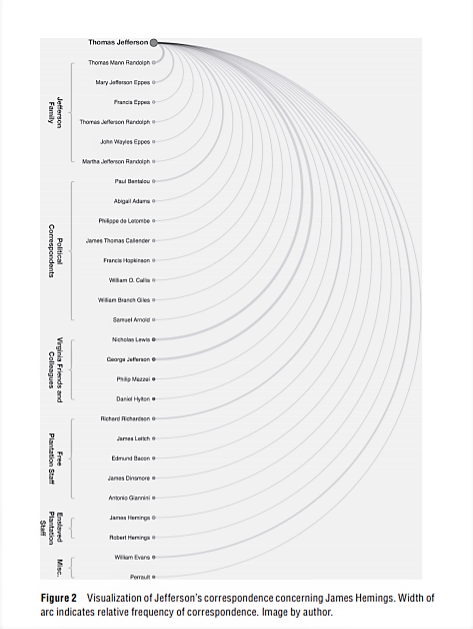
This image is an arc network diagram showing the frequency of correspondence regarding a certain topic by Thomas Jefferson. It is from “The Image of Absence: Archival Silence, Data Visualization, and James Hemings.” by Laura F. Klein. It shows the names of individuals as well as specific groups they were a part of, for example, the Jefferson Family or Free plantation staff. This is helpful because then the visualization shows that correspondence was more frequent between different groups of people.
-
Data Critique: Eastern State Penitentiary Admission Records
This dataset contains information on the admission of people to Easter State Penitentiary. It includes the name, age, ethnicity, religion, birthplace, prisoner number, admission and discharge dates, offense, sentencing date and location, number of convictions, as well as several notes about the inmates. The dataset contains information about convicted criminals. The data itself is a mix of qualitative and quantitative data. The sentence length is an example of quantitative, while the offense description is qualitative. The data spans 13 years, from 1830 to 1843. Geographically speaking, it covers the Northeast United States. The scope of this data only includes convicted criminals, not the entire crime rate. This specific data shows the types of crimes committed in this region during this time period, as well as the demographics of the offenders. This data cannot show the same trends in other areas and over other time periods. It also can’t show whether the rate of crime has changed at all since earlier time periods.
A majority of the information comes from the admission records of the prison. There was also some information pulled from a report made from investigating the running of the prison. Some of the notes on the inmates were observations made by the prison’s Moral Instructor, Thomas Larcombe. These were observations about the moral states of the inmates. Information for the dataset was also pulled from letters to, from, or between the inmates.
The dataset is set up chronologically by admission date, starting with March 1830 and ending in May 1843. Each individual row contains the data for a single inmate. The columns are divided into specific information about each individual, such as their age or offense. This is likely to make it easier to compare specific data about the individual inmates. If this was the only dataset used, there would be a lot of information left out. For example, the goal of the prison was to reform the inmates, but the discharge notes don’t say whether or not that goal was reached. It also leaves out information regarding the time spent in the prison. For example, the inmate’s behavior and if or how many times they were disciplined. The data is also biased towards the prison administrators, specifically the notes about the inmates. Much of the information was recorded by the prison workers, so we’re seeing it through their observations. If this was the only dataset use, it would also leave out similar information for different time periods and areas in the United States.
-
Project Review: Kindred Britain
Kindred Britain http://kindred.stanford.edu/# Created by Nicholas Jenkins, Elijah Meeks, and Scott Murray. Maintained by Stanford University Libraries. Reviewed Jan. 2, 2019 – Jan. 4, 2019
The goal of this project is to show the relationships and connections between individuals. The argument is that the project can be used to uncover connections between people that aren’t well known. It also argues that history looks like a family tree. The method used is a family tree style setup which show different kinds of connections between people. The presumed audience seems to be academic scholars, as it has a lot of information on it that assumes background knowledge. It is also accessible to the general population though. Its basic format shows the connections between people in a way that’s easy to understand. The project is very interactive. The reader interacts with the content by dragging individuals to one another to view the connections between them. The interactions complement the argument because it allows the audience to view individuals their interested in, and let’s them follow paths that interest them. The project allows for more individual research and allows the audience to research topics that interest them. A print form wouldn’t have allowed for as much individual research or would have made it more difficult to find information. The digital component allows for people to follow their own interests easily, getting directly to information instead of going through a large amount to find specific details.
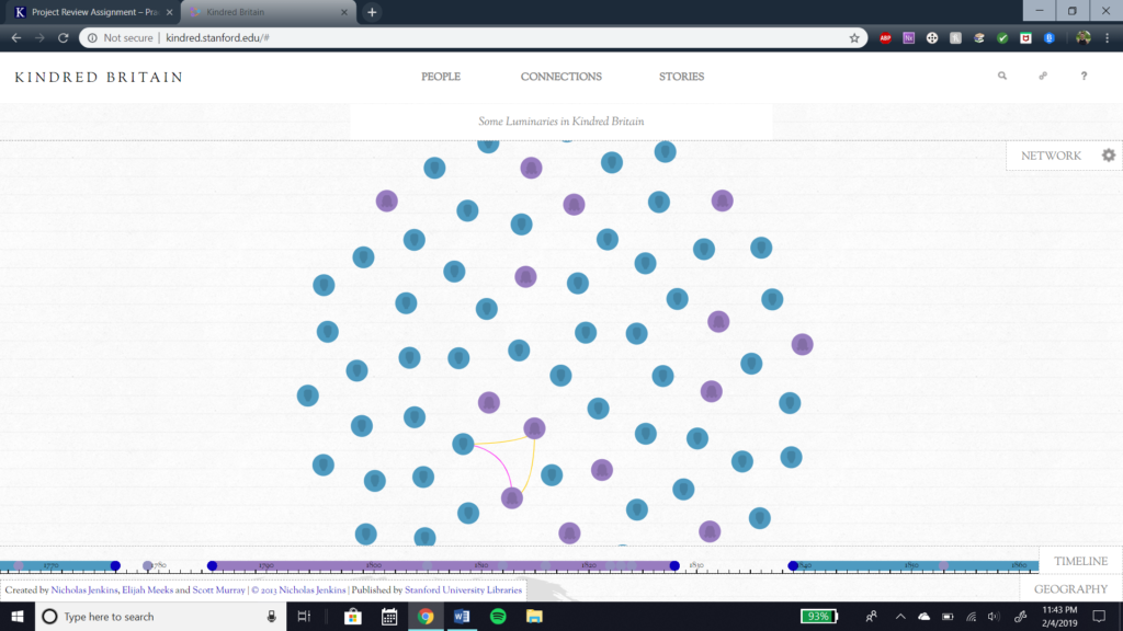
This is the main page of the project. 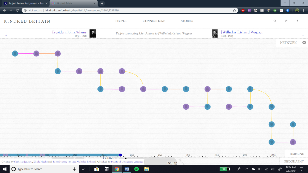
This is an example of the connections between individuals.