-
Finding a Place to Belong: Jeff Aldrich Final Project
Below is the link to my final project. Thank you and Best.
-
Jeff Aldrich: Rough Draft
Here is a link to the rough draft of my project.
https://jdaldrich01.wixsite.com/digitalhistory
Thank you for the feedback!
-
Wireframe: Pittsfield Census Records
The structure of this project will be composed of a series of interlinked web pages utilizing the program Twine. The different pages are as follows: Introduction, 1920 Census, 1940 Census, Further Information/Reading List, and Future Project Goals.
Introduction Page
The Introduction page will have a large, centrally placed image of a ward map of Pittsfield, Massachusetts. Underneath the image, visitors to the site will be able to read the main argument of the project.
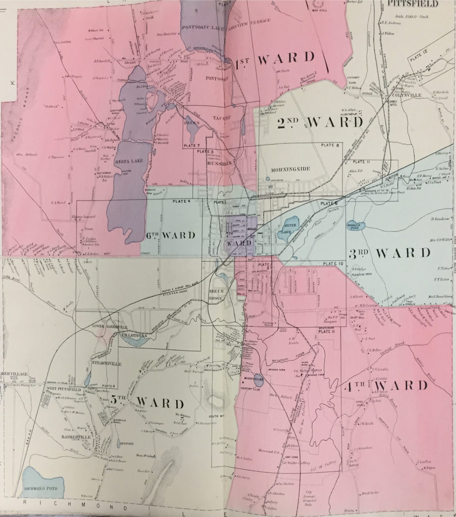
Introduction Map (1899) -
Final Project Proposal: Space and Community in Pittsfield, Massachusetts
The data being used in this project is compiled from United States census records of Pittsfield, Massachusetts from the years 1900, 1920 and 1940. By 1900, Pittsfield began including ward data within the federal census. Starting with some of the larger ethnic populations that immigrated into the city during this forty year period, this project aims to focus on the following immigrant groups: German, Irish, English, Polish, Austrian, Italian, and French residents of Pittsfield.
Contained within these census records is basic information about the individuals living within the city of Pittsfield, Massachusetts. This includes the name, birth year, birth location, gender, ward residence, position in family, and any known family members of each individual listed on the census. By focusing on ward residence and birth locations from the three specified time periods it is possible to discern and interpret immigration patterns within the city, where different ethnic and racial groups were living, and how this changed throughout the first half of the twentieth century. This then leads to a series of research questions:
- Were different ethnic and racial groups living within specific wards within the city?
- Was there overlap within each ward where different ethnic and racial groups were living?
- How did population number of a certain ethnic or racial group impact population disbursement of that group?
- How might have population and ward location of one ethnic or racial population have affected the population and ward location of another group?
- How does Pittsfield’s overall population change overtime? (emphasizing that the city is always evolving in size and culture)
- How was Pittsfield’s population impacted by larger immigration movements? (ex: Irish immigration, the Great Migration from Eastern and Southern Europe)
-
Text Analysis: Religion and Slavery
The words chosen for this analysis are as follows: god, christian, slaves, slave, and slavery. They have been chosen for the purpose of studying the correlation between the use of religious terminology with both the mention of the enslaved and the institution of slavery within the documents assigned.
Using Bubblelines to analyze the terms within the documents yields an interesting trend of categories from one time period to the next. The categories are as follows:
1.) Early 1700’s: there is a relatively even amount of mention of religious terminology and slave terminology, but they are discussed separately within the document.
2.) Mid 1700’s: slave and religious terminology are not discussed together
3.) Late 1700’s – Early 1810: there is a relatively even dispersement of religious and slave terminology throughout the documents
4.) 1810-1843: there is more emphasis on one topic over the other, but both are mentioned
5.) Mid 1800’s-1880’s: there is a return to a more even dispersement of the terms
6.) 1890’s: there is more emphasis on slavery, but religious terminology is still used
7.) 1900’s: there is a return to a more even dispersement of the terms
-
Networks: Jeffrey Aldrich
In this week’s Networks tutorial there are many interesting factors that stand out while studying the edges between the different members of the church congregation.
The first question to address is how these networks of church members change over the years 1735-1745. The first two major variables to assess over time are the change in the quantity of networks and the change in the overall size of each network throughout the decade. There are essentially three primary phases in the data set. The first is at 1734-1735. This period is represented by a minute number of networks with a minimal number of edges and nodes. The second phase runs from 1736-1739. At this point, two larger networks have formed with smaller networks scattered throughout the periphery. The number of edges and nodes has also largely increased. Lastly, the final phase is from 1740-1745. At this point the two larger networks, seen in the previous phase, have joined together, and there are several, smaller networks throughout the periphery. This phase also contains the largest number of nodes and edges.
-
Horizon Graphs and Small Multiples
Horizon Graph
A horizon graph is a chart that utilizes a diverging color scale, where either end of a data sequence is represented with different opaque colors that stratigraphically become more translucent and similar to the opposing color as the data reaches a start value, to showcase the different values within a dataset.
To create a horizon graph, one begins with a simple line graph that can go both positive and negative along the X or Y axis. After a line has been plotted, then a different color is used to represent each group of data within a given range. Then, all of the different color categories are re-plotted with only positive values on the graph at the axis.
An excellent example of a horizon graph can be found at flowingdata.com. In this example, the author uses a horizon graph to show the fluctuating price of bacon from 1990 to 2015. These three steps, below, show how the author shifted the data visualization from a line graph to a horizon graph:
-
Data Critique: Slave Sales and Appraisals, 1775-1865
Slave Sales and Appraisals, 1775-1865 is a spreadsheet created by Robert W. Fogel and Stanley L. Engerman from the University of Rochester. Utilizing probate records of slave sales and appraisals from eight southern U.S. states, currently housed at the Church of Jesus Christ of Latter-Day Saints Genealogical Society Library, Fogel and Engerman have compiled the information from these primary sources into an easily readable data set.
-
Last Seen: Finding Family After Slavery; a Review
Last Seen: Finding Family After Slavery. http://informationwanted.org/. Created and maintained by the Department of History at Villanova University in collaboration with Mother Bethel AME Church, http://informationwanted.org/about-us. Reviewed January 27, 2019-February 4, 2019.
Worked by a team of graduate students within Villanova’s history department, Last Seen: Finding Family After Slavery serves as a digital archive and teaching website that collects, transcribes and stores newspaper ads taken out by former slaves searching for their family members. The purpose of the website, as argued by the Last Seen team, is to provide new primary sources to genealogists and researchers, engage with the public, teachers and grade school students over the history of slavery, and give agency to former slaves that lived throughout colonial and United States history. Through the gathering of these newspaper sources and the methods employed by the Last Seen team in running the project, there are a series of different ways in which the have gone about achieving these goals.
-
Review: Foreign-Born Population 1850-2010
Foreign-Born Population 1850-2010. https://dsl.richmond.edu/panorama/foreignborn/#decade=2010. Created and maintained by the Digital Scholarship Lab partnered with Stamen Design, https://dsl.richmond.edu/panorama/foreignborn/#decade=2010. Reviewed January 27, 2019-February 4, 2019.
Utilizing U.S. census records and county boundaries from 1850 to 2010, supplied by the Minnesota Population Center and the Newberry Library, the project Foreign-Born Population 1850-2010aims to show that a significant percentage of America’s residents were born outside the country’s borders. In doing so, the ultimate goal of the Foreign-Born Population project is to argue that because so many of the country’s residents have been born elsewhere, it is essential that researchers, historians and the American people look beyond the country’s borders to fully understand the history and culture of the United States.