Digital Harlem Review
Digital Harlem: Everyday Life 1915-1930.
Digital Harlem focuses on the everyday lives of African Americans living in Harlem between 1915-1930. The project captures everyday activites, places, and relationships by tracing lives through extensive research and map making. Instead of focusing on black artists and the black middle class, the researcher’s focused their attention on the ordinary African New Yorkers living in Harlem between 1915 to 1930.
The researchers focused on four types of resources for the project: District Attorney’s Closed Case Files, from the Municipal Archives New York City, Probation Department Case Files from the Municipal Archives New York City, Newspapers from the New York Public Library, Committee Fourteen Papers from the Manuscript & Archives Division of the New York Public Library, and W.P.A. Writers Program Collection from the Schomburg Centre for Research in Black Culture, New York City. It is worth mentioning, the researchers are four professors of the Department of History at the University of Sydney, in Australia. It begs the question of how long and extensive their research was and why they are interested in Harlem.
Of the four professors, two do not live in the United States and only one is a historian of African American history. It is worth mentioning that all of the researchers and website developers are white men either from Australia or the United States. While a researcher and web developer’s race and gender do not make them better or worse of a historian or creator, it is interesting that black voices are only heard through their (researchers and web developers) archival research. There is no interpretive voice on the website, either from a white or black perspective. Instead, the information is gathered and left to the interpretation of the users. This lack of perspective and argument (being that ordinary black people lived in Harlem), has the authors defend the information layout to the user.
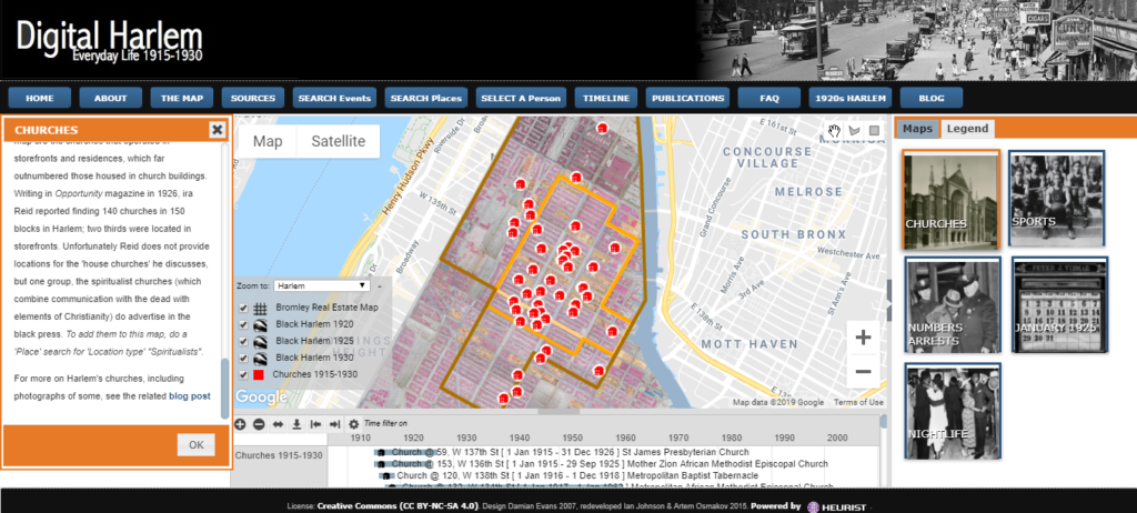
By focusing on ordinary people in Harlem, most of the information provided on the map seems to focus on crimes, with many of the Legends (markers on the map), ranging from abortion, prostitution, to various forms of assault. In the FAQ pop-up of the site, this query is addressed. The authors argue that the records relate to events and places where residents of Harlem spent their time. The authors dive deep into the categories of events to defend how these crimes reflect ordinary life, “Notwithstanding the marginal scholarly attention is has received, this form of illegal gambling was a central part of the cultural and economic life of the neighborhood, a black owned and black-run business that turned over millions of dollars a year.” While the argument seems to be lost on the map, the FAQ and blog attempt to provide some argument.
An Google map is enhanced with boundary lines based on Gilbert Osofksy’s Harlem: The Making of a Ghetto (1971) and James Weldon Johnson Black Manhattan (1930) as well as the Federal censuses records of 1920 and 1930 and the New York State census of 1925. With the boundaries of the predominately African American neighborhoods established, the overlaid map of individual buildings is a stark contrast from Google Maps basic layout. The project team used Atlas of the City of New York, Borough of Manhattan volumes 4 and 5 by G.W. Bromley & Co. to give the neighborhood more dimension and provide another layer of architechtural context to the map.
The combination of Atlas of the City of New York layered over an interactive Google Map, with markers and a browsable timeline, the website is very user-friendly to native digital users. However, the website’s navigation bar serves as a how-to-use-this-map guide for novice users. The use of pop-ups for each navigation button and marker on the map, allows the user to stay on one page instead of losing their place in a line of tabs. However, this is not friendly to someone who is interested in comparing the information on more than one marker. The basic information provided on the map and the more detailed information provided by the blog, which usually includes newspapers and other resources about the location, implies the audience to be focused on people interested in Harlem history beyond history books. This site would be best used by middle to high school classes and undergraduate courses to provide more context to what Harlem was like in the early 1900s.
This project could not be easily reproduced on paper unless you are a talented artist with a lot of time on your hands. The digital project does provide a clear context for the famous black artists and black middle class of Harlem. The use of historical maps, census, and architechure books gives a plain Google Map more interactive components. The addition of a timeline and markers allows the user to choose what type of information is to be collected and presented. The freedom of use of information is what digital histories give to users. However, at what cost does this freedom do to histories and the historians that create them? Digital Harlem researchers give visitors the information with instructions on how to search but leave no interpretation of the information so freely available. All the work is done, but the interpretation (the art of history) is buried in the FAQ, waiting to be clicked on.
2 Comments
Maeve Kane
We’ll discuss this in class, but: do you think that the authors should have offered more of an interpretation up front, given their sources? I’m not quite clear what you mean by this: “This lack of perspective and argument (being that ordinary black people lived in Harlem), has the authors defend the information layout to the user.” How do you think an author could help a reader who is unfamiliar with the digital layout used navigate more easily without being defensive?
scarlatte28
I do think the authors should have stated their argument or added some statement about why the data is focused on crimes up front with a pop-up. So, in the FAQ pop-up, the authors answer a question on why crime is the main focus of the data. The authors had to provide a reason which I think their reason should have been included in the first pop-up (image attached). Does that make sense?
The authors could have highlighted the blog more on the map. The blog has the sources and interpretation of data. Only the side pop-up panel has basic information about the topic. Unlike the other pop-ups, this one is small and is set on the side of the map. By presenting this pop-up on top of the map it keeps the visitor’s attention on the narrative and argument as well as a hyperlink to the blog for more interpretation of the data.