-
-
England’s Immigrants Rough Draft

The data set used was compiled by government records, such as tax forms, meaning that the data set is not entirely representative of the amount of women who immigrated during this period of 1330-1550. The very fact that women were not included in some government documents, however, supports the claim that women were afforded less opportunities during this period, specifically economically.
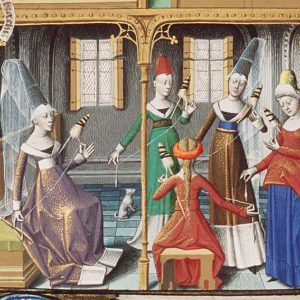
This visualization intends to demonstrate the difference in employment of men and women at this time. Men had the opportunity to learn a trade through apprenticeships or learn a profession, such as law or medicine, whereas a woman was more likely to become an unemployed vagabond than a doctor, lawyer or even merchant.
The purpose of the world cloud is to once again illustrate the lack of opportunity for women in terms of employment. The word cloud which represents men shows the different professions practiced, such as a smith, merchant, brewer or baker. The cloud representing women, however, features the term “servant” most prominently as it was the most commonly practiced profession by women of the period. The cloud is predominately composed of men’s names as well, the names being of the men the women were employed to. During this time, women had less autonomy and were defined by men in society as well as in the eyes of the law.
-
-
-
Text Analysis
By Clara and Merissa
The five main terms we decided to focus on are “God,” “Master,” “Life,” “Home,” and “Slave.”
We chose the Bubblelines visualization first because it allowed us to easily see the prominence of different terms in each independent work, making it much easier to compare and contrast the use of our selected terms.
-
Horizon Graph/ Bubble Chart
Horizon Graph:
A horizon graph looks similar to a line graph, but uses a color scale to differentiate between points, such as between positive and negative values, with only two divergent colors used in order for the chart to be more concise. It reads similarly to a heat map in the sense that the denser the color is, the greater the frequency of the data presented or the farther the absolute value of the point is away from zero.
-
Data Critique: Eastern State Penitentiary Admission Book
The data set we analyzed was that of the Eastern State Penitentiary admission books. The books listed the admission of the incoming prisoners by name and other features such as their age, ethnicity, religion, job, birth place, prisoner number, admission date, sentencing location, offense, length of sentence, number of convictions and general notes. The data describes the inmates imprisoned at Eastern State Penitentiary from the years 1832- 1868. While the data was collected in one specific region the original homelands of the inmates covers a large geographic area demonstrating the changing demographic in the industrial age. For example, imprisoned are not only people from the local area, but from countries such as Holland, Germany and Ireland. The data provided lacks much of the context needed to understand the sentencing procedure. Some were sentenced to a year for forgery, while another was sentenced to 10 years for the same offence, likewise others who committed a seemingly minor offence were given more time than those who committed murder.
-
Project Review: Negro Travelers’ Green Book, 1956
The Negro Travelers’ Green Book, 1956. https://digital.library.sc.edu/collections/the-negro-travelers-green-book-1956/. Created and maintained by the University of South Carolina Library, Columbia, South Carolina, https://sc.edu/about/offices_and_divisions/university_libraries/index.php. Reviewed February 4, 2019.
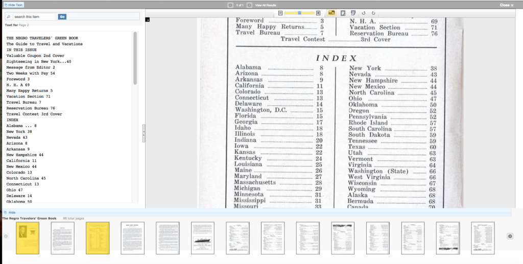
Pictured above is the index of the digitized Green Book