Visualization Guide
-
Cartograms and Histograms
By Jesse Aragona
A Cartogram is generally speaking a map used to represent quantitative data, the representation of which exaggerates specific portions of the map presented in an effort represented greater and smaller amount of whatever is being measured.

This image for instance represents the distribution of Walmarts, McDonalds and Starbucks respectively. The larger the presence (in this case franchise locations)in a specific state the larger that state appears. It’s important to understand when working with Cartograms that they DO NOT accurately portray the geography of the location instead showing the quantitative data in a representative image. Cartograms allow for inferences about population sizes, and are an excellent tool for the representation of quantitative information in a geographic area.
(Image from http://www.stephabegg.com/home/projects/cartograms)Histograms, unlike Cartograms are simply the accurately displayed numerical data in a linear fashion. A histogram is designed to display information in a comparative fashion, allowing inferences to be made on numerical data. While similar to a bar graph, a histogram displays quantitative information instead of categorical and the bars of a histogram do not touch.
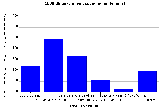
This histogram displays government spending, allowing for the comparison of funding distribution showing which areas receive more funding then others. Information displayed in this manner is useful especially in making cases regarding funding, comparing spending between categories gives us the ability to compare information in a way in which arguments can be made. For instance the highest spending categories are Social Security and Defense, while Law Enforcement and State Development are the lowest showing us where priority is placed in the budget.
(From http://www.shodor.org/interactivate/discussions/HistogramsVsBarGraph/) -
Data Visualization: Histograms and Arc Network Diagrams
Histograms
Histograms are a good way of displaying information as they are very intuitive. It is easy to understand histograms without having much experience with visualization. They are good for showing the relationships between quantitative measures, especially single distributions Histograms show the frequency of specific data types . Visualizing multiple distributions can be harder to do with histograms. It can be difficult to tell where each bar begins and ends when using a stacked histogram. However, histograms can be misleading. The parameters on the axes depend on the data, meaning that looking at different trends within the same data can be misleading.
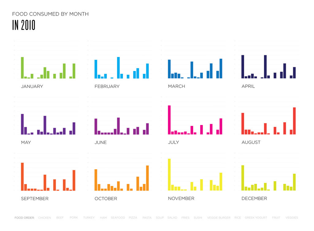
This image was posted on the DataViz project website. The histograms above show how much certain kind of food were eaten in a month. Each bar per month represents a different kind of food, with the foods being listed at the bottom of all the charts. This chart is useful for seeing the relationships between each food in an individual month. However, it is difficult to compare the trends over the entire year based on the setup of the image.
Arc Network Diagrams
Arc network diagrams are good for finding co-occurrence in datasets. However, they don’t show connections between nodes as easily as 2D models do. They can also become easily cluttered and hard to read with an increasing amount of data. Arc network diagrams are good for showing the relationships between qualitative and quantitative measures. They are primarily used to show correlation in data.
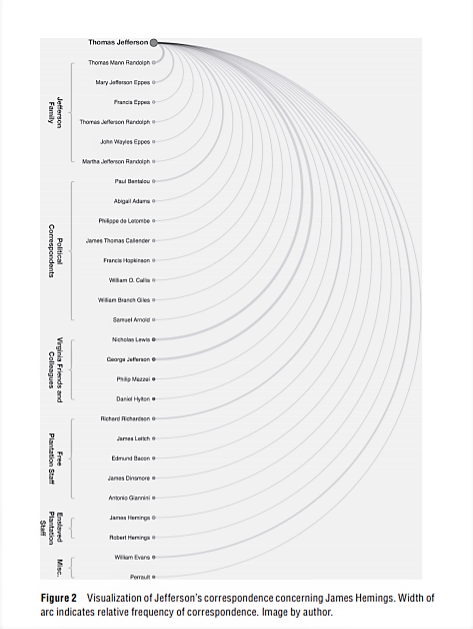
This image is an arc network diagram showing the frequency of correspondence regarding a certain topic by Thomas Jefferson. It is from “The Image of Absence: Archival Silence, Data Visualization, and James Hemings.” by Laura F. Klein. It shows the names of individuals as well as specific groups they were a part of, for example, the Jefferson Family or Free plantation staff. This is helpful because then the visualization shows that correspondence was more frequent between different groups of people.
-
Matrix Plots and Node-link Diagrams/Dendrograms
Historians looking to analyze trends and connections between several scatterplots and compile clusters will need to utilize both matrix plot graphs and node-link diagrams/dendrograms to represent their datasets. Node-link diagrams, dendrograms, and matrix plot graphs are all ways of compiling smaller samples of data to analyze broad trends.
-
Data Visualization: Line vs. Area Charts
When seeking to visualize data consisting of discrete points that can be measured continuously to some extent, or data that is entirely continuous, two options for data visualization are area and line charts. Though both of these formats serve similar purposes, there are notable differences in their optimal usage, particularly when attempting to represent multiple sets of data within one visualization.
-
Arc Network Diagrams/Stacked Area Graphs
Owen McCarty
Arc network diagrams are an interesting way of displaying information for a reader. With arc network diagrams, nodes are placed on a single line x axis along with arc that connects the nodes to establish a relationship. The main draw of arc network diagrams is it typically uses thickness as a way to represent the relationship between nodes on the axis. The thicker the arc, the higher the frequency. Where this type of chart can be useful is displaying information that you want the reader to understand connections between various aspects of something. In looking at examples for this type of graph, words and people were frequently displayed in this chart. This included looking at correspondences between politicians and how frequently they showed up in each other’s archives and the frequency of related words that popped up in journal articles. Showing relationships in linguistics and individuals seems to be the best usage for this type of graph.
-
Stream graphs and Line Charts

Source: Gerd Altmann/PublicDomainPictures.net/CCO Public Domain With the advent of new technologies in recent decades, historians have changed how they present their data. From simple bar graphs and pie charts to the eye-catching designs of Stream graphs, layers of information can now be dissected in one visualization. But, like their predecessors, these new methods of data visualization have their own problems which can scare users away for more traditional graphs.
-
Trees and Circles
Imagine that you walk into a pet shop and you are tasked with organizing all the animals into categories. How would you represent that data visually? Maybe bar graphs to show there are more dogs than cats. However, what does each bar represent an animal or a general type of animal? And you want to show your readers how the proportions of mammals and reptiles, something a simple bar graph cannot easily express.
-
Data Visualization: Stacked Area/Stream Graphs and Matrix Plot Graphs
Stream Graphs and Stacked Area Graphs
Stream graphs and stacked area graphs both represent data in similar ways. A stacked area chart represents data on an x- and y-axis, and each item is represented by a band of color. In these visualizations, the areas are “stacked,” allowing the viewer to compare the areas and see the totals. For example, the chart below shows the revenue per capita – essentially, how much a single person might spent in each given year – on each music format.
-

There exists a plethora of ways to visualize data beyond simple bar graphs, pie charts, and basic line graphs. Historians often shy away from using visualization tools, partly because of their lack of use or maybe an inherent fear of statistics.
-
Horizon Graph/ Bubble Chart
Horizon Graph:
A horizon graph looks similar to a line graph, but uses a color scale to differentiate between points, such as between positive and negative values, with only two divergent colors used in order for the chart to be more concise. It reads similarly to a heat map in the sense that the denser the color is, the greater the frequency of the data presented or the farther the absolute value of the point is away from zero.