Data Visualization: Histograms and Arc Network Diagrams
Histograms
Histograms are a good way of displaying information as they are very intuitive. It is easy to understand histograms without having much experience with visualization. They are good for showing the relationships between quantitative measures, especially single distributions Histograms show the frequency of specific data types . Visualizing multiple distributions can be harder to do with histograms. It can be difficult to tell where each bar begins and ends when using a stacked histogram. However, histograms can be misleading. The parameters on the axes depend on the data, meaning that looking at different trends within the same data can be misleading.
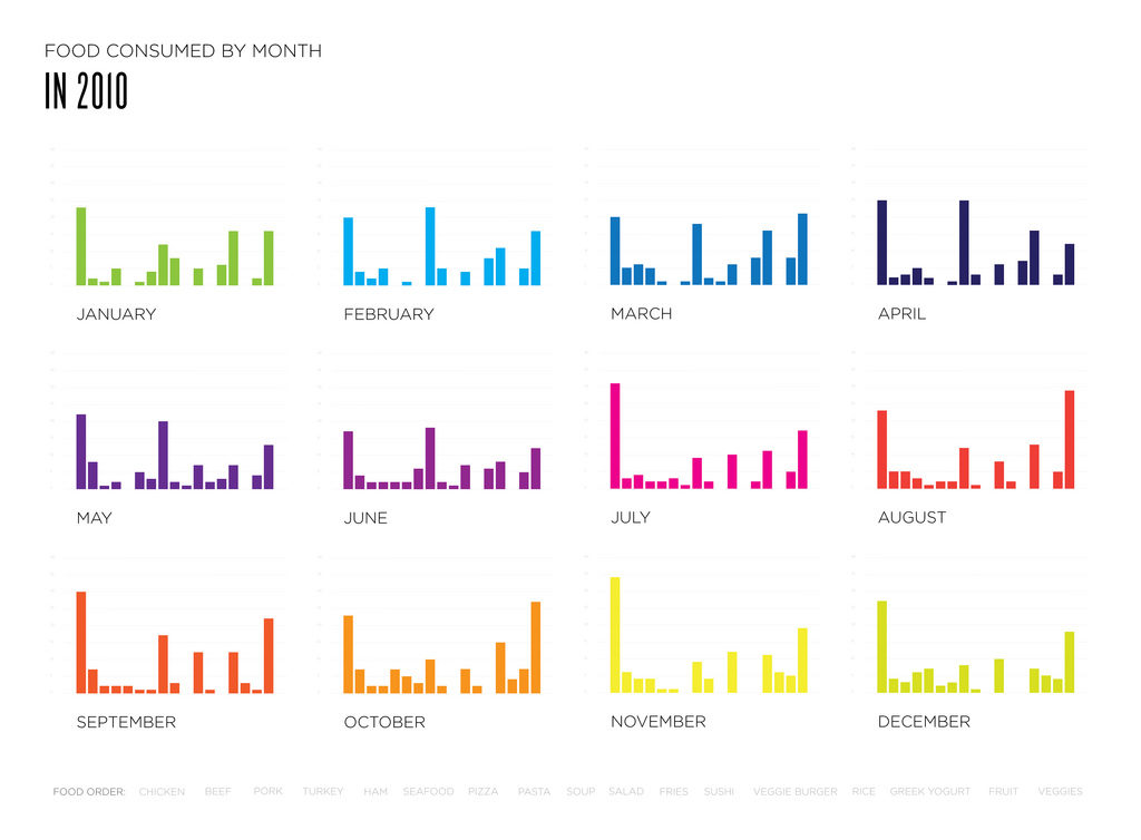
This image was posted on the DataViz project website. The histograms above show how much certain kind of food were eaten in a month. Each bar per month represents a different kind of food, with the foods being listed at the bottom of all the charts. This chart is useful for seeing the relationships between each food in an individual month. However, it is difficult to compare the trends over the entire year based on the setup of the image.
Arc Network Diagrams
Arc network diagrams are good for finding co-occurrence in datasets. However, they don’t show connections between nodes as easily as 2D models do. They can also become easily cluttered and hard to read with an increasing amount of data. Arc network diagrams are good for showing the relationships between qualitative and quantitative measures. They are primarily used to show correlation in data.
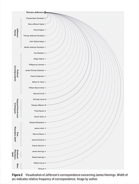
This image is an arc network diagram showing the frequency of correspondence regarding a certain topic by Thomas Jefferson. It is from “The Image of Absence: Archival Silence, Data Visualization, and James Hemings.” by Laura F. Klein. It shows the names of individuals as well as specific groups they were a part of, for example, the Jefferson Family or Free plantation staff. This is helpful because then the visualization shows that correspondence was more frequent between different groups of people.