Heat Maps and Dendrograms
Heat Maps
A heat map is a way to visualize data that is reliant on color variation. All heat maps require a legend to show what each color means. It can show labeled categorical data or qualitative data so long as it corresponds with a color. While some he maps may have specific colors, others can cover a range. This kind of heat map works best with quantitative, continuous data that allows for a range of possibilities, such as temperature.
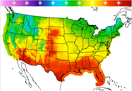
While heat maps may not be the most well known way to plot data, they are certainly easily recognizable. People see them all of the time on the weather channel, in their doctor’s office, or on maps with population data. To me, heat maps are interesting because they are driven by quantitative data but often show more subjective issues. For example, a heat map can be used to show temperature throughout the United States on a given day. Lower temperatures may be represented through cool colors (greens, blues, and purples), where hotter temperatures are generally reds, oranges, and yellows. Seeing red in Texas might automatically invoke that it’s going to be very hot in Texas, whereas the green in New York would make one think of more temperate weather. Additionally, doctor’s offices will also use heat maps to identify risk factors in terms of obesity levels. With height on the y-axis and weight on the x, one can plot their weight and see their zone. Normal weight would be in green, overweight in yellow, obese in orange and morbidly obese in red. People will relate to the color red as meaning warning or stop, so being in the red is bad.
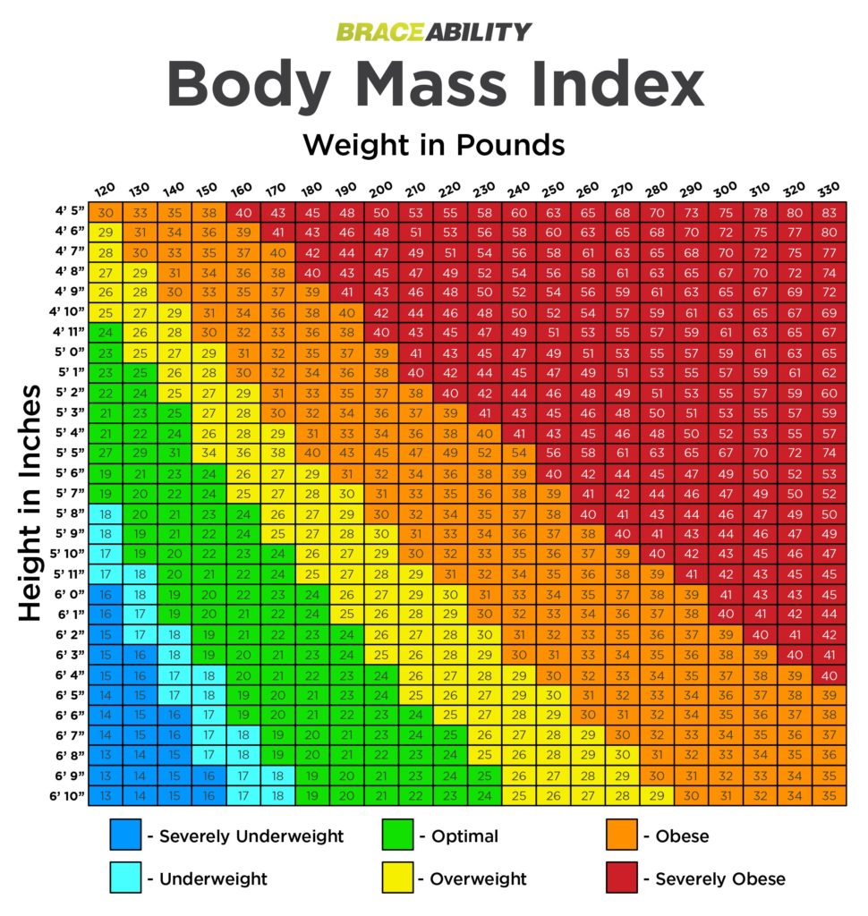
The chart above offers a color scale that does not give the same bad connotations to being severely underweight as being severely obese even though they can be equally unhealthy. One is coded as red (dangerous, caution) whereas the other is blue (peaceful, good). This has less to do with data and more to do with the visualization itself.
The reliance on color, though it can be beneficial to understanding what is bad/good hot/cold, may make it difficult for some people to read the map itself. For people with red/green colorblindness, an orange might just look like a weird yellow color. This could lead to a gross misjudgement in reading the map, through no fault of the viewer. However, there are efforts being made to make heat maps work better for colorblind people and color scales that are curated specifically for helping that audience.
The biggest issue with heat maps is how easily data can be skewed if the person is not intent on reading the scale. For example, if green meant hot and red meant cold in the chart below, one might be able to trick a viewer into expecting cold weather when they should be getting their air conditioners ready. [This might not be the best proof of this because people expect the south to be warm and the north to be cold.]
Ultimately, heat maps can be very useful, especially in showing ranges of continuous data. However, the use of colors can have possible drawbacks that include skewing a casual viewer’s opinion or being difficult for people with vision related issues.
Dendograms/Node Link Diagram
Dendrograms/Node-Link Diagrams are best used to show hierarchy and relationships through clusters and trees (dendro- meaning tree). The most recognizable form of a dendrogram is a phylogenetic tree or a family tree. In a dendrogram, qualitative data is grouped into clusters, bars then connect those clusters to each other. The lower the connection bar, the more closely related the clusters. A node link diagram accomplishes a similar task in that it shows relationship but may resemble a chemical formula as opposed to a tree. However, a google search reveals that people consider the node link diagram to look like a tree as well.
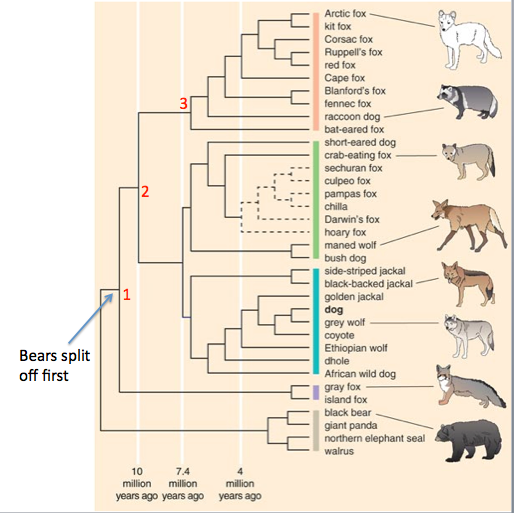
A dendrogram is best applied to qualitative clusters on one axis with quantity (height) on the other. I have not found any that use quantitative data and I believe that is due to the nature of the cluster: you cannot clust numbers together. The height is used to show how closely related two clusters are. For example, on the mammalian phylogenetic tree below, black bears and arctic foxes are not closely related due to the difference in branches, however black bears and walruses are.
Although the evolutionary chart is most common, it is not the only application of a dendrogram. I found another one that links the campaign rhetoric of certain political candidates.
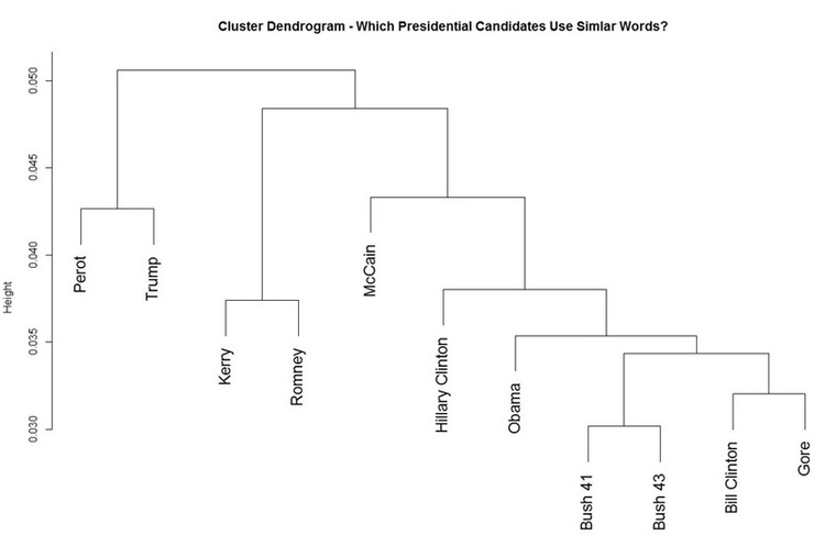
The Dendrogram shows the relationships and subgroups of political candidates through the similarity/frequency of words in debates
Like the heat map, the dendrogram comes with its own issues. For a large data set, it might not be wise to use this particular diagram. One, it would be incredibly overwhelming to the audience; and two, you need to have an excellent grasp on your data set to be able to note all the relationships and hierarchies. Additionally, when using an algorithm to plot the data set, one must be careful to check for data that has been wrongfully clustered or put into a relationship with data that it is not related to. The visualization of the data can also confound the audience if they don’t take a good look at the diagram they’re presented with.
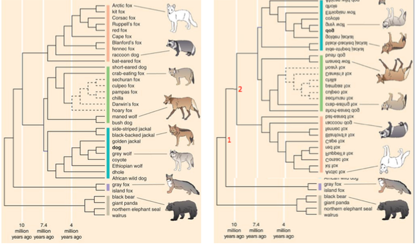
Branch 2 is flipped thought the data is the same
For example, the branches on the same tree can be flipped so that the arctic fox (least related to bears) is right near that branch on the tree. Although the information is the same, one might think that the nearness indicates a close relationship.