Data Visualization: Stacked Area/Stream Graphs and Matrix Plot Graphs
Stream Graphs and Stacked Area Graphs
Stream graphs and stacked area graphs both represent data in similar ways. A stacked area chart represents data on an x- and y-axis, and each item is represented by a band of color. In these visualizations, the areas are “stacked,” allowing the viewer to compare the areas and see the totals. For example, the chart below shows the revenue per capita – essentially, how much a single person might spent in each given year – on each music format.

Graph retrieved from DataViz Project
According to this graph, between 1976 and 1979, the average person might spend $63 on music, but most of that money would be spent on vinyl. By the year 2000, almost all of the average of $69 was spent on CDs.
A stream graph is similar, but it looks a bit different. Where the stacked area graph looks like a conventional graph with a straight baseline, the stream graph has a constantly changing center line. The graph below represents the amount of times certain characters are mentioned throughout Mark Twain’s Tom Sawyer.
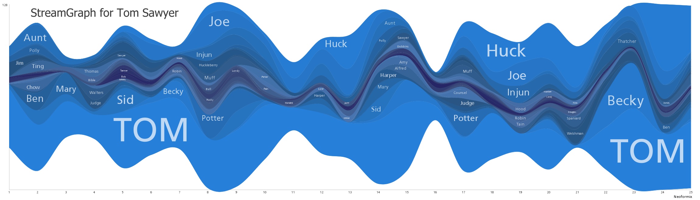
The large area allotted for the word “TOM” means that “TOM” was used most in those sections. This makes sense, considering that Tom is the main character. Like in the area graph, the different streams are “stacked,” so their values are added to one another.
Both of these charts work well to show trends and relationships between different data series. In the stacked area chart, the viewer can see that by 1991, vinyl was almost entirely obsolete, and the average person was spending their money on cassettes and CDs. This chart represents the trend of new formats being introduced and eventually dominating the market, making the relationships between these different formats very clear. In the Tom Sawyer stream graph, the viewer can see how important each character is based on how big their stream is. The weakness of these graphs, though, comes from a lack of ability to determine unique values. In the stacked area graph, it’s easy to see the relationships between CDs and cassettes in 2000, but it’s hard to determine exactly how much would have been spent on cassettes in that year.
Overall, these graphs can be very aesthetically pleasing, and they can certainly catch a viewer’s eye. However, beyond the conveyance of big trends and relationships, they are limited in their ability to effectively represent data in a legible way.
Matrix Plot Graphs
The Matrix plot graph is a graph that allows the creator to establish multiple categories as the x- and y-values. In the example below, three different variables are established: body mass, skull size, and head length.

By comparing these three variables, nine separate charts are created. The bottom left and the top right charts both measure skulls size vs. head length. The top left, middle, and bottom left charts measure each variable against itself (ie: body mass vs. body mass). Placing these nine charts, each measuring different variables, so close to one another allows the viewer to easily compare the differences in the observable trends. The three charts all composed of one variable (top left, middle, bottom right) shows the viewer the trend that, generally, male s have higher body mass, bigger skulls, and longer head lengths. It is then easy to compare this trend to the rest of the charts – all of which provide a similar conclusion but also represent their own version of the data. The chart on the bottom left shows that, in both male and female s, there is a correlation between larger skull sizes and longer head lengths.
This kind of data visualization is very well-equipped for representing trends in quantitative data. However, it can be quite confusing at first, and it does make the best use of its space. One chart will always be shown twice, and, realistically, the three charts that measure the variable against itself are not generally useful. (In this case, it was because I might not have known the relationship between the sizes and body masses of male and female blue jays.) Overall, this visualization is helpful, but it takes some time to grasp.