There exists a plethora of ways to visualize data beyond simple bar graphs, pie charts, and basic line graphs. Historians often shy away from using visualization tools, partly because of their lack of use or maybe an inherent fear of statistics.
Data Visualization can be a key facet to conveying the right point or to reinforce a historians argument with poignant proof in beautiful, data filled form. Today we will be looking at two specific tools; the Histogram and the Cartogram. Both are better at showing specific data than the aforementioned bar graph, pie chart, or a line graph. Although both are more niche they both excel at their specific tasks.
At first blush the histogram looks exactly like a bar graph, however they both do very different things. A bar graph represents each individual piece of data as a separate “bar.” For example you could have a bar representing how many cats live in your house, then another bar representing the dogs. Each bar would then be corresponded to the number on the left side or the “Y-Axis.” A histogram does not deal with individual or divided objects instead it represents a range of numbers. This “range” of numbers are a continual line and the “bars” are representations of the number of units in the range within a certain “bin.” There is a lot to unpack here, so let us start with an example.

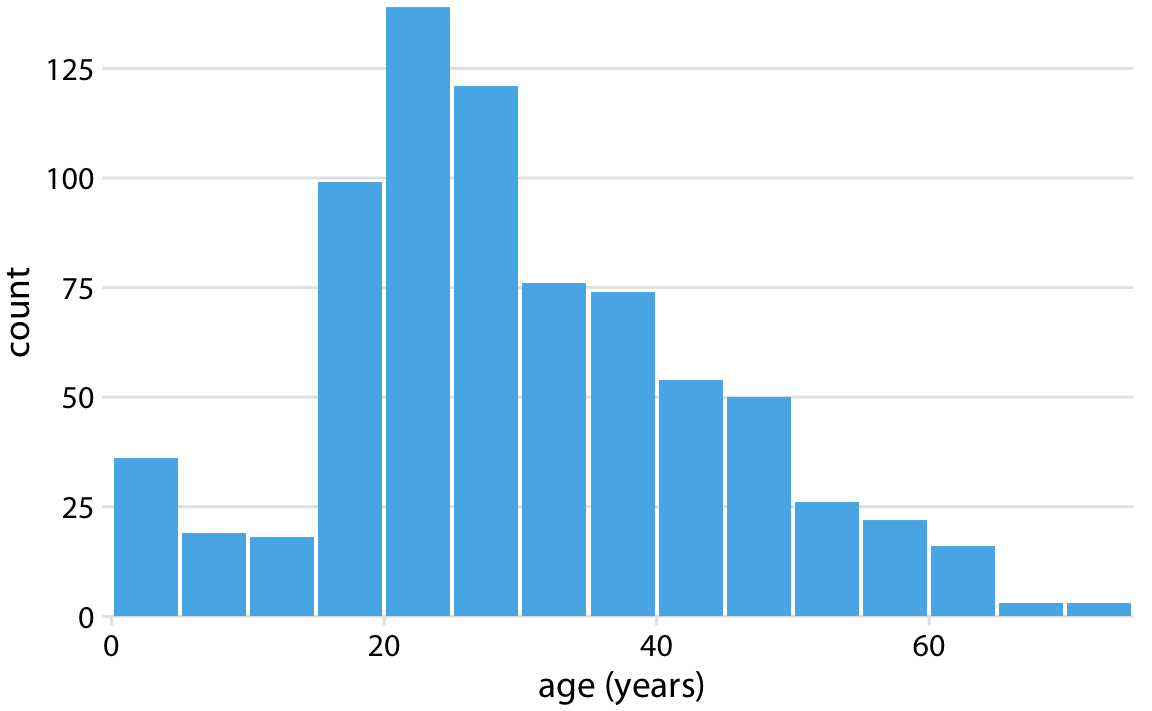
The example above shows the ages of the passengers aboard the Titanic. The “range” is the age of passengers, the “frequency” is the number of passengers in that age bracket, and the bracket is the “bin” the author prescribed for the graph, this one being set for five years per bar. Therefore, the highest “bin” is passengers between the ages of 20 and 25. This graph shows age break down of the passengers in a quick to read visualization without the need of breaking each group down and writing out the raw numbers in a table.

Histograms are strongest in dealing with a set of continuous data. The histogram is not able to detail discrete data, such as what kind of food a cat prefers. Instead it could be used to show the average weight of cats or to track when a cat wants its dinner plotted to the time of day. Set and continuous lines of data such as weight, age, and time are the true strengths of the histogram.
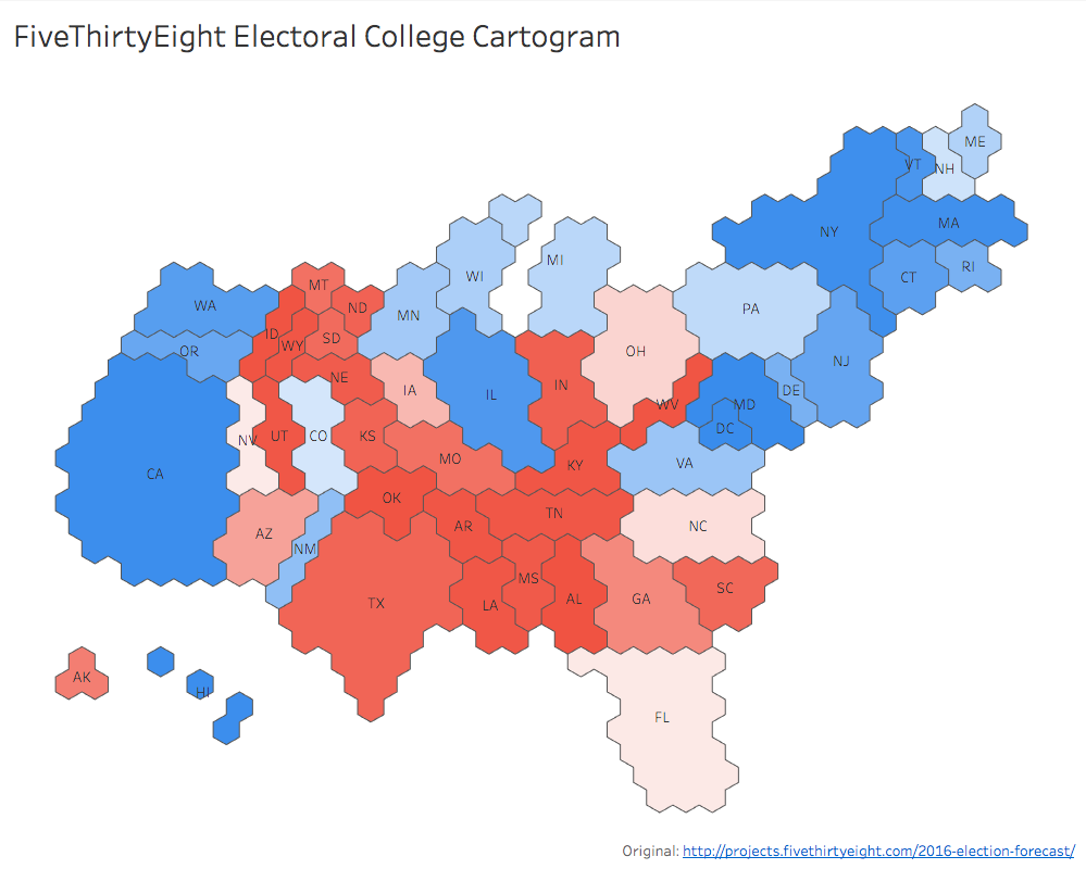
There is two common ways to represent the data using a cartogram. The first is using set “blocks” to represent a certain number. For example the number of electoral college votes each state has in the Presidential Election, seen here from Five Thirty Eight.
The other type of “-gram” is the Cartogram. As the name implies it visualizes data on a map. However, it uses the map as a point of reference to be manipulated by the data. The cartogram model is used when trying to show disparity between geo-spatial areas. It is often used when dealing with population density, showing how certain areas are more concentrated compared to the rest of the area. Drawing from that same thread is using the cartogram to represent voting and election results. The point of the cartogram is to try to balance the map with the data instead of putting the data on the map.

Each hexagon in the map represents one electoral college vote. The map is not accurate, but a common reader understand where each state belongs and draws the conclusion from that inherent knowledge. The block method is a clean version of the cartogram that is visually appealing while trying to balance the map to a more equitable distribution. The ugly step-sister of the block version is the blob version.

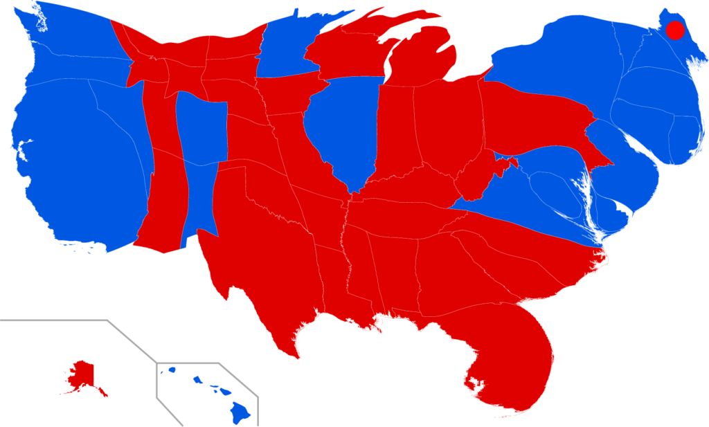
The blob tries to maintain the original borders of the map, but changes the size based on the frequency of the data. In the above case it is based upon electoral votes, the same as the hexagon map from before. While less visually appealing it does serve a purpose. It can be easier to understand if the end user does not understand what is being shown because the relative shape of the state or country remains the same, more or less. Whereas if it was a hexagon it becomes harder to distinguish. The other benefit is if it is a change over time map. Seeing countries or states population balloon and shrink in real time is easier to understand with the blob form over the block form.
Cartograms are perfect for showing continuous data on a map. The votes for president, population of the country, rates of disease; these are the quintessential data for a cartogram. The cartogram, like the histogram, does not do discrete data. It cannot be used to compare data in the individual country or region. Cartograms also require borders, which could be an issue if looking at periods of shifting borders or unclear borders. With these constraints in mind, the cartogram is another vital tool for historians trying to balance their data on a map.
The issue with these two grams is they can be manipulated as any data visualization can be. However, especially prone to manipulation or bias is the cartogram. A purpose of the cartogram is to “balance” the map with data. For example the cartogram for the Electoral College votes from Five Thirty Eight shows the size of New York and California and their large amount of votes dwarf the lower population Mid-Western states to combat how red the normal map is. While not necessarily nefarious it can be used to push an agenda. With this in mind, both “-grams” excel at visualizing certain data.