Horizon Graph/ Bubble Chart
Horizon Graph:
A horizon graph looks similar to a line graph, but uses a color scale to differentiate between points, such as between positive and negative values, with only two divergent colors used in order for the chart to be more concise. It reads similarly to a heat map in the sense that the denser the color is, the greater the frequency of the data presented or the farther the absolute value of the point is away from zero.
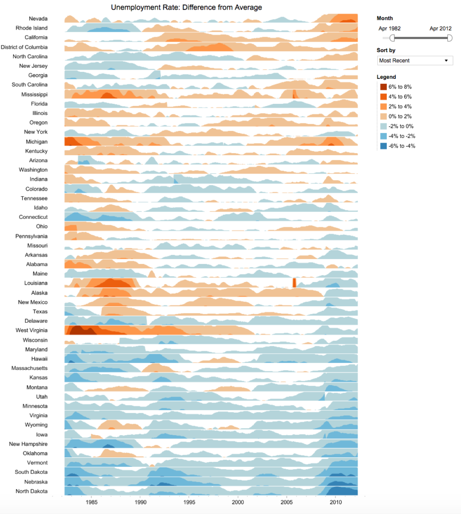
The chart is based on a horizon or baseline value, most commonly zero, therefore, this type of chart is most useful when showing a trend of changing metric behavior over time. For example, the above chart was used to show the unemployment rates of each of the United States in comparison to the national average from the years 1985 to the 2010’s. This example also demonstrates how ideal a horizon graph is in terms of making comparisons, many graphs demonstrating the same trend, but with a different dependent variable can be shown side by side making the difference between each graph easily discernible. The use of a horizon graph also reduces space as positive and negative values do not need to be divided by a line, but the use of divergent colors, such as blue for negative values and orange for positive values as shown in the above example is sufficient in demonstrating the difference between the values. A horizon graph, however, would not be ideal in demonstrating qualitative information.
Scatter/Bubble Chart:
A bubble chart is similar to a scatter chart in the sense that both use the Cartesian coordinate system, meaning the points are plotted on an x, y axis. What makes a bubble chart unique, however, is that it measures three variables, the x axis, the y- axis and the size of the area of the bubble plotted. It is also unique as it does not use a category axis, meaning that both the horizontal and vertical axis are measured numerically. The color of each bubble is also used to divide the bubbles into categories or differentiate between each bubble. One thing to be weary of is that the bubble must be calculated and measured in terms of area rather than radius as calculating the area of the bubble will ensure that the data of each bubble is accurately represented in comparison to the others, preventing a misrepresentation of the data.
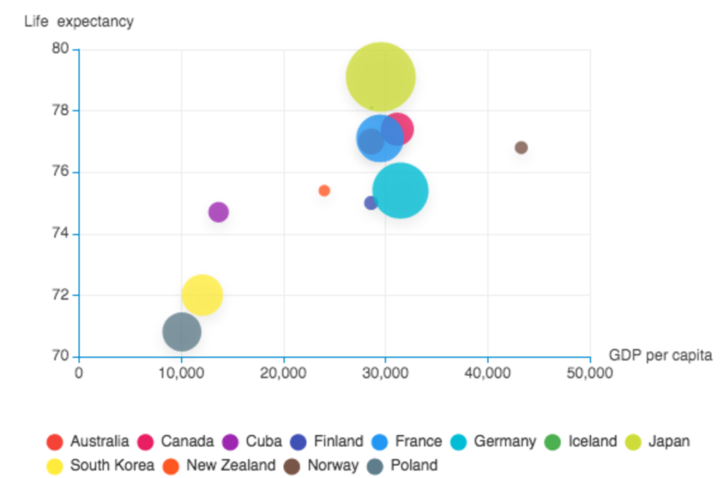
Bubble charts are popular in the business profession as they allow outliers to be easily discerned and can be used to compare and show relationships between 3 different data subjects (x-axis, y-axis, bubble area). This type of chart does have its limitations as zero or negative values cannot easily be plotted, as a result a square is often used to show a zero value or an outline of a bubble rather than one that is filled in is used to show this value. This type of chart can also easily become messy and difficult to read if too many bubbles are added, so a bubble chart is not ideal when presenting an extensive amount of data. It is popular, however, to incorporate a “hover over” feature which allows for more data to be displayed, such as in the example above which shows the correlation between life expectancy and GDP per capita for the countries listed, such as Poland. When you place the cursor over the gray bubble representing Poland, it also displays more information for the country, such as the exact number for life expectancy, GDP per capita and population.
Link to a cool video demonstrating a bubble chart: https://www.youtube.com/watch?v=jbkSRLYSojo