Cartograms & Bar Charts
Cartograms
Cartograms are a type of data visualization that can help historians to display comparative data. Taking the glancing appearance of a map, cartograms are a data visualization that display as an altered map, in which the typical basis of display (land area) is altered. Ordered loosely by geographic locale, cartograms allow historians to view data loosely based on geography, yet altered to assist in digestibility or to display comparative values. Below is an example of the former:
A cartogram created by political scientist Nate Silver for the 538 Politics Site (http://2019-dh-practicum.maevekane.net/wp-admin/post.php?post=1158&action=edit). The map displays each congressional map as an equally sized square, with the square colored red or blue to represent the party membership of the Representative from the district (with blue for Democrats and red for Republicans). The data is taken for the 110th Congress (elected in 2008, serving from 2009 to 2010) as of December 2008. Equally displaying each district as the same size allows for better comparisons as to the relative strength of the parties. Each district is labelled with its number in the state. Which state the district belongs to most be gleaned by the approximate geographic ordering of the square.
In the above cartogram on the 538 site, a map of the United States is visible, but distorted to display the 435 districts of the voting members of the House of Representatives as spatially equal. This is so as to increase the ease of comparability. When expressed in a non-numerical form, the information spatially displayed in place of land size is typically expressed as a choropleth map.
But the distortions can also be used to compare numerical data between political entities. Below are two cartograms in one image taken from Reddit’s Map Porn group (https://www.reddit.com/r/MapPorn/comments/aeq98p/the_popular_population_cartograms_1900_and_2015/). These cartograms display world maps, but instead of land size, proportions are scaled to national population:
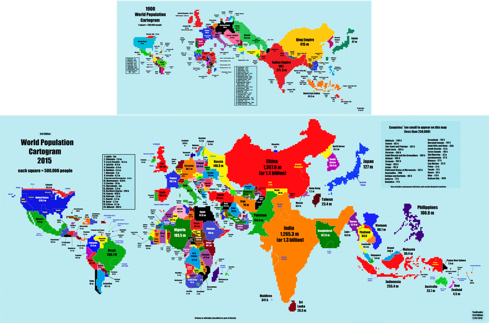
Cartogram taken from Reddit’s Map Porn site (https://www.reddit.com/r/MapPorn/comments/aeq98p/the_popular_population_cartograms_1900_and_2015). The above cartogram shows countries sized by national population and roughly geographically ordered in 1900, while the below image shows the same for 2015. The colors shown are used simply to differentiate countries from one another and not to display a secondary, overlain form of data.
As with the example taken from 538, this is being used to compare data between different political or administrative units. However, unlike 538, instead of size being even to express spatial distribution of congressional seats by party, in these cartograms, the political units vary in size. Numerical data that can be used in a cartogram is not limited to just population, but can also be GDP, crime, etc.
Cartograms are typically used EITHER with equally sized units with color coded to comparatively display data OR spatially distorted units to comparatively display numerical data. Cartograms are a data visualization form not conducive to multiple overlays displaying non-numerical data with numerical data. Cartograms can be paired with choropleths struggle to display multiple vectors of information and sort information due to confusion of data and an inability on the part of the viewer to ground themselves through pre-existing information. Of example of this is shown below as taken from the Wikipedia page (https://en.wikipedia.org/wiki/Cartogram#/media/File:Cartlinearlarge.png) on Cartograms:
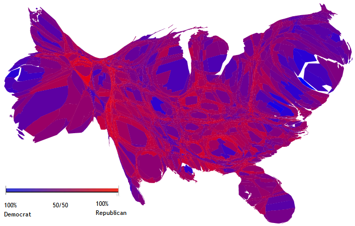
Taken from the Wikipedia page for cartograms (https://en.wikipedia.org/wiki/Cartogram#/media/File:Cartlinearlarge.png) this cartogram attempts to display too many types of information and comes off confused.
In the above cartogram, a map of the United States is displayed, distorted by information related to the 2004 Presidential election. Two different vectors of information are displayed. First, the population of each county in the United States is displayed by spatial size of the county on the map. Second, how each county voted on a scale from 100% Democratic to 100% Republican is displayed. This cartogram attempts to mix two different forms numerical data with one other, resulting in a busy data visualization.
Bar Charts: Original, Grouped, & Stacked
Bar charts are very basic forms of comparing numerical data across multiple groupings, and even subgroupings. Below is an example of a basic bar chart comparing a single vector of numerical data with a single grouping. The grouping being asteroids and the numerical value being the “Potential Damage” caused by a strike as measured by the velocity of the asteroid times its diameter:
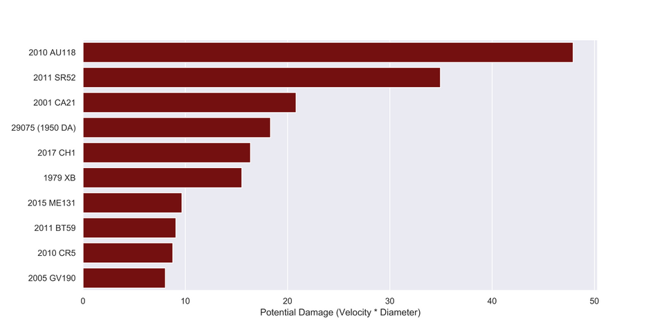
Above is a simple bar chart comparing the potential damage from various potential asteroid strikes on the Earth. Chart taken from Reddit’s Data is Beautiful grouping (https://www.reddit.com/r/dataisbeautiful/comments/aeus09/a_bar_chart_showing_the_potential_damage_output/).
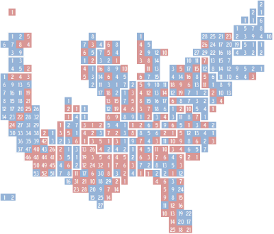
Grouped bar charts are bar charts that seek to compare numerical data that is divided and/or subdivided into various subgroups. In this way, a single vector of information can be broken down into multiple different subgroupings. The way the groupings are displayed is up to the author, and can be adjusted based on the most important factor being analysed. Below are two grouped bar charts, taken from Wilke’s Fundamentals of Data Visualization, Chapter 6. Each is displaying data from the US Census Bureau. In each, income of individual Americans is grouped both by race and age. The two charts show the same information, but the data visualization is different in each, with each highlighting a certain vector of information:
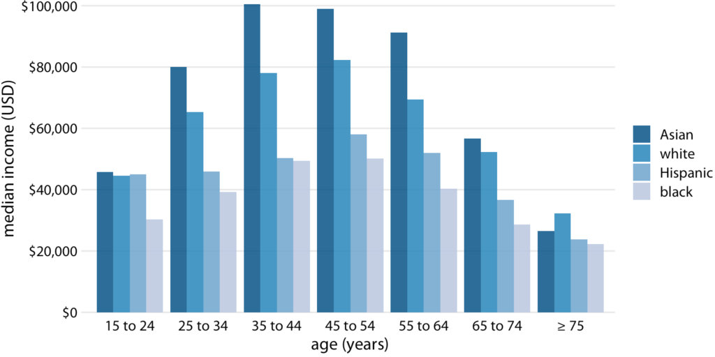
In this grouped bar chart, individual American income data from the US Census Bureau has age on the x-axis, income on the y-axis, and race is color coded in shades of blue (https://serialmentor.com/dataviz/visualizing-amounts.html#grouped-and-stacked-bars).
In this grouped bar chart, age is prioritised over race by its prominent placement on the x-axis. By comparison in the following chart, this is reversed and race is prioritised over age:
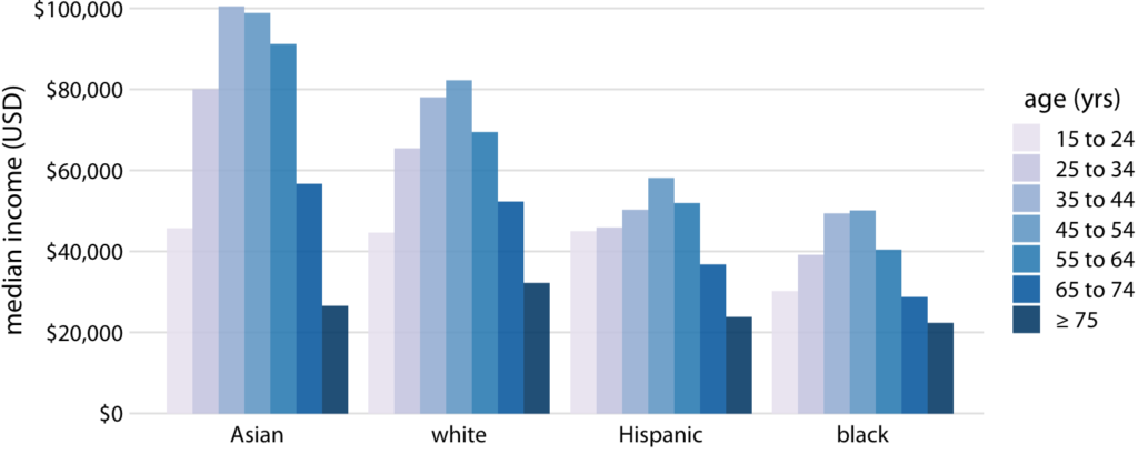
In this grouped bar chart, individual American income data from the US Census Bureau has race on the x-axis, income on the y-axis, and age is color coded in shades of blue (https://serialmentor.com/dataviz/visualizing-amounts.html#grouped-and-stacked-bars).
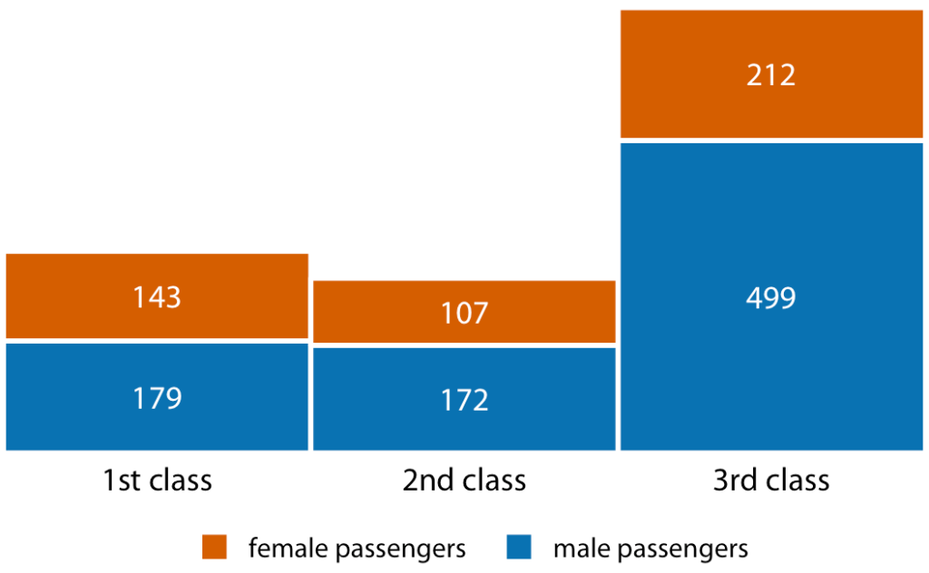
Finally, stacked bar charts are a form of data visualization that dispenses with a y axis and instead visually displays comparative data that is proportionally sized:
In this stacked bar graph, the number of Titanic passengers by gender and by passage class is displayed. Gender is colored coded and separated out, while passage class is displayed on the x-axis (https://serialmentor.com/dataviz/visualizing-amounts.html#grouped-and-stacked-bars).
One Comment
Maeve Kane
Two things: remember that you need a read more cut after the first one or two paragraphs, and your links need to be “pretty” links where the text is a link, and the url address is not written out in the text. This is very easy to do in the WP editor with the link icon, so please edit your post ASAP.