-
-
-
Wire frame Slave Trade
By Jesse Aragona
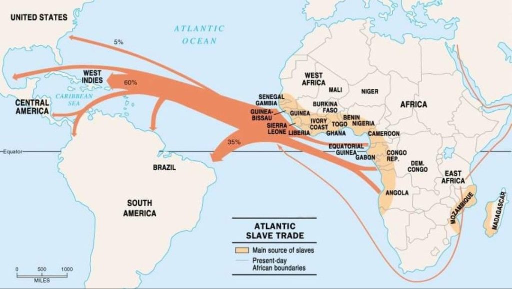
The main component of my project is my two maps, this map isn’t the product but a similar image from the internet. The finished products will be uploaded to a website. containing both the essay text broken down into both the Trans Atlantic and Internal Slave trades as well as chronicling and explaining the importance and impact of the voyages.
The main focus of my project is beyond just tracking the journeys but is an attempt to provide a link to where journeys began and ended, using the data set regarding both trades. The final project will also contain a revised table, featuring locations and the names of ships to trace the journeys.
-
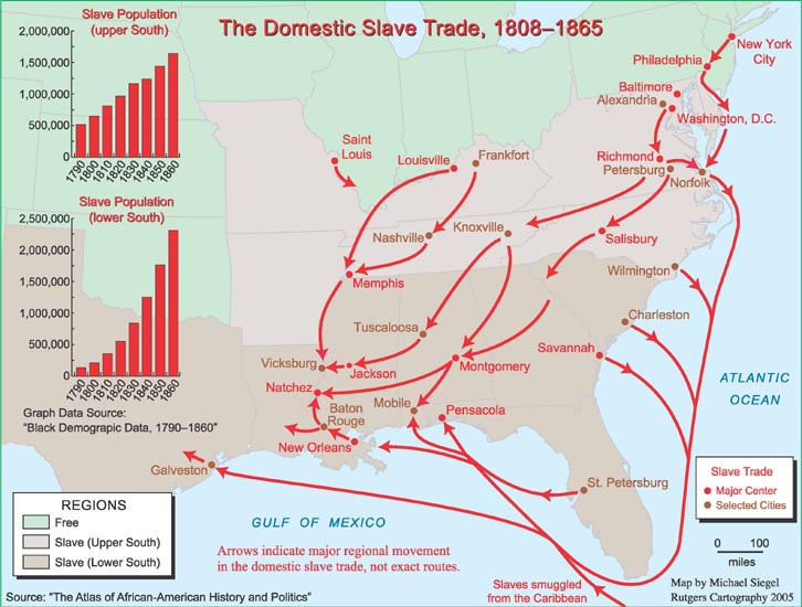
Final Project Proposal: Internal Salve Trade
By Jesse Aragona
Data Critique- My project begins with a tweak in my initial Data Critique, analyzing how best to interpret and use the data provided for my research needs. Revisiting the issues with the data set will provide a clear and concise lens through which I can view the rest of the project.
Data Cleaning- The main focus as far as cleaning is two fold for this project, narrowing the scope of the data set excluding information irrelevant to the United States and using the original formatting to decipher categories lost in translation to Google sheets is absolutely necessary for the completion of this project.
Secondary Bibliography-
1)The Chattel Principle: Internal Slave Trades in the Americas by Walter Johnson
2)Quantitative Estimates of the United States Interregional Slave Trade, 1820-1860
3)Hidden in Plain Sight: Centering the Domestic Slave Trade in American Public History
4)Slave Trading in a New World: The Strategies of North American Slave Traders in the Age of Abolition
How closely can we trace the route from Africa to arrival at U.S. ports, and with how much accuracy can we find the final destinations of the enslaved? Did certain ships stick to certain routes, and if so how close can we come to obtaining national origins for the enslaved and their ancestors. How accurately can we map those journeys?
Goals- A map of voyages, hopefully expanding out from the initial port to separate destinations if possible. A cleaned representation of the data used, sheets provided representing the journeys and individuals shown on the map. Ideally the map will allow the reader to trace routes of individual voyages from the nation of origin to the point of departure, and further if more data can be adapted and used for that purpose. The project will also provide a significant explanation of the Internal United States Slave trade, including policies and methods.
Timeline- March 30th, Isolation of Data to be used as well as completed cleaning of said Data. April 3rd, rough draft of map as well as final data set exclusions and inclusions. April 9th, Rough Map of Voyages completed
-
Text Analysis
Voyant allows us to compare the frequency of the appearance of specific terms in text, for example time, place, night, morning, and place. For instance below is shown the appearance of time, while all the other terms fit within time it doesn’t mean they necessarily correlate in text. Viewing the data in regards to how often a term shows up allows us to make inferences based on patterns appearing in the text.
The graph below represents the appearance of the term night, showing the ups and downs of the terms appearance. While by itself we can see trends in the usage of a particular word, by adding other similar terms we can compare the usage of those terms. While comparing times of days isn’t necessarily useful to make inferences about the past itself it serves as a control that demonstrates the functionality of Voyant, here we can see how these terms compare and applied to other terms trends will prop up for analysis.
The last graph, the comparison of frequency of use highlights the utility of the tool itself. Comparing all of these terms that fit into one category allows us to establish the appearance of patterns of use. In this case day, night, and morning can show us when things happen, and while that can’t tell us about thoughts and ideas it can establish the patterns of behavior, when things happened and how day, night, and morning played into the lives of those represented in the documents. The more a term appears, the more frequently events described took place during that time. Using place, the only term not related to time establishes a sort of control group, also analyzing patterns of usage but without representing any true correlation with other terms.
-
Networks
By Jesse Aragona
- As you add years into the network, family connections continue to develop and grow as more are people are born. The major connectors who cause more and more intertwined networks tend to be both the original founders of the network and offspring they inevitably have. As children from different families intermarry, more and more connections develop between groups eventually creating a vast inter connected network especially with the sample data set.
- The betweeness centrality is used to find the influence a particular node has over the larger graph, judging it by what connections it helps create where as filtering by degree is simply designed to find the largest amount of connections. While there does tend to be some overlap, those found by filtering by centrality are not necessarily the same as those who have the most connections when filtered by year. While these tools can produce similar results its important to recognize the differences between these two approaches, as commonality doesn’t necessarily produce exact results.
- Patterns formed by clustering finds individual who have the same connections, grouping them into a class. They tend to be better represented then those found filtering by year, as well as more closely related. Using this method we can better compare individuals, allowing us to see best who relates to who and how.
-
Cartograms and Histograms
By Jesse Aragona
A Cartogram is generally speaking a map used to represent quantitative data, the representation of which exaggerates specific portions of the map presented in an effort represented greater and smaller amount of whatever is being measured.

This image for instance represents the distribution of Walmarts, McDonalds and Starbucks respectively. The larger the presence (in this case franchise locations)in a specific state the larger that state appears. It’s important to understand when working with Cartograms that they DO NOT accurately portray the geography of the location instead showing the quantitative data in a representative image. Cartograms allow for inferences about population sizes, and are an excellent tool for the representation of quantitative information in a geographic area.
(Image from http://www.stephabegg.com/home/projects/cartograms)Histograms, unlike Cartograms are simply the accurately displayed numerical data in a linear fashion. A histogram is designed to display information in a comparative fashion, allowing inferences to be made on numerical data. While similar to a bar graph, a histogram displays quantitative information instead of categorical and the bars of a histogram do not touch.
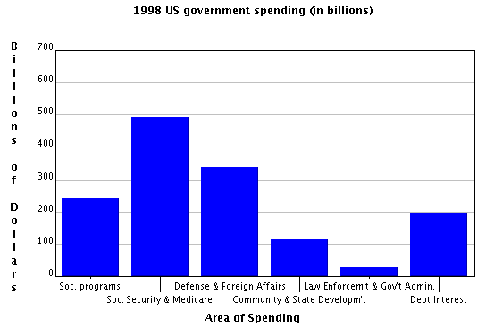
This histogram displays government spending, allowing for the comparison of funding distribution showing which areas receive more funding then others. Information displayed in this manner is useful especially in making cases regarding funding, comparing spending between categories gives us the ability to compare information in a way in which arguments can be made. For instance the highest spending categories are Social Security and Defense, while Law Enforcement and State Development are the lowest showing us where priority is placed in the budget.
(From http://www.shodor.org/interactivate/discussions/HistogramsVsBarGraph/) -
Data Critique (Aragona)
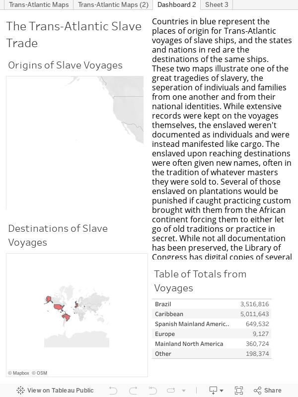
The data gathered from Transatlantic Slave ships has a wide variety of applications for a multitude of research. Scholars on Slavery, Trade, Naval movements and the Colonial period will find information detailed a separated into the following categories, Voyage ID (numbered 1-900237), name of ship’s captain, year undertaken, place of origin, destination, fate (whether that be as detailed as records of sales or as simple as disembarked.) The spreadsheet goes on to detail the end result of the journey, generally stating slaves delivered to or for original owner. From this data we can study the specifics of journeys undertaken and trace the origins of the enslaved population in certain locations. Port Documents from a multitude of nations, in a multitude of languages including English, French, Spanish, and Dutch were used to compiled the data which ranges in date from 1514 all the way through 1866. The types of records used to compile this information would have been used in a similar manner to modern cargo ship manifests, as a way to track “property” and capital. The apparent limitations in the data, likely originating from the various data sources at different ports, are demonstrated in the lack of full details beyond end results and numbers. While the presentation of data in cold numbers can be eye opening, this particular data set does very little for the ”human” side of history. We aren’t given information regarding families, or any information portraying the victims of the slave trade as anything besides numbers. Manifests like this would have been an excellent way for the ancestors of slaves to trace routes both beyond just the African continent and to separated family members had record keepers viewed them as humans and not objects. However the data kept is informative for what is present, even though what isn’t present tells an even darker story about the horrors of slavery.
-
Review of Invasion of America
Jesse Aragona
http://usg.maps.arcgis.com/apps/webappviewer/index.html?id=eb6ca76e008543a89349ff2517db47e6/. Project Director: Claudio Saunt, Russell Professor of History at the University of Georgia. Reviewed, Made for eHistory.org. Reviewed Feb 4 2019
Invasion of America is an interactive map of the United States, showcasing the westward push of settlers into America’s heartland while also showing the loss of Native Lands. The map consists of three colors, the gray is unceded territory, the blue is for Native lands, and lastly the red represents reservations. The map itself is a simple as it is effective, allowing the user to add or remove layers, adjust for time to view the contemporary or the historical, and even has a search system to locate individual nations within the map itself. Beyond features unique to this project the map has standard zoom, and movement features that any standard digital map has, allowing for adjustment to the screen. The details however are what give this project its meaning as the map allows those who interact with it to watch a visual representation of the losses experience by Natives at the hands of the ever-expanding United States. The ability to track specific tribes allows for a more intimate look at this process, helping to break down the mass of loss of land and life into a more easily digested smaller chunk. Allowing for this break down not only allows a closer look at the individual nations, but also does an excellent job of maintaining the necessary scope to tackle such a vast project. Aside from the visuals, the project also provides a rather well written introduction about the map itself and the events it describes. The importance of this project isn’t lost in its appealing visuals and interactive design, instead the map itself serves as a grim reminder of an incredibly dark, and rarely discussed chapter in America history. Remembering the tragic events of our nation’s past against the back drop of the current state of Native affairs in regards to reservations is a stark reminder for all of us to do better to help those marginalized.
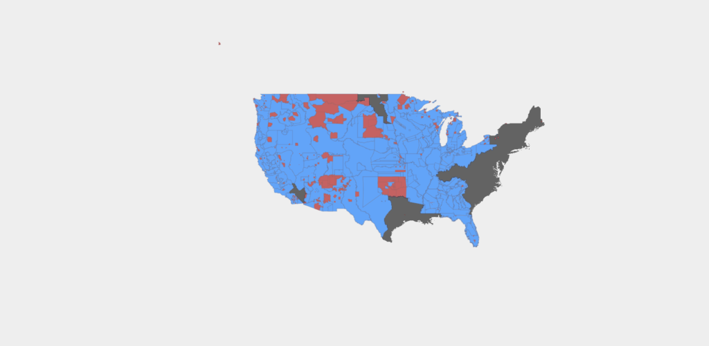
The map as a whole 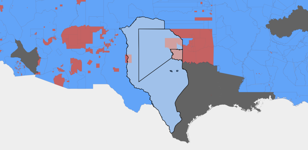
Using the search tool to find the Kiowa Nation