Data Visualization: Line vs. Area Charts
When seeking to visualize data consisting of discrete points that can be measured continuously to some extent, or data that is entirely continuous, two options for data visualization are area and line charts. Though both of these formats serve similar purposes, there are notable differences in their optimal usage, particularly when attempting to represent multiple sets of data within one visualization.
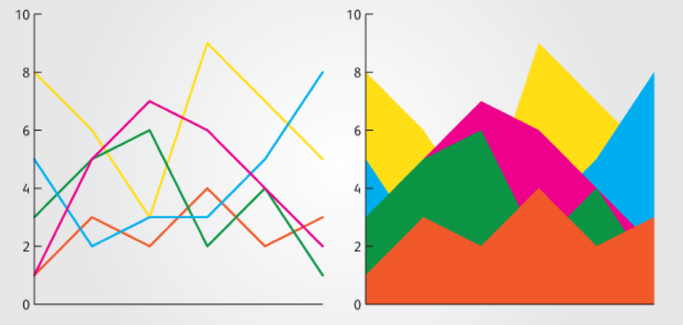
In terms of their shared functions, both line and area charts are used to represent and analyze trends in data, measuring changes over a particular spectrum (time, distance, etc.). Both charts can be used with multiple data sets, though this is one point where the optimal choice comes into question. Visually, both share basic characteristics: the usage of X & Y axes, the connection of distinct data points via trend lines. The obvious difference is that the portion below the trend line is filled in on an area chart, while this segment is left blank on a line chart.
In terms of optimization, line charts are best utilized when the focus is on analyzing data trends. While area charts are also capable of demonstrating trends in data, the format of a line graph makes this information more immediately observable, as the visual focus is on the trend lines rather than the shaded area.
Where line charts also excel is in the inclusion of multiple sets of data. As can be seen in the figure below, a line chart with multiple datasets is still relatively easy to follow, whereas an area chart with multiple datasets can become increasingly cluttered. The threshold of legibility for a line chart is typically considered to be between five to seven datasets, whereas the same number of figures in an area chart quickly becomes difficult to follow.
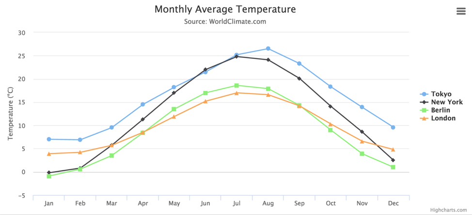
With this multiple line chart, it is easy to distinguish the data trend lines between Tokyo, New York, Berlin, and London, despite some crossover between them in the June-July and September-October ranges. However, if more lines are added to the chart that have significant crossover, it can become more difficult to quickly interpret.
Area charts can also be used to represent multiple sets of data, though the issue of occlusion can inhibit the effectiveness of the visualization. Occlusion occurs when the upper layer of data obscures the lower layer. This problem can be addressed by the use of transparent shading, though too many datasets can quickly make these charts more difficult to interpret.
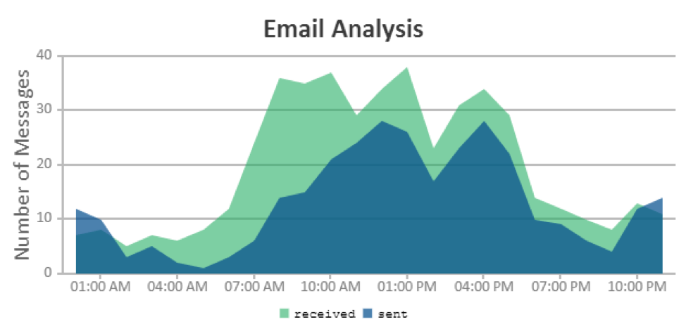
Area charts are best utilized when attempting to highlight the difference between two sets of data, as the viewer can visually subtract the lesser value from the greater one.In the example below, there is a distinction between emails sent and received, and the difference between these two values can be quickly observed through the visualization. This chart uses a degree of transparency, though it can be hard to follow some of the crossover areas.
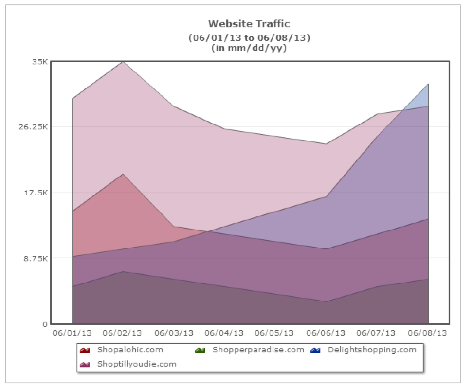
While transparency can be used to alleviate issues of occlusion, it can become difficult to analyze when working with multiple sets of data. In the example below, the “delightshopping.com” figure, mostly obscured by other sets of data, becomes difficult to identify due to the discoloration of the majority of its values.
Area charts, particularly stacked charts where sets of data are placed on top of one another, are also useful for demonstrating a part-to-whole relationship. These charts help to display certain sets of data representing a proportion of a whole value. In the example below, one can observe the proportion that each region’s total sales make up within the gross sales totals among the entire nation. It allows the viewer to quickly determine the contribution of each region to the total sales.
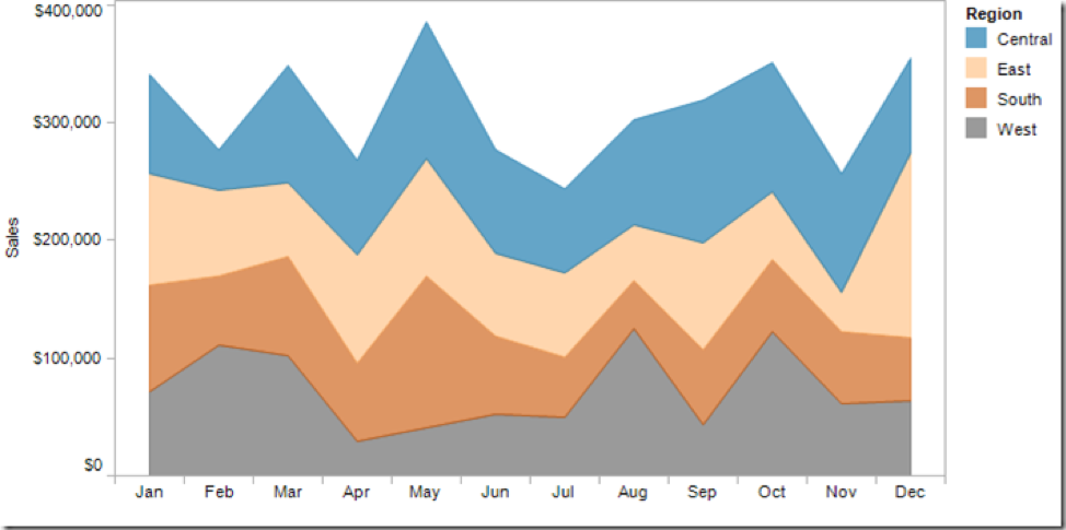
However, stacked area charts can be misleading. Because the sets of data are “stacked” on top of one another, a viewer not acquainted with the function and purpose of these charts might interpret the top dataset as having values associated with the values’ positioning on the Y-axis. However, these values are influenced by the datasets below them. In the example above, a viewer might interpret the central region as recording almost $400,000 in sales during the month of May. However, that value is in fact the total number of sales company-wide; the central region is represented at the top of the stack because it contributed the largest share of those sales. So while stacked area charts are excellent for showcasing the contribution of individual, related datasets to the overall scope of the data, there is a bit more of a learning curve to properly analyzing these trends than a viewer might find with something like a multiple line chart.
Both line and area charts are effective tools for visualizing continuous data that changes over a spectrum such as time, distance or age. Line charts are marginally better at displaying trends of growth and decay, particularly when multiple figures are involved, while area charts are better suited for displaying part-to-whole or proportional relationships between figures.