Choropleth and Heat Maps
Choropleth map uses shading and color variation to display data on a specific geographic location. This type of data visualization is most often associated with the display of population densities, income distribution, and election results. Choropleth maps are best at displaying density. By using either varying shades of a single color, transitions along a color scale, or discrete color blocks, Choropleth maps take advantage of contrast to display data on a geographic boundary.
Claus O. Wilke, Fundamentals of Data Visualization, https://serialmentor.com/dataviz/geospatial-data.html.
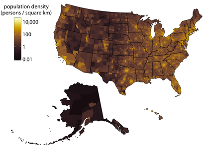
Visually, choropleth maps can be particularly useful in establishing broad comparative patterns. For example, this choropleth map of population density in the United States uses a color scale to display population density with lighter colors representing denser areas of population. This clearly shows dense pockets of population present within the United States allowing for quick comparative analysis. I.e., the coasts broadly have a higher population density than the middle of country, or Alaska is sparsely populated compared to New Jersey. Choropleth maps are most well suited for the display of population density however in practice choropleth maps are used to shade a variety of other variables, among the most common is voting data.
When creating a choropleth map, there are several factors that must be considered for effective visual presentation. Proper scale, color, and scope are essential for the effective use of a choropleth map. The population map above uses a continuous color scale, the broad spectrum of color can be useful for displaying large differences however it is more difficult to depict subtle differences and establish where specific change happens. In comparison, the choropleth map below of the 2016 Brexit vote uses discrete colors to represent difference in a much more dramatic way.
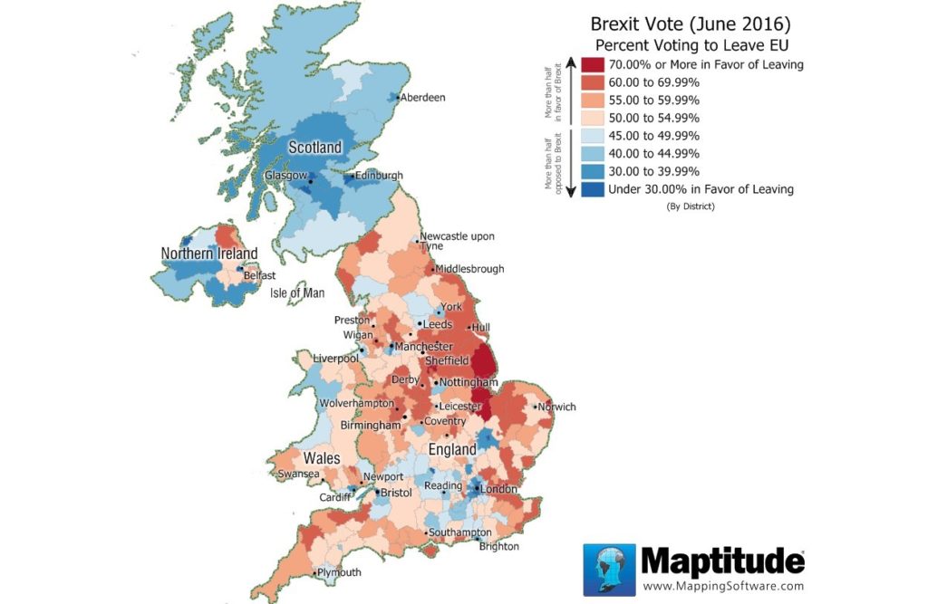
June 2016 Brexit Vote
https://www.caliper.com/featured-maps/maptitude-brexit-map.html
While more complexity can be presented when using a continuous color scale, contrast can be lost sometimes leading to a less effective visual presentation. The use of red to blue shifts and eight distinct color groups allows for comparison to be made and understood without the blur of continuous color scales.
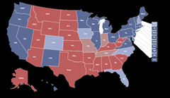
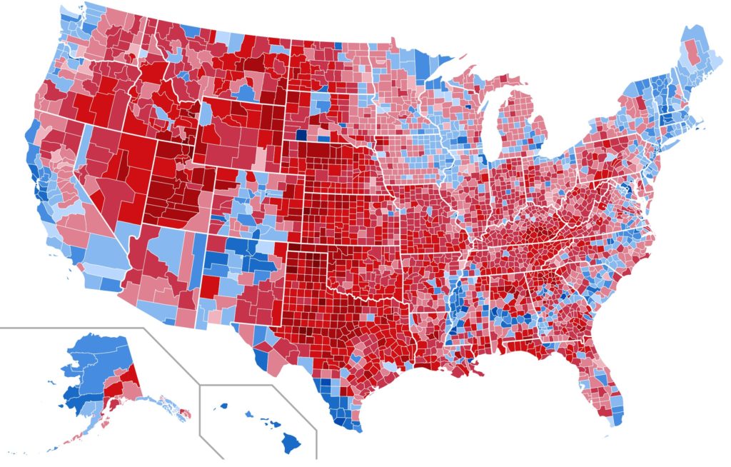
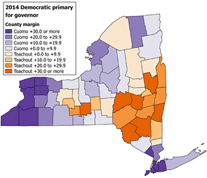
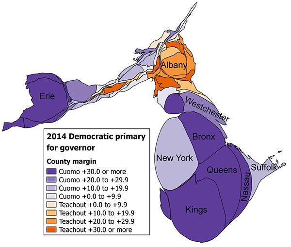
Just as the selection of color and color scale is essential to a choropleth map, the scale of areas is also critical. Figure 1 and Figure 2 are both choropleth maps of the 2012 US presidential election. The difference being the scale of coloring. Figure 1 uses the geographic boundaries of states to divide colored sections while fig 2 uses county lines to differentiate. This leads to vastly different view of the same data, with fig 2 showing the variety of voting patterns within particular states. While Fig 2’s scale provides a more complex view of election results than Fig 1, both display some of the challenges of using choropleth maps. First, classic choropleth maps rely on existing geographic boundaries like state or county lines to contain data. When displaying data, this limits the scope to predetermined and often arbitrary boxes. Good for understanding broad scale patterns but limited to preexisting boundaries. Second, choropleth maps are limited to a singular variable limiting the complexity of data they can effectively show.
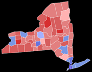
Election maps often presented as choropleth maps are often seen as inaccurate because while the maps shows voting differences, classic choropleth maps lack the ability to account for population density. Leading to misinformed statements like, in the words of a fellow Upstater “why is Cuomo the governor when the majority of the state votes against him.” This claim is perpetuated by a misunderstanding of a choropleth map. Because of the red/blue dichotomy it is unlikely that the creators of election maps are going to stop using the visualization method entirely. However, in recent years classic choropleth maps have been combining with scale altering cartograms to create more accurate data visualizations.
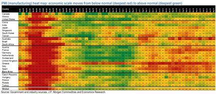
Heat maps are a way of expressing a data set using color rather than dots, lines or bars. Most often taking the form of a color codded table, this method of data visualization uses color to differentiate between data points. Depending on the data begin expressed, heat maps often use a spectrum of shading to indicate difference. These data visuals are often much more visually appealing than traditional line or bar graphs while remaining an effective form of data presentation. Heat maps use of color spectrum rather than points or lines often makes them less precise than traditional forms of graphing however the contrast of color present in heat maps make them highly effective at depicting broad patterns. Heat maps are effective at comparing quantitative data and require some form of key to understand the color system.
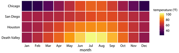
The biggest asset to a heat map over more traditional graphs is the visual appeal. When comparing mass quantities of data the use contrasting color is both easier to read and more effective in drawing patterns than line or bar graphs. For example, figure 3 represents a heat map of average temperatures in four cities over the course of a year. Each box is colored to match the corresponding temperature. This small illustration of a heat map is useful in drawing attention to the effectiveness of color as a contrasting and comparing device.
However the small data set and lack of numerical values highlights the imprecision of the heat map as a visualization category. As data sets get larger heat maps become an effective way to establish relationships and patterns. Unlike line graphs and scatter plots, comparisons become more easily identifiable between both rows and columns. As seen in this heat map of PMI (economic health indicator) for a five year period between global economic powers. Here one can both visually see the global economic crash of 2008 while also visualizing individual countries developments and responses, for example the lingering differences between India and Greece.