Visualization Guide
-
Cartograms & Bar Charts
Cartograms
Cartograms are a type of data visualization that can help historians to display comparative data. Taking the glancing appearance of a map, cartograms are a data visualization that display as an altered map, in which the typical basis of display (land area) is altered. Ordered loosely by geographic locale, cartograms allow historians to view data loosely based on geography, yet altered to assist in digestibility or to display comparative values. Below is an example of the former:
-
Symbol Map & Force Directed Network Graph
Symbol Map
A symbol map, also referred to as a bubble map, is used to depict proportional data geographically, hence the word map. This type of map uses dots or another marker to show where something is located on a map and how much of that thing there is. The larger the marker the more there is of that thing. There are two different kinds of symbol maps. First, is the proportional symbol map (Fig. 1). These use markers to show the amount of something based on the size marker displayed. The smallest dot is fixed by the creator and then as more data is inputted the larger the dot becomes. When looking at a proportional map the viewer can easily see where there is more of the thing being counted. Viewers can zoom in to get more precise data about a particular location. The other type is a graduated symbol map. With this type of map each sized dot is assigned a specific number or range of numbers called classes (Fig. 2). They are both similar in that they both are based on scales of data, but one uses classes and the other does not. These maps often use size alone to depict the data, but color could also be used to make different groupings depending on what additional values you wish to portray. These maps are different than dot maps that use only one sized marker and add or subtract dots rather than increasing and decreasing in size.
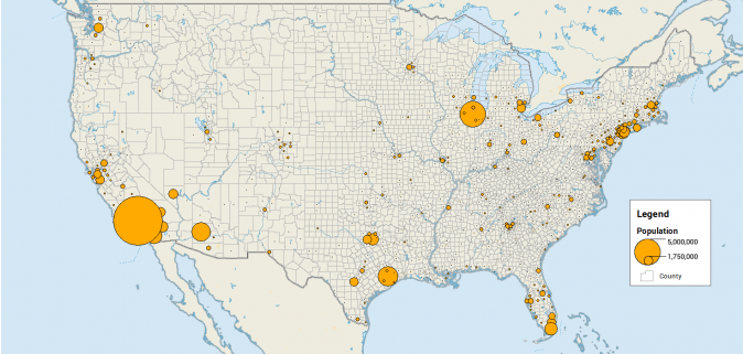
Figure 1 (https://gisgeography.com/dot-distribution-graduated-symbols-proportional-symbol-maps/)
This map is best for comparing quantitative measures geographically, such as cat populations or number and location of earthquakes in 1906. A symbol map can easily and quickly show where there are more cats or earthquakes based on the size of their markers. Sometimes, users can zoom in and out to decide what level of granularity is necessary. One problem is that large markers may hide smaller ones. A possible way to prevent this is to make the larger markers more transparent so the smaller dots show through. Also, very large markers will make it difficult to see where exactly the marker lies on the map, so symbol maps may not give the precision one is looking for. Proportional symbol maps rely on marker size, in proportion to other markers, to depict the data,. It is not always clear which marker is bigger or smaller. Consolidating the data into distinct classes and making a graduated symbol map, can make it a bit clearer. These maps are meant to give overall trends and not specifics, though. They are not good for representing change over time without getting crowded and confusing or for representing qualitative data.
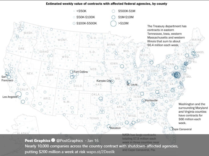
Figure 2 (Graphics by Kate Rabinowitz and Lauren Tierney- https://twitter.com/PostGraphics)
The map above is an example of a symbol map that breaks the data up by class. This symbol map is depicting the number of companies that have contracts with government agencies that were affected by the shutdown in 2018. The larger the circle the more money affected. This is a speculative map about potential outcomes of the shutdown and gives and idea of where government contractors are located and how much money they are making from the government. It gives a broad overview of the quantitative data. The circles make it a little difficult to see but it does help prevent larger circles from obscuring the smaller ones, except around D.C. were the circles are denser. The added text highlights some spots they think are particularly significant to their argument.
(2016) GIS Geography. Dot Distribution vs Graduated Symbols vs Proportional Symbol Maps. https://gisgeography.com/dot-distribution-graduated-symbols-proportional-symbol-maps/
(2019). Making sense of data visuals. Seeing Data. http://seeingdata.org/taketime/inside-the-chart-proportional-symbol-map/
Capitula, C. (2014). Tableau Essentials: Chart Types- Symbol Map. Interworks. https://interworks.com/blog/ccapitula/2014/08/18/tableau-essentials-chart-types-symbol-map/
Forced Directed Network Graph
A forced directed network graph is a “node-and-link graph” (Wu, 2015). It shows how the different nodes connect to each other. Nodes can be different sizes or colors depending how many variables you want to show. They use programs and algorithms to input data and either attract or repel nodes, based on the information imputed into the algorithm, to make a visually pleasing and easy to understand graph. This process is similar to positive and negative charges. The user also has some ability to manipulate the data once the graph is made (Wu). This process is what makes it different that traditional node-and-link graphs. Some forced networks are interactive and some just rely on the clustering or closeness of nodes to show stronger relationships. These graphs are simple and easy to understand (Fig. 1).
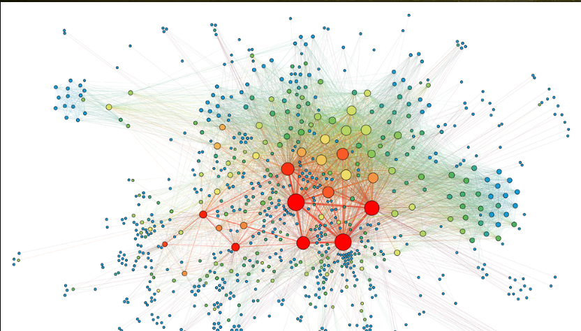
Fig. 1 (Martin Grandjean: https://en.wikipedia.org/wiki/Force-directed_graph_drawing#/media/File:SocialNetworkAnalysis.png)
An example is the graph below (Fig. 2) is taken from a New York Times article about Oscar winners. The original is interactive. This small piece of a much larger infograph shows some of the winners of the Oscars in 2013. They are the nodes and each node are color coded by which category they were nominated under, such as actress or director. The links connect each winner to others on the graph. When you hover over the links it tells you which movie they worked together on. Obviously, the ones with the most links worked together the most such as Kathleen Kennedy and Steven Spielberg. This layout clearly shows the relationships between Oscar winners.
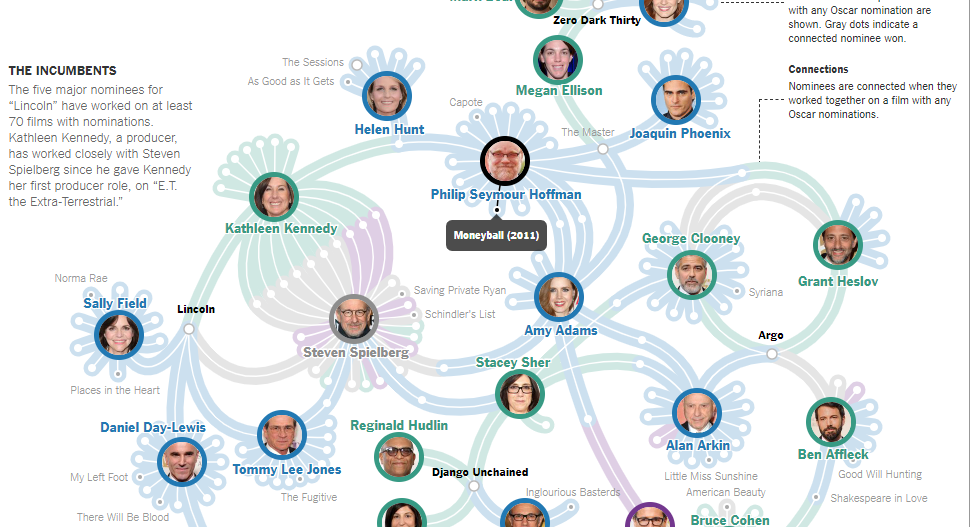
Fig. 2 (Mike Bostock, Shan Carter and Josh Keller: https://archive.nytimes.com/www.nytimes.com/interactive/2013/02/20/movies/among-the-oscar-contenders-a-host-of-connections.html)
This network graph is great for showing relationships between qualitative data but can also show qualitative data. Take the example above, the Oscar winners. It shows the relationships between winners but also how many projects each worked on together. It used both qualitative and quantitative data to make its point. Therefore, researchers can use this type of visualization to both see connections but also understand better the quality or importance of those connections. It may even lead users to discover new or important connections that were previously missed. But there are many types of data this graph would not be useful for such as number of earthquakes or cat populations. There needs to be a relationship between the different nodes.
Wu, S. (2015). Understanding the force. https://medium.com/@sxywu/understanding-the-force-ef1237017d5
-
Horizon Graphs and Small Multiples
Horizon Graph
A horizon graph is a chart that utilizes a diverging color scale, where either end of a data sequence is represented with different opaque colors that stratigraphically become more translucent and similar to the opposing color as the data reaches a start value, to showcase the different values within a dataset.
To create a horizon graph, one begins with a simple line graph that can go both positive and negative along the X or Y axis. After a line has been plotted, then a different color is used to represent each group of data within a given range. Then, all of the different color categories are re-plotted with only positive values on the graph at the axis.
An excellent example of a horizon graph can be found at flowingdata.com. In this example, the author uses a horizon graph to show the fluctuating price of bacon from 1990 to 2015. These three steps, below, show how the author shifted the data visualization from a line graph to a horizon graph:
-
Data Visualization: Cartograms & Histograms
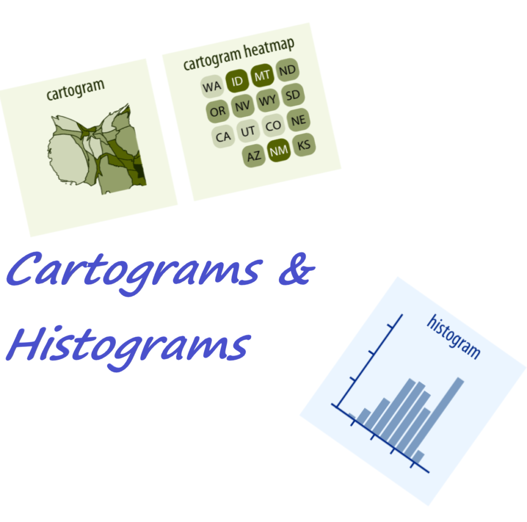
One of the challenges posed to historians working with data is determining how to visualize one’s information in ways that are both able to be interpreted, but also aesthetically pleasing or useful to other researchers. Among the many types of data visualizations that historical scholars may opt to utilize in representing their research are cartograms and histograms.
-
Big Pictures in Small Multiples
Historian using large sets of data can take advantage of small multiples to create a cohesive visualization of the data. By breaking down large chunks of data into smaller pieces and represent that data in more than one chart historians can present an argument.
-
Visualization Guide
Due: Thursday February 21
Undergrad: Approx 500 words total, 2 types per person
Grad: Approx 1000 words total, 2 types per person
Visualization guide posts should be aimed at an audience of historians, and should aim to give a basic understanding of what each visualization is useful for to someone who understands basic line/bar/pie charts.