Big Pictures in Small Multiples
Historian using large sets of data can take advantage of small multiples to create a cohesive visualization of the data. By breaking down large chunks of data into smaller pieces and represent that data in more than one chart historians can present an argument.
Let’s start with what a small multiple is. Small multiple slices up data into panels based on one or more criteria. This allows each data slice to be visualized separately. These visualizations are arranged in a grid with columns, rows, and other panels labeled by the criteria of each data slice. This visualization can show change over time and compare values in an easy to read set of charts.
Small multiples can be expressed through different types of charts and graphs. In the examples, we see traditional bar graphs and line graphs used in small multiples, however, using small multiples allows for unique and creative ways to express data.
When creating a small multiple, there are two important elements to be aware of. First, it is important that the charts are arranged in a logical order. The order can be based on increasing or decreasing values or arranged by a subject. Another element to be aware of is using the same axis ranges and scales in all of the charts. Without these two elements in small multiple, a reader may not understand the argument and/or misunderstand the visualization.
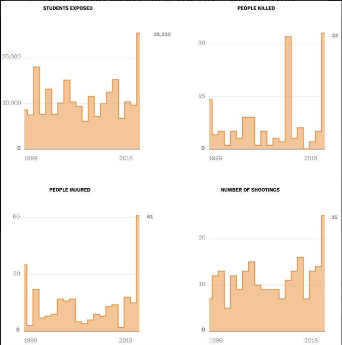
Figure 1, from the Washington Post’s Twitter page Post Graphics, uses small multiples to express on-campus gun violence. While this example does follow some guidelines of small multiples like arranging the data based on subjects (students exposed, people killed, people injured, and the number of shooting) and the x-axis is consistent in each chart representing a year span of 1999-2018.
The charts do not share the same y-axis range which may cause some confusion for a reader. Each chart varies in ranges, the student exposed ranges from 0-20,000 but the number of people killed ranges from 0-30,000, while the number of people injured ranges from 0-60,000. A quick glance at these charts may show a reader that gun violence on campus is increasing over the years. However, a reader needs to take a closer look at the range of people exposed, killed, and injured in comparison to number of shootings.
It is best to use a small multiple when working with large and complex datasets. Large and complex datasets contain lots of information that can be displayed visually in panels. Small multiples condense the large dataset with complex information into digestible comparison and argument. Small multiples show the big picture of big data.
A good example of big data in small multiples is Figure 2, fatal drug overdoses between 2010 and 2017. This small multiple uses the x-axis to express the year span and y-axis to express the number of fatal overdoses. Note that both y- and x- axises are
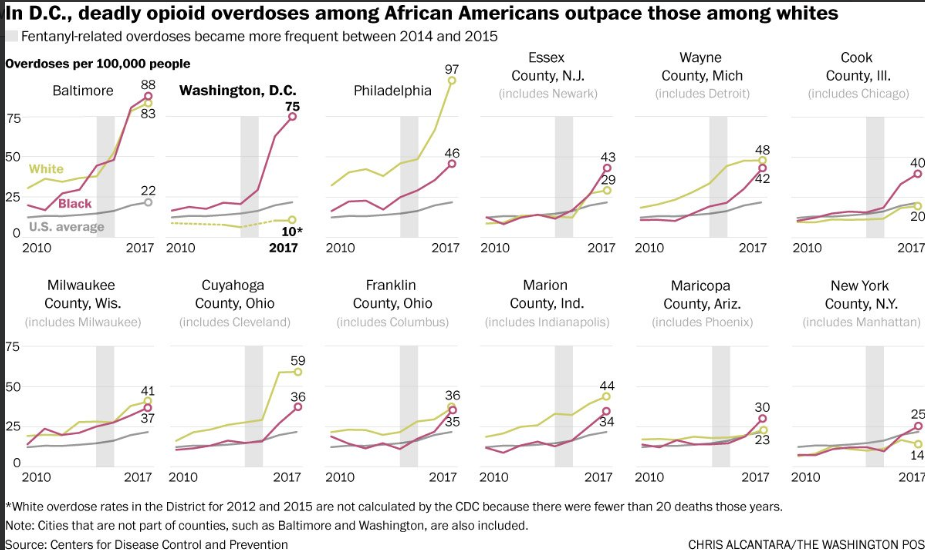
You can quickly glance at the charts to compare fatal overdoses from different counties and compare fatal overdoses for Black, White, and the U.S. average in one county. And by including the average in each chart, we can compare each county’s/metropolitans fatal overdoses to the national average. Which one has the highest fatal overdoses among whites; Baltimore, Washington D.C., or Philadelphia? A quick glance at the small multiple allows you to find the answer.
The same cannot be said for small sets of data. Small multiples do not show specific data points and therefore are not useful for small datasets. Let’s look at the dataset we used in class, 1850 Industry Census. How would you express this data in a small multiple? What would be the x-axis and the y-axis? Would a small multiple help readers understand your argument just by glancing at it?
You could have multiple bar graphs (like in Figure 1) based on industry type showing how many men and how many women were employed there, with the y-axis being the number of employees and the x-axis being men and women. However, since there are only 223 entries and there are more men employed than women (1116 men and 267 women) small multiples would not be the most efficient way to express that data.
A graph or chart that shows specific data points and allows the reader to dig for more information from the graph/chart would be better to express the 1850 Industry Census than small multiples,
Small multiples can show rich, multi-dimensional data without trying to cram all that information into a single, overly-complex chart
https://www.juiceanalytics.com/writing/better-know-visualization-small-multiples
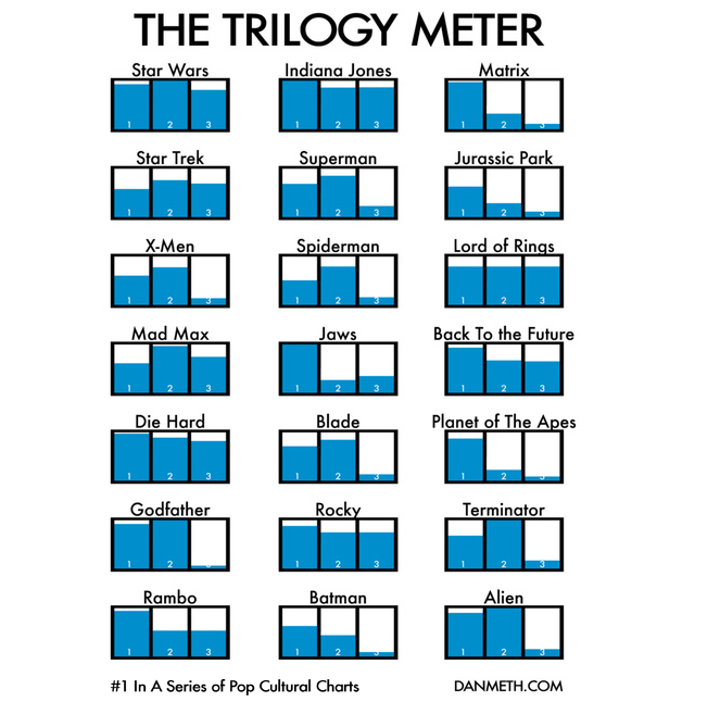
Figure 3 is a small multiple showing the success of trilogy movies. While the dataset for this chart may be completely biased by the author, a reader can easily see how the author ranks each movie’s trilogy and take into account the author’s argument (or in this case, pure opinion).
Small multiples can illustrate many ideas. As we saw in Figure 1, small multiples illustrate change over time. Figure 2 small multiple illustrate the relationship between the quantitative data of fatal overdoses. And in Figure 3, the sarcastic small multiple illustrates ratings based on enjoyment. The most important element to remember about small multiple is to use big and complex data.