Coins. A Review.
by Joshua Porter
COINS: A journey through a rich cultural collection. https://uclab.fh-potsdam.de/coins/. Created and Maintained by Münzkabinett of the Staatliche Museen zu Berlin. Reviewed February 1-4, 2019.
When I was a kid, my neighbor kept a large jug in which he would put his loose coins into everyday, until the fateful day when he would tip it over and let all the coins fall out so he could sort them, roll them, and then take them to the bank. The COINS project at Münzkabinett of the Staatliche Museen zu Berlin is the digital representation of tipping over the proverbial jug and letting the coins scatter on the digital carpet. While novel in approach, the use of the project seems stymied by how unwieldy the piles become and results in the same frustration of trying to sort through hundreds of coins on the real physical carpet.
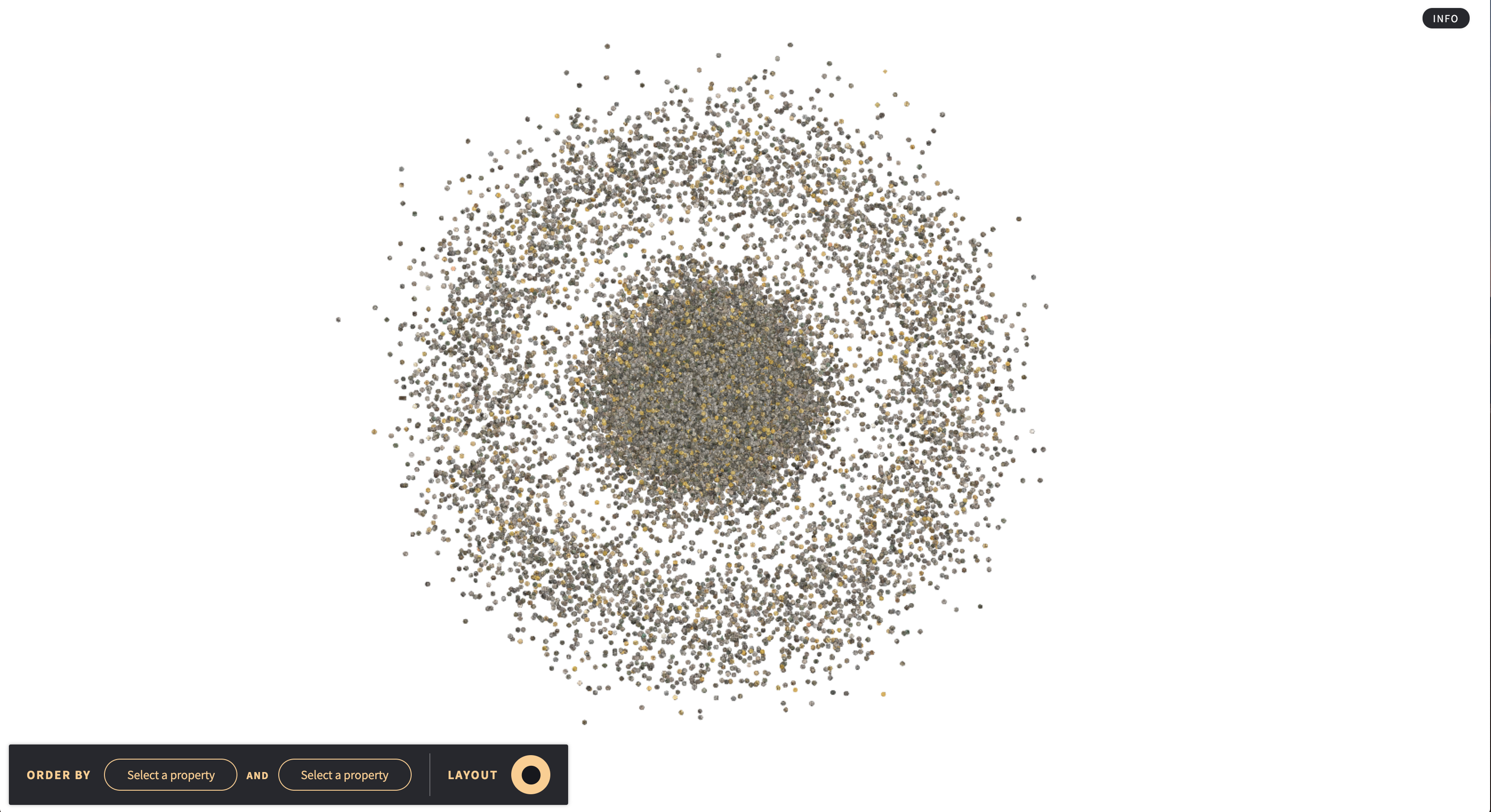
The project opens with a massive pile of coins in the middle of your screen, however if you click on one single coin it “picks” that single coin up and details what exactly it is along with a link to the full detail page on the museums database.

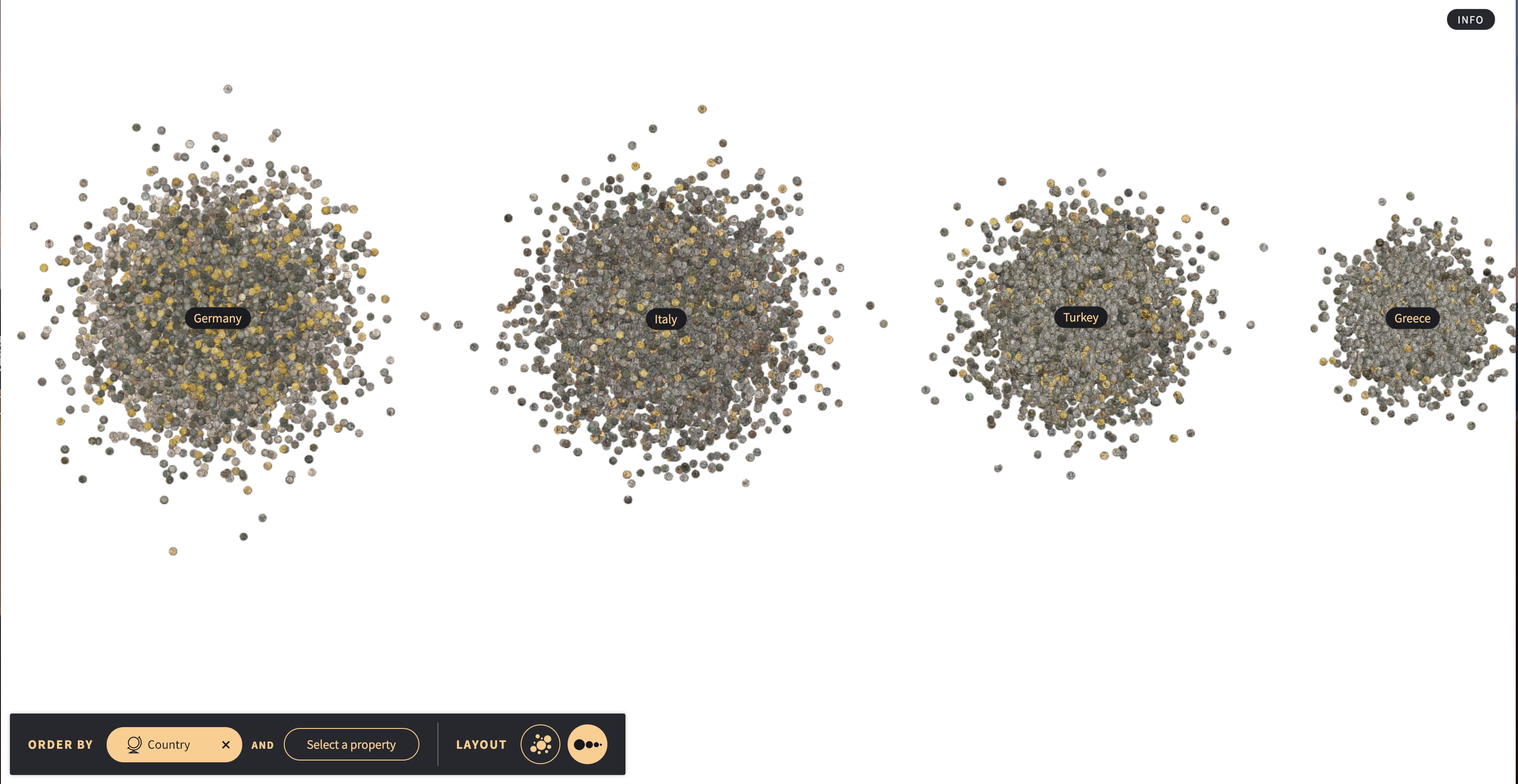
The project lets you sort the coins, sorting them by Country, Region, Period, Material, Weight, and Diameter. Doing this throws the single pile of coins into multiple piles of coins along a linear line for each sorting measure. The sorting also allows you to do two sorting properties at once which then puts the coins in piles according to a graph or a grid pattern.

All this creates is an extremely stylish design that shows the breadth of the coin collection at the Münzkabinett. Giving visitors a clear idea of where the coins come from, the period they are from, and the quantity of each in a clear picture.
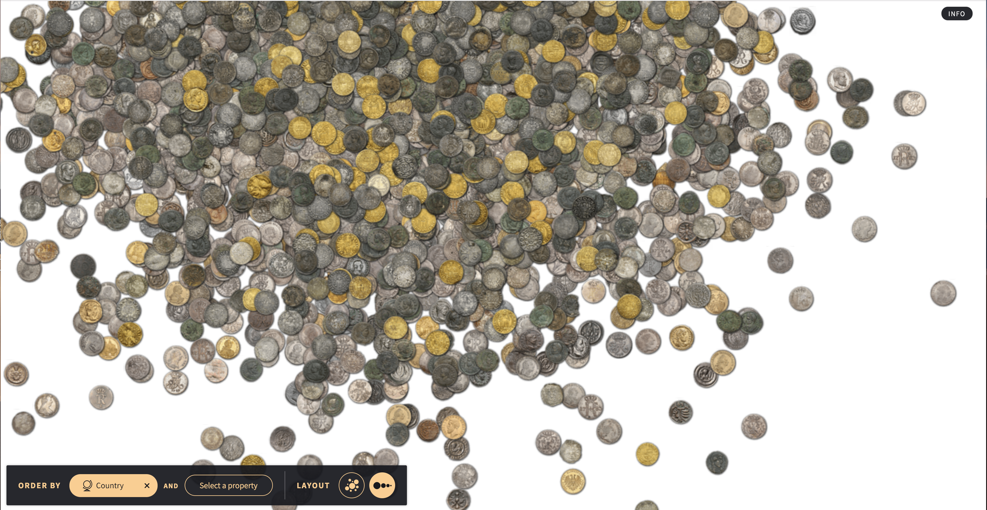
Style is also where the project begins to crack under the weight of the 26,000 items being on display on a single webpage. As shown in the photos, the collection is difficult to navigate. There is simply too many items and not enough detail given within the project. You are unable to tell what coin you click on and then once you click on another coin, the first coin returns to the pile. Puzzling is the ability to sort the coins by dragging them, however as soon as you click on a single coin the rest gets thrown back in the pile. Hampering this is the inability to adequately get zoomed in enough to the coins to tell the difference, instead they remain pixelated blobs in the distance in a pile of other blobs. By committing to skeuomorphism, the designers neglected what made sorting on a tabletop useful.

Looking back at the pile of coins it is clear to see the point of the project is not to give the viewers or users a new way to interact in a meaningful way with the museums collection, instead it is a way to highlight or advertise their collection. The point is to show how unwieldy the collection is in its entirety. In their brief description of the project, Münzkabinett highlights that “The aim of this experiment is to develop playful ways to explore these historical artefacts.” The issue then is that COINS does not move or alter the way we see coins or their history, instead it seems focused on self-aggrandizement of Münzkabinett’s vast collection. The project seems crippled by its novel approach and contranian way to show coins. There is a reason why clothing stores do not form piles clothes in the middle of their store. While it may look impressive, not all that glitters is gold.
2 Comments
Maeve Kane
What’s wrong with the project’s purpose being the advertisement and aggrandizement of the collection? Does it have to have a narrative or let the user explore each and every piece of the collection, especially if the normal catalog allows that? Make sure you’re reviewing the project that was created, not the one you wish was created!
jporter
My major issue is not the project was not for me specifically, but it seems rather pointless which is especially sad since it is a beautifully done piece. The project does seem like an aggrandizement, without any specific use. As in, the project shows how big their collection is, but it could have been easily done with a giant poster and not have been interactive at all. The issue being that the project does not really target anyone specifically. The more historical or the collector will use the museum’s database to find what they are looking for and the general “public” would be overwhelmed by the large assortment and run into the issues regarding the usability of the project. The museum themselves published a long form article and they basically said it was a “playful” representation of their collection, and when pressed for additional features they shelved them because they wanted to remain minimalist. This was including a feature asked by the public, a little treasure chest or piggy-bank, for which to store “neat” coins the user found. I actually think this addition would actually give some use and usability to the project and actually warrant the project existence.