Pox Americana
Pox Americana. SmallPox Epidemic (1775-1782). Search Tool. http://usg.maps.arcgis.com/apps/webappviewer/index.html?id=2c94e981a6c6485ab0e26bb680e0b063. Created by Elizabeth Fenn at the University of Georgia, https://ehistory.org/. Reviewed Feb. 3, 2019.
Beginning in 1775, North America experienced a smallpox epidemic. It was the “single experience that most Americans shared,” regardless of where they lived. Pox Americana was designed by Elizabeth Fenn as a tool to help her visualize the progress of smallpox across North America, while writing her book titled, Pox Americana: The Great Smallpox Epidemic of 1775-82. She input data gathered during her research into a Geographic Information System (GIS) called ArcGIS . The program allowed Fenn to visually see where and how the disease moved across space and time. This led to further questions and ultimately a better understanding how people moved and interacted across the continent during this period.
As a research-oriented project, it presents data and shows movement and scale of infection over time and space, but it does not offer further interpretation or narrative beyond what the user extrapolates. A pop-up window details the specifics of the project, such as topic, scope and methodology. Fenn presents her own data and invites others to contribute their findings. People are also encouraged to use this site as a starting off point for their own research. Through collaboration she hopes to better understand this disease’s spread and impact throughout North America.
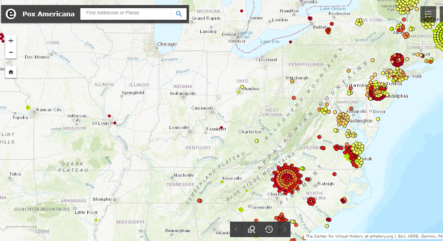
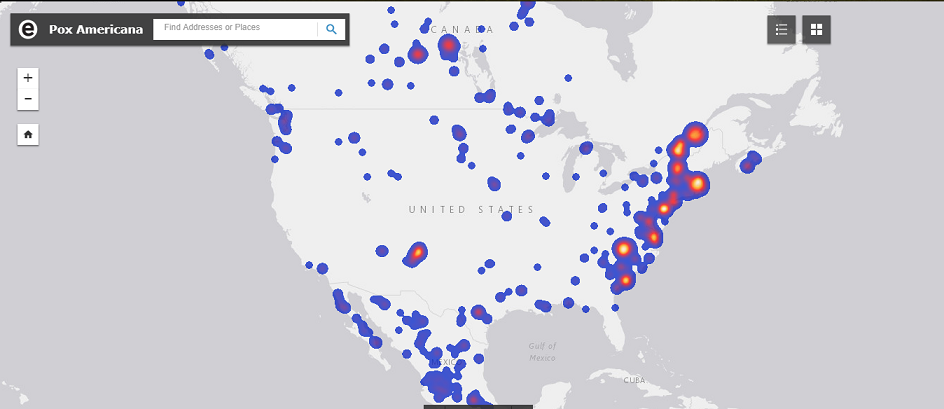
This digital project is easy to navigate and offers multiple layers of information. First, viewers can change the base map, to maps like a basic Light Grey Canvas, Topographic or OpenStreetMap. When zoomed in, viewers can see individual cases. Each case is marked with a different color circle denoting a specific date. Each point, when clicked on, shows the date, the exact quote mentioning the disease and the source citation. Some entries have more than one citation. A second viewing option is accessed by zooming out. It is based on density of cases from high to low. These two maps are static. There is a third option which allows the viewer to dynamically follow the density of cases. It starts in 1775 and shows the progression of the disease across the continent over the course of those seven years. Site visitors also have the option to search individual reports by location, citation or quotation.
This site can be a useful tool not only for those interested in understanding how smallpox spread, but also how people themselves, moved and interacted. Fenn does not offer any specific interpretations but a quick scan of sources she cites reveal that multiple topics of study are present. Native-European relations, western exploration, trade and the Revolutionary War are all potential alternative themes.
Presenting information on both a macro and micro level was this site’s strongest feature. The graphic depicting the movement through time gave a simple overview of where the disease started, the density at specific locations and how the disease spread. This is something that is not possible in a printed format. It was easy to see its trajectory westward and the major clusters of potential cases. The micro-level allows for more in depth searching. This layout also show movement, based on the differentiation of colored dots, but is not as clear because of the static nature of the data’s presentation. The information provided in those colored dots, allows users to further explore those resources. The quotes, though, from which the information is taken, are fragments of longer quotations, from varying sources. Unfortunately, this does not give a lot of context. It does not answer how these individuals got sick, any biographical information or how they came to be in contact with the infected. Sometimes this can be extrapolated from the citation, but it is not always clear. A hyperlink connecting to the digitized resource would be a welcomed addition. This would give users a richer experience and allow for further and easier exploration of the data without having to individually find every source which may not be easily obtained.
The opportunity for expansion by other researchers is another great feature as it encourages collaboration. It shows that research is a process and new information is always being discovered. As new information is recorded, our understanding of a historical moment may change as well. This site allows possibilities not available in print. While a map can show clusters of information and can even be color coded, it would not allow for the time-lapse graphic that tracks the spread over time and space. Overall, though, this site is well designed for data presentation and use by researchers.
One Comment
Maeve Kane
We’ll talk about this in class, but: the point about linking to a digitized source is a great one. Do you think there are any practical/ethical limits to that, eg, quoting from sources that the holding archive has not itself digitized? And what do you think the trade off is of having a digital companion site to a traditional monograph which does have a narrative argument?