Review: Foreign-Born Population, 1850-2010
Review: Foreign-Born Population, 1850-2010
Foreign-Born Population, 1850-2010. https://dsl.richmond.edu/panorama/foreignborn/#decade=2010. Created and maintained by the Digital Scholarship Lab at the University of Richmond, https://dsl.richmond.edu/panorama/. Reviewed February 3, 2019.
Foreign-Born Population, a segment of the American Panorama project created by the Digital Scholarship Lab at the University of Richmond, is a project centered around an interactive map documenting migration and settlement of foreign-born peoples across the United States. The data, gathered from the Minnesota Population Center’s National Historical Geographic Information System, is displayed for every county of every state in the nation spanning each decade from 1850 to 2010.
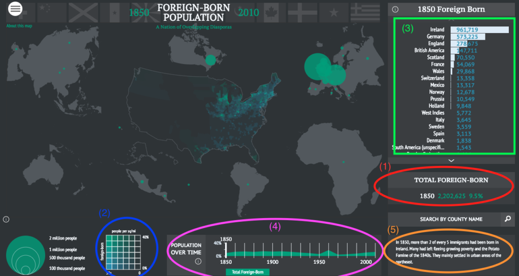
On the surface, the project displays nation-wide statistics regarding foreign-born populations, including total foreign-born persons (1), density of foreign-born persons (2), and a breakdown of points of origin across the nation (3). Furthermore, it also includes a timeline of the foreign-born population of the United States (4), marking increases and declines in those figures from 1850-2010, as well as a qualitative description of immigration trends during the decade (5).
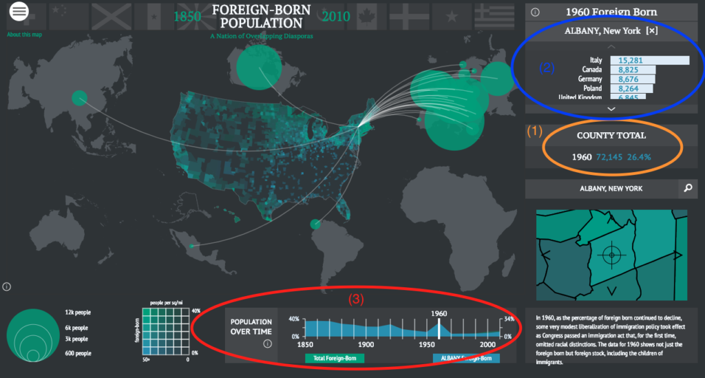
One of the most compelling features of the project is the indexing by county. For any county in the United States, you can find foreign-born population statistics, broken down in a similar fashion to the nation-wide scale. There are some restrictions upon this process due to the unavailability of data for some regions and decades (i.e. Albany County in the 1850s and 1860s), but there is nonetheless a plethora of information availability. The physical layout is largely the same, with a display of the county’s total foreign-born population (1), a country-by-country breakdown of the points of origin (2), and a timeline illustrating the growth and decline of the proportion of foreign-born residents of the county (3).
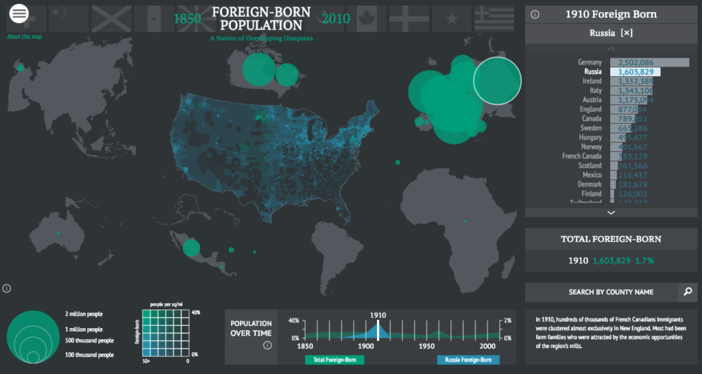
Another interesting feature of the project is the ability to observe the distribution and immigration trends of US residents born in specific foreign nations. Utilizing a similar structure to the aforementioned modes, it allows the user to trace areas with higher proportions of residents born in the nation in question, as well as the overall proportion nationally and a timeline of growth and decline trends in proportional representation in the US population. This feature also allows the user to compare the proportion of a specific foreign-born population (e.g. Russian immigrants) to the entire foreign-born population at large.
Though it could be argued that the intended audience for this project is that of academics conducting research requiring specific demographic and population statistics, the ease of navigability and explicit nature of the descriptions and layout could easily be interpreted by a more casual audience. For example, those conducting genealogical or local history research might find this tool useful in determining the origins of residents of a particular region.
One of this project’s greatest assets is in its interactive nature. Rather than digging through piles and piles of raw data, this project allows the user to dig through a map, automatically compiling and presenting data in visual form, indexed by county as well as by nation of origin. The layout is straightforward, but at the same time intricate, allowing users to observe immigration and settlement of foreign-born people from a variety of angles. With the sheer amount of data present within this project, it would be virtually impossible to present it in print form. Even if such a feat were realistic, it would be a far less engaging experience, restricting its use primarily to those trained in archival and quantitative research. The digital nature of this project makes the information far more accessible for viewers of all backgrounds and experience levels.
Overall, the Foreign-Born Population atlas project is an exciting and incredible flexible tool for conducting research related to immigration and distribution of foreign-born residents in the United States. The inclusion of a brief tutorial prior to accessing the map helps users unacquainted with such tools to gain a basic understanding of the functionality of the interactive map. The combination of visual displays and raw demographic data allows greater accessibility to the information while also creating an enjoyable user experience.
2 Comments
Maeve Kane
What do you think of this project as a teaching resource, either at the high school or college level?
tluneau
As a high school teacher, this would be the exact kind of resource I’d seek for my students to utilize, given its ease of use and interactive nature. In fact, I recall a couple of my previous students using this resource for a project on Irish immigration to New York in the pre-Civil War era (I hadn’t even made that connection until after beginning my investigation of the source; I thought something had looked familiar!). At the college level, I do believe that it still has value for anyone requiring indexible census data on immigration and foreign-born populations.