Arc Network Diagrams/Stacked Area Graphs
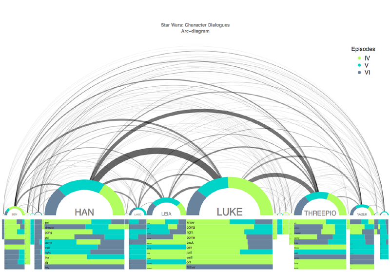
Although this type of chart has strengths, it is not perfect for displaying all types of data. If you want exact numbers for the types of relationships displayed, arc network diagrams do not give you that. The thickness of a line can be an easy way to gauge the frequency, but it can be a bit confusing when it comes to comparing lines that are either both thick or both thin. Another potential problem with this type of graph is it can also become confusing for the reader if there are too many links between the nodes. In the graphs that I thought displayed information in a quality way, clutter was not an issue. However, for the graphs that I found myself staring at for a decent time trying to figure out what was going on, clutter was a prevalent issue. One final potential weakness was brought up in the datawizcatalogue video where the creator made the claim that other 2D chart better display structure and connections compared to arc network diagrams. I will certainly be looking at other people’s posts to see if the data represented in charts I looked at would have been more appropriate with other display forms.
For my example arc network diagram, it is attempting to display a relationship between the characters in the original Star Wars trilogy by connecting their dialogues between one another in the three movies. From my first initial impressions of the graph, it was easy to recognize the connections between characters like Han Solo and Luke Skywalker as they had a lot of dialogue throughout the films. However, I also had problems looking at this graph. When it came to looking at the interactions with more minor characters, it was tremendously difficult to see the writing inside the smaller nodes on the x-axis. Along with this, the graph becomes somewhat cluttered making it difficult to recognize the relationships with the dialogues amongst the characters. It’s a creative way to attempt to display these relationships, but was more so of an example of a “less clean” graph compared to others that I looked at for examples.
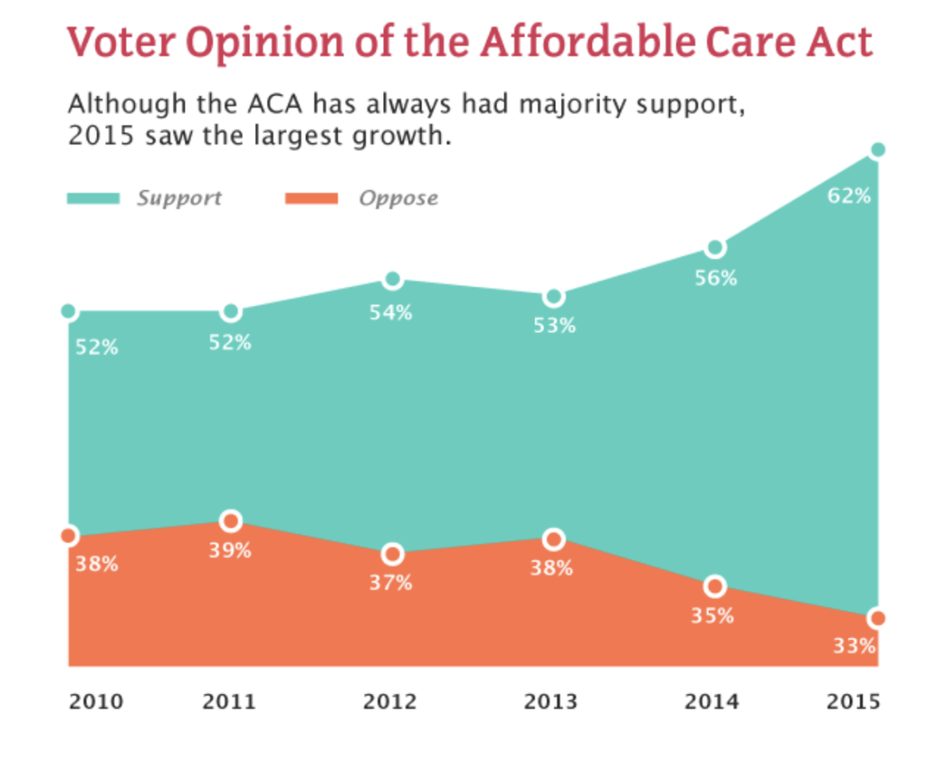
Stacked area graphs are very similar to regular area graphs, but where stacked area graphs shine is it able to display multiple data series on the same graph. With this, the whole graph is able to display all of the data instead of having to make an individual graph for each data series. This proves to be very useful if you want to compare these datasets. Placing these data sets on the same graph allows us to recognize the changes over the interval that is the basis for the x-axis. For example, in this image titled “Voter Opinion of the Affordable Care Act”, this stacked area graph displays multiple sets of information. This includes the percentage of people who both supported the law and those who opposed the law. This graph allows us to look at the change of both opinions over time as a comparison point. As we can see from the graph, the law was much less popular in the year it was passed compared to 2018. With this type of graph we can easily recognize the shifts in data over time with multiple data series.
As with every type of graph, it comes with potential downsides and limitations. The example I chose to use was an example of an easy to read stacked area graph. Part of the reason was due to its simplicity. However, sometimes this type of graph can feature much more than two data series. When more and more data series are featured on this type of graph it can be difficult to compare each data series. Not only can it be due to clutter, but also just how the data series are stacked can change perceptions of the data. Although two stacked area graphs can use the same data series, the order can change the impression the graph gives off. An alternative mentioned in a piece I read critiquing stacked area graphs mentioned his/her preference for using line graphs that were not stacked, but still able to feature the multiple data series on the same graph. Also it’s important to be cognizant of color choice with stacked area graphs as if colors are too similar it can also be difficult to look at.
Overall stacked area graphs can be a valuable way of displaying multiple data series over an interval of time. From looking at examples, the most frequent examples that came up involved comparing revenues over time, political positions, and statistics such as temperatures in various cities over a time period. I’ve personally found this type of graph to be very useful for politics and it was interesting for me to see it implemented with different types of data series.
Pages: 1 2