Horizon Graphs and Small Multiples
Step 1: Start with a Line Graph

Step 2: Add in a Diverging Color Scale

Step 3: Plot each Color Range from the X or Y Axis

For more information, here is a link to the article:
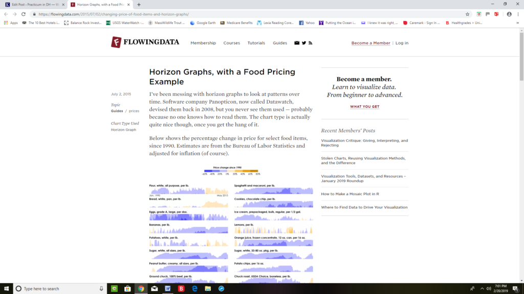
Horizon graphs work well in visualizing short and long term trends of a single dependent variable with two independent variables. This helps in emphasizing changes over time, and alterations both quantitative and qualitative for one specific thing. For instance, concerning the example from flowingdata.com, bacon is the only dependent variable represented and both price and time are the only independent variables. If a second type of food were to be added to the horizon graph above, and categorized differently from bacon, then a separate diverging color scale would be needed to represent the range of values from the second data set. With too many colors representing multiple dependent variables the entire graph would become visually confusing and muddy. If a third independent variable was added, for example different geographic locations where bacon is sold, then it would be easier to visualize the data as different shaped points on a scatter plot, instead of a horizon graph.
When using a horizon graph, one must be careful to select the same size in range for each layer of data in the color scale. If the color categories are not equal in size then the data can be misrepresented. The numbers chosen must also accurately depict the data as a whole. For example, if all the numbers of a dataset are between zero and one, the numbers on the Y-axis of a horizon graph run from one to five and zero to one are all clustered into a single color category, then only one color will show up on the graph.
One way to represent a data set that contains multiple dependent variables, and still implement the style of a horizon graph, is to have several graphs side-by-side, with one graph representing each dependent variable. This graph would then become a Small Multiples/Horizon Graph.
Small Multiples
A Small Multiples Chart is when several graphs are placed next to one another in a sequence that best works in showing broader trends within a large data set, or comparing information from different data sets. There are a wide array of types of graphs that can be placed in Small Multiples to emphasize these points, including, but not limited to, bar graphs, line graphs and pie charts.
There are a diverse number of broad patterns and relationships that small multiples can convey. These include changes over time, qualitative and quantitative analysis of a single dependent variable, and comparisons of different dependent and independent variables.
Small Multiples work best when each graph within the overall chart focuses on a single dependent variable. By keeping each, smaller graph more simplistic it allows viewers to easily comprehend the larger, broader trends when they are all put together into sequence on the chart.[1] There can be several independent variables per smaller graph, though. Different graphs, within the overall chart, can also have different dependent variables, in order to emphasize a trend between each dependent variable.
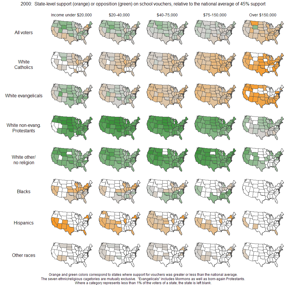
A perfect example of a good small multiples chart can be seen on juiceanalytics.com. Utilizing a nation-wide data set, created by Andrew Gelman, Zach Gemignani emphasizes how utilizing small multiples allows viewers to easily see the broad trend of support or opposition from different demographics within each state towards school vouchers. Each graph is choropleth geospatial and utilizes a diverging color scale to emphasize levels of support and opposition for school vouchers. The single dependent variable is the support for school vouchers, while independent variables include income level, race, religion, and location.
For more information, here is a link to Gemignani’s article:

One thing that an individual using Small Multiples must always be aware of is the number of graphs they are using and how to create a visual aid that is concise and easy to read. Although, several different types of graphs can be used in a Small Multiples chart, a researcher must pick one that works well in showcasing their data. Here is an example by Nathan Yau, on flowingdata.com, of a small multiples chart that has too many individual graphs:

For more information, here is a link to Yau’s article:
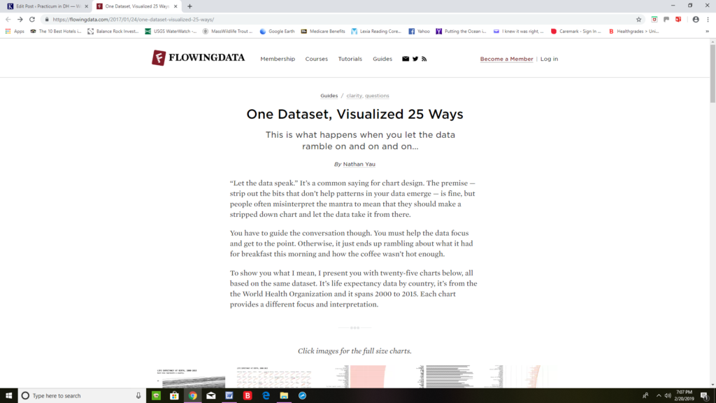
https://flowingdata.com/2017/01/24/one-dataset-visualized-25-ways/
These line graphs are placed in a small multiples chart to represent fluctuations in life expectancy from birth through the years 2000-2015. With so many different countries being represented, one for each graph, it makes the chart both visually unpleasing and very difficult to read. It would be better to show the data on a geospatial/small multiples chart, like the one used for support/opposition for school vouchers, or without using small multiples altogether.
[1] Gemignani, Zach. Better Know A Visualization: Small Multiples. https://www.juiceanalytics.com/writing/better-know-visualization-small-multiples [Accessed February 20, 2019].
Pages: 1 2
One Comment
Maeve Kane
Remember that any links need to be pretty links, not just the URL text written out, and they need to link directly to the page you’re talking about, not just the main site.