Final Project Proposal: Trans-Atlantic Slave Trade
Data Critique
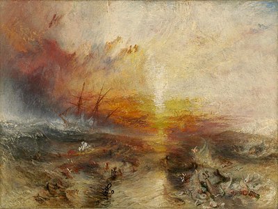
The Trans-Atlantic Slave Trade Voyages Database is a record of 36,000 voyages that included the shipping of slaves between west Africa and New World colonies. The earliest voyage occurred in 1514, and the latest recorded voyage occurred in 1866. The data itself is derived from a vast collection of legal and economic records from regions and ports that worked to record voyages for the sake of taxation and the prevention of fraud. The records contain English, French, Dutch, Portuguese, and Spanish voyages from points of embarkment all over the Atlantic world. Not all voyages originated in west Africa or Europe, with many ships transporting enslaved peoples from colony to colony as well.
There are several major challenges with the Voyages Database that need to be addressed before using it as a source. While the data contains a massive amount of information there are major inconsistencies with record-keeping that vary over distance and time. Some nations and ports had extensive records with detailed entries while others only record basic information. Part of this is the different legal and taxation systems between nations and over time. In addition, some of the records skew and misrepresent the fates of the ships in very broad ways. Several entries list the reason for a failed delivery as, “human agency,” and other vague terms, necessitating further qualitative research into the historical record to contextualize these incidents. Part of these omissions is the vast amounts of fraud that slave ship captains and crew committed in order to make more profit. Unfortunately, much of this is lost to the historical record, but researchers need to keep in mind that this database is nowhere near a full account of the trade.
The final two concerns deal with simple outliers as well as the qualitative factors behind the trade itself. Much of the data contains outliers that may skew mortality rates and percentages when analyzing the trade. For example, there are many voyages that contain less than 5 enslaved people onboard the ship. If one or several die during that voyage the mortality rate can be skewed. This becomes much more problematic when also looking at the qualitative factors associated with the trade itself. There has been a recent push in Middle Passage studies to cut back on the quantitative tradition of Philip Curtin when studying the trade to show the emotive and affective toll that enslavement took on individuals. The focus of the database on enslavement as a quantitative and economic interaction needs to be tempered with a greater understanding of the Middle Passage as a brutal and degrading enterprise.
Data Cleaning
The data cleaning portion of the project will not be difficult to work through. The major part is standardizing the characters that will be used in the individual voyages. Some programs have trouble reading accent marks and other special characters, so these will need to be changed or tested to see if they work. The other major piece is splitting up the regions and port information into two separate columns. Many entries include specific port information, while others only include a major region such as Brazil or Sierra Leone. Splitting this information will make it easier to deal with moving forward. In addition to these issues, many of the port names and regions will need to be updated to their equivalent modern counterparts in order to map them with our software. Only modern locations are recognized so each port and region will need to be checked to make sure that it will display properly on the interactive map.
Secondary Bibliography
Brown, Vincent. The Reaper’s Garden: Death and Power in the World of Atlantic Slavery. Cambridge and London: Harvard University Press, 2008.
Curtin, Philip D. The Atlantic Slave Trade: A Census. Madison: University of Wisconsin Press, 1969.
Fuentes, Marisa J. Dispossessed Lives: Enslaved Women, Violence, and the Archive. Philadelphia: University of Pennsylvania Press, 2016.
Harms, Robert. The Diligent: A Voyage Through the Worlds of the Slave Trade. New York: Basic Books, 2002.
Klein, Herbert S. The Middle Passage: Comparative Studies in the Atlantic Slave Trade. Princeton: Princeton University Press, 1978.
Mustakeem, Sowande’. Slavery at Sea: Terror, Sex, and Sickness in the Middle Passage. Chicago: University of Illinois Press, 2016.
Rediker, Marcus. The Slave Ship: A Human History. New York: Penguin Books, 2007.
Smallwood, Stephanie E. Saltwater Slavery: A Middle Passage from Africa to American Diaspora. Cambridge: Harvard University Press, 2007.
Outline of Goals for Data Visualization
My goal for this project is to create a data visualization that maps out the Middle Passage over time similar to the Jamaican Slave Revolt website created by Vincent Brown. While Brown’s map tells a specific story regarding the tactics of Jamaican resistance fighters, I am hoping for a larger and free-form map that encompasses the Atlantic trade between Africa, Europe, and American colonies. Similar works would also include Andrew Kahn’s map on Slate.com, which represents voyages as traveling nodes, which can be clicked on to explore a specific voyage on the Slave Voyages website. While similar in concept, the Slate.com map is hard to work with, meant more as a quick tool to show the extent of the Middle Passage. It does not include voyages originating in the Americas and does not allow the user to filter data to analyze different regional factors.
I will include filters that allow the user to search for data based on several different factors (nationality, embarkment and disembarkment point, years operating, etc.). Additionally, I will work on creating a tool in the map to allow users to read more into specific voyages in order to provide greater context and information. For example, one of the ships that is recorded is the Diligent, a relatively famous ship that Robert Harms wrote a monograph on. By including information about the ship and specific examples of human interactions in the trade, my hope is to undercut the ‘violence of abstraction’ that has been criticized in quantitative studies of enslaved peoples and their struggles. These short biographies would also include the additional information from the Slave Voyages database including captain info, tonnage, etc.
Possible Research Questions
How did the trans-Atlantic Slave Trade develop spatially and temporally?
Does mapping out routes and travel reveal anything about the Atlantic world and international trade?
What different patterns exist between ships sailing under different nations?
Can qualitative data be effectively included in a data visualization project like this?
Timeline
March 30: Data Cleaning Complete
April 1-5: Meet with Dr. Kane to discuss Path map and Spider map
April 6: Plan out mapping project, begin work on wireframe, plan out voyage example information
April 9: Wireframe Due
April 10-12: finish maps, paths, and filter
April 20: Finish project and expand if needed
April 25-May 10: Do something I am inevitably forgetting about
May 11: Profit
May 16: Final due date
One Comment
Maeve Kane
Don’t discount your outliers–the voyages with 5 or fewer enslaved people are fascinating, and not part of the usual narrative of the overcrowded Middle Passage ship. What about comparing mortality rates on large vs small groups? Or outcome/destination for different group sizes? Do gender ratios change in large vs small groups?
For your project especially you’re going to have to be very careful of passive voice–“If one or several die during that voyage the mortality rate can be skewed” is a very abstract way of discussing death. Try thinking of it more in human terms, not just the problem it presents for data analysis. You’re going to have to do the work you describe by actually describing what the numbers mean, not just talking about that numbers alone can be dehumanizing.
I think I mentioned this in class, but your data cleaning should include creating columns for city, country, and region. You’re going to have to do some fiddling with creating custom regions–basically, you’re going to classify your place names by their modern names, then select multiple countries and click group to create a custom-named region. However, if you want custom regions that don’t have the same boundaries as the modern nations, you and I will have to do some fiddling with making a separate spreadsheet to define your regions.