The Cataloger Final Project
The Cataloger Game is ready when you are! Try to have fun, unlike this cataloger.
What made this game hard or easy? Was there enough information in each question for you to get the correct answer? Do you understand what a catalog record is?
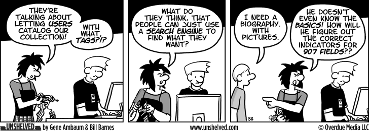
The cartoon above by Unshelved, is a pretty good example of what museums and libraries are experimenting with which allow users to add information to already existing catalog records.
Why Digital Collections Matter?
With the rise in digital collections making museum objects available online, museum goers can stay home and browse through entire museum collections in a matter of seconds. Museum no longer rely solely on static exhibits open for a few months or a few years at a time. With entire collections available online, museums are creating more digital exhibits, web pages, and adding more interactive technologies, like augmented reality, into traditional exhibits. When an object is available online, metadata (or information about the item) is included for researchers. By doing so, not only can researchers use correct terms, photos of the object, and citation but museums are also vulnerable to how little metadata is given about objects.
Let’s look at University of Pennsylvania Museum of Archaeology and Anthropology digital collection. Not only is the museum’s entire collection available online but so is all the metadata about those objects. As you noticed in The Cataloger Game, the names of objects are vague. For example, only looking at the photo of the first object most people would consider that a string or maybe a shoelace.
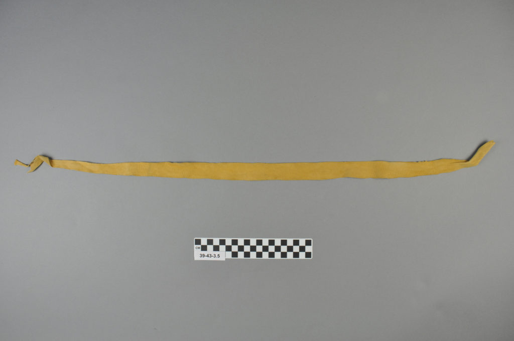
However, the catalog record states the object is a band. Why didn’t the cataloger use the term waistband or catalog this piece with the rest of the girl’s costume? If we look at the graph below, we can gleam what terms are used for object names. As you see, the term “band” is used by itself and along with more identifying terms like “arm”.

Object names are not the only inconsistent identifier of items in catalog records. Unfortunately, we cannot ask the cataloger why they did not give the object a more specific name. However, museum scholars like Hannah Turner, Benjamin Filene, and James Gardner note how past museum theories and practices do not fit in our digital lives.
The Literature
Cataloger’s are painfully aware of “legacy data”, a term used by Turner to describe metadata that was directly migrated to computerized systems from typed and handwritten records with no attention to accuracy.
Another part of The Cataloger was matching descriptions with objects. While that is not typically the case for museum catalogers, in most cases they either create their own description, use information available upon object’s arrival to the museum, or they will provide the most basic descriptions as possible. As you noticed in the game, these descriptions vary from extremely detailed, like the Huipil blouse to basic details like the human figure. Take a look at this graph of Descriptions used.
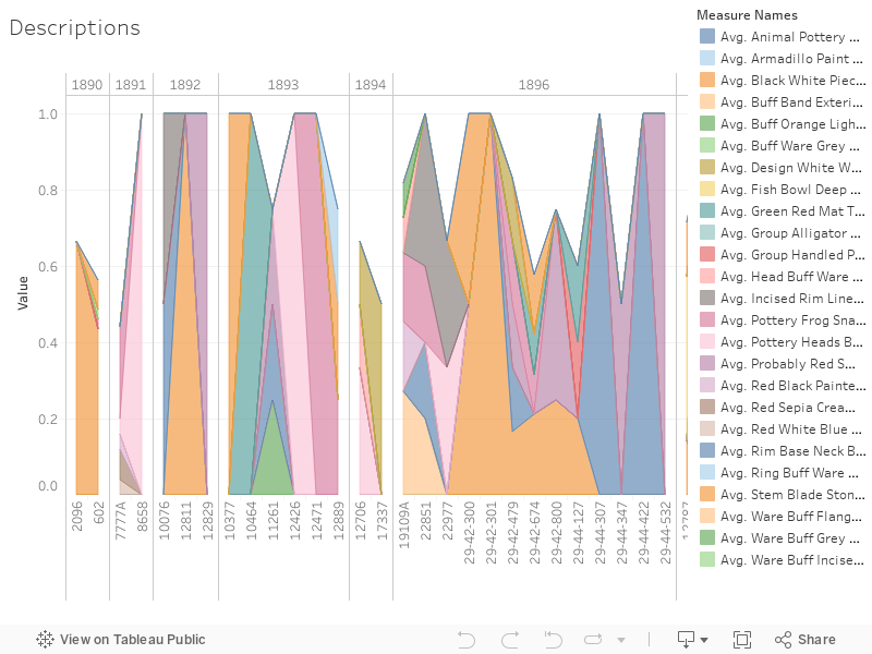
While Object Numbers do not specify when an object was cataloged, the sequence is consistent. This graph shows us what terms are used together most often. If we look at Object Numbers 13535 through 13599, we see the descriptive terms most frequently used together. These bag of terms are most used together to describe objects in the collection. Looking closely at these terms, we see descriptions of shapes, size, materials, and texture. There is little description concerning how an object was used.
In Gardner’s article, he encourages museum professions to give some authority to visitor in museum exhibits by being transparent about museum practice and theory. The same should be applied to digital collections. Take this hat for example. When I look up the word hat in the catalog, this item shows up immediately. However when I search basket, this hat is still on the list of potential items. Looking at the hat it does resemble as basket.
This may be an issue with the digital collection platform. Yet, it still begs the question, was this object once considered a basket then changed to a hat? If UPenn was transparent about any changes or even how objects are categorized (even an explanation on how objects are named or more provenance of an object) may better explain why this object is a hat.
Conclusion
Many museums are looking to expand descriptions by providing crowdsourcing opportunities to researchers and museum visitors. Flickr is a popular platform for museums to allow social tagging and provide more contextual information. Let’s compare this Karuk Basket Flickr page to the catalog record in the digital collection. The Flickr page includes one unique piece of information that is not in the catalog record, a concise description.
This elegant Karuk basket with lid was made by the Native American weaver Elizabeth Hickox who lived from 1872 to 1947. Karuk, California, ca. 1910. Collected by Patty S. Jewett.
University of Pennsylvania Museum of Archaeology and Anthropology. “Karuk Basket with Lid.” Flickr, Yahoo!, 10 June 2009, www.flickr.com/photos/pennmuseum/3614369530/.
If this information was included in the catalog record, do you think visitors and researchers would be more likely to use it? Unlike other descriptions used in the catalog records that we saw in the Descriptions Graph, this description used adjectives like “elegant”. Also note, the creator’s full name is used in the Flickr description along with her role as a “weaver”. In the catalog record we only see her abbreviated name, “E. Hickox” as the “Maker”.
Fliene’s article looks at public history projects like StoryCorps created by a non-public historian in comparison to traditional museum exhibits created by public historians. Similar to Gardner, Fliene argues that traditional public history projects (i.e. museums) limit curators in creating innovated projects like StoryCorps. He encourages public historians to go beyond the boundaries of the physical museum and create projects like non-public historians.
In a perfect world, museum catalogers could add this descriptive metadata to reflect the Flickr page. In the meantime, social media like Flickr allows users to add Tags and comment on images. By giving museum visitors opportunities online through social media to add descriptions, museums can go beyond the boundaries described by Fliene.
Data Visualizations
The data used for this project comes directly from the UPenn Museum’s digital collections data set. For the purpose of this project, objects from the Americas collection was used. The UPenn Museum encourages researchers to use their data sets for projects as well as sharing those projects with the museum. Below is a collection of data visualizations created from the data set.
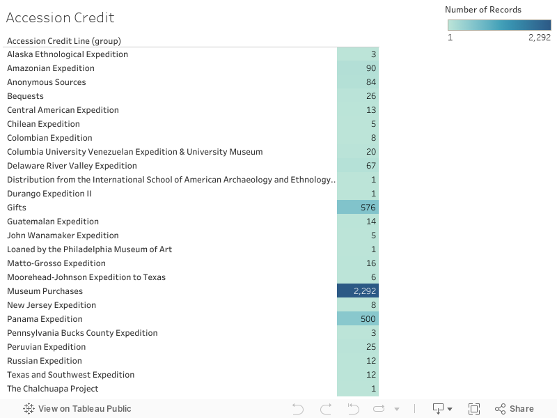
This graph shows how many objects were given to the museum based on the information from the “accession credit line” in the data set. The most being from “Museum Purchases”. Depending on how an object is given to a museum and who is giving the object can determine the level and detail of description.
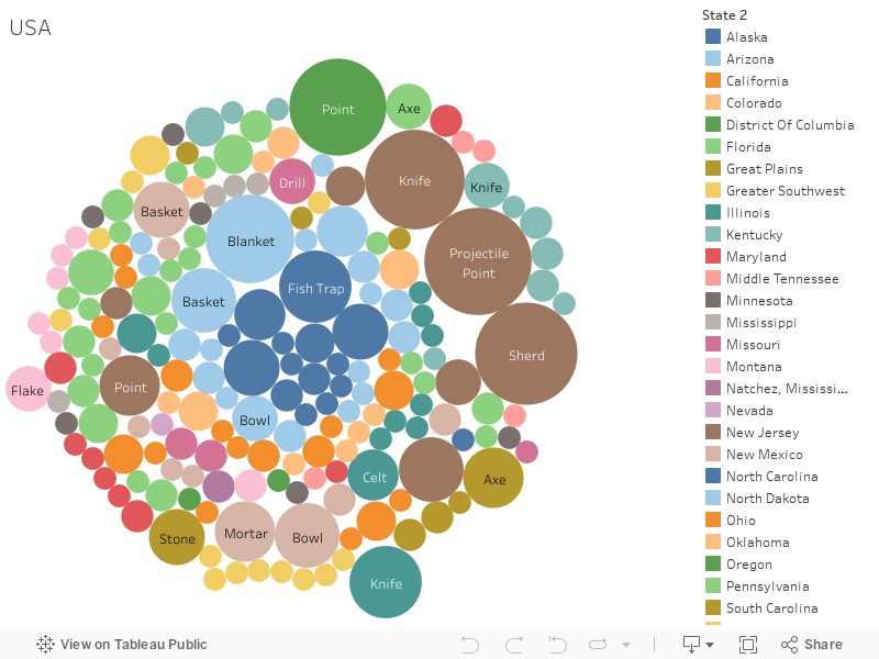
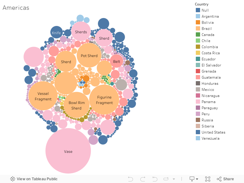
These two graphs relate object names to locations. Above locations are primarily in the United States. Below locations are North, Central, and South Americas. Like descriptions, object names can be provided by object donors.
References
Turner, Hannah, “The Computerization of Material Culture Catalogues: Objects and Infrastructure in the Smithsonian Institution’s Department of Anthropology” Museum Anthropology 39 no. 2 (2016): 163-177.
Filene, Benjamin, “Passionate Histories: “Outsider” History-Makers and What They Teach Us” The Public Historian 34, no. 1 (2013) 11-33.
Gardner, James B., “Contested Terrain: History, Museums, and the Public” The Public Historian 26, no. 4 (2004) 11-21.
3 Comments
Maeve Kane
Notes on the game first:
You should add a brief note at the beginning that you’re using UPenn’s open dataset https://www.penn.museum/collections/data.php, and that you’re not actually affiliated with them. They note that anyone can do anything with this data, so you’re fine there, but the credit is polite.
Some of your terms aren’t clear if you’re aiming at an audience with no prior museum/cataloging background–provenience, for example.
On the “where do you want to start” question, it would be helpful to know a. why these options and b. what these options mean. Are these the common paths a cataloger takes? What does it mean to start by naming something vs describing it? (Or is that part of what you want the player to learn?)
In the naming objects section, right now you’re framing the answers as either objectively right or wrong based on the object’s use–what about issues of cultural naming? For the drum and drumstick, there’s the issue of what it’s called in English vs its indigenous ceremonial name, which is a much thornier issue. I think by framing the names as objectively right or wrong based on use, you’re missing a chance to talk about the bigger epistemological problem of who has the power to name things in collections. Similarly with the object locations, I don’t think the right/wrong framing highlights the problem that you want to talk about–you’re essentially asking the player to play a guessing game where they’re flipping a coin, because they don’t have the knowledge that you, as game builder/omniscient floating catalog voice, have. Your text introducing the locations, talking about the lack of knowledge about where something came from, is really compelling. For the Haida box, what about framing it as Queen Charlotte Islands vs Haida Gwaii vs Canada vs Pacific Northwest? All of those are true names, but convey different information about what’s prioritized in the collection. With the Peruvian skirt, you’ve got similar issues with Inka vs Peru vs Tawantinsuyu vs Andean vs South American.
You’ve got some typos like “Andrean Native American,” “The ideal description should be unbias,” and some errant capital letters where you don’t need them–make sure to proof the final version well.
The description section for the blouse is really interesting–you have an opportunity here to talk about what the catalog is for and what “best” means. You imply that more detail is better but don’t say why–who needs this information, why is more detail better, is there such a thing as too much detail? Who judges best? Are there audiences for whom “best” differs? (Say, an audience of textile historians vs an audience of biologists who want to know about indigenous cottons?) Giving the player more up front info about the criteria for best will make this feel like less of a blind guessing game and help highlight the compelling questions you raise. Likewise, you could use the description of the Maya figure to highlight issues of cultural bias–“Human figure. Hollow red pottery, some color, fine ornate clothed figure.” vs “Primitive figure holding ritual bloodletting rope and sacrificial knife.” Again, both true, but give a very different slant to the significance of the object and what judgement is implied.
The image for the human Maya figure is a bit squashed–try specifying width=100% height=auto. If you do this for all your images, they should display full width in the browser instead of being squashed to one side.
This wasn’t something we discussed in class, but I edited your post to embed your game in an iframe within your post–you can hit edit to see the HTML block how this is done. Basically, < iframe > embeds another website in your website, like embedding a youtube video. OFC, you can get rid of this and leave it as a link if you prefer.
Maeve Kane
For the rest of the project:
Small thing, but do you mean “Why do collections matter?” As it stands sounds a bit awkward now.
The cartoon isn’t currently well tied in with the rest of the project, and as your hook/lead in, it feels especially odd that it doesn’t go anywhere. I think this is in part because you’re not clear on what your own argument is–what do you want the reader/player to take away from this whole experience? That users are bad catalogers? That cataloging is tricky and can be done in multiple ways? That collections and best practices evolve over time? Because right now you’re saying all of those things in different sections, and they don’t quite jive with each other. I’d like to see more connection between the game and the rest, to really drive home the argument you’re making with the game and your analysis. Your conclusion section is mostly a summing up of others’ work–what’s YOUR argument? You’ve also got a tension between the difficulties of having non-trained catalogers do cataloging, as you highlight in your game, and the limitations of traditional cataloging that you highlight in your conclusion. Do more with this tension!
NB: glean, not gleam: “we can gleam what terms”; catalogers, not cataloger’s: “Cataloger’s are painfully aware”
I’m not sure what point you’re making with the first visualization re: band, especially since band is grouped in with other things. Is this about controlled vocabulary vs non controlled vocabulary? Generic names for objects by catalogers who aren’t familiar with the context?
This: “However, museum scholars like Hannah Turner, Benjamin Filene, and James Gardner note how past museum theories and practices do not fit in our digital lives.” is interesting and you should say more about it. Don’t just name drop! What are these people arguing, and how does the Penn collection specifically address it? The section immediately following “The Literature” heading is great! Do more with that, you really get at the heart of your issues there.
It’s odd to have your conclusion before the dataviz section–either integrate these in the body or axe them. Appendixes are for weenies! The accession credit one would be better off as a bar graph or similar–maybe a treemap of accession credit vs date gifted, or accession credit vs state? What does method of acquisition matter for your argument re: how things get cataloged? Are things acquired through purchase more likely to have fuller descriptions than things acquired through gift?
For your bubble map, think about flipping it so that colors represent your primary object name group, and state is a secondary label that just splits colors into multiple bubbles. You’ve only got 20 colors to work with, so Alaska and North Dakota are the same color. You’ve got more than 20 primary object names, but with more aggressive groupings (eg clothing and personal adornment, containers/baskets/boxes, tools, etc) you could get it under 20 and make this viz clearer. And think about the so what question: what’s it matter that some kinds of objects mostly come from certain areas? What might that tell us about donor interest in those areas?
See the attached screenshot for straightening out the issue of sorting your object numbers by date in your doctopics graph. We didn’t have the two sheets connected correctly–go to Data > Edit Relationships, and Object Number in the Clean Dataset should be matched to Object Number 1 (NOT Object Number) in the doctopics sheet.
I hope comps went well!
scarlatte28
Edits have been made and a new post has been created under the title “Final Project”- very original I know.