Wireframe: Albany Census Data
The main question this project asks is “Where were people in Albany coming from?” The biggest part of this project will be a map. I’ll break it down into each year on the census from 1850 to 1940. I would like to have a world map where a viewer can highlight a certain country or region and be able to see how many people were born in the selected area.

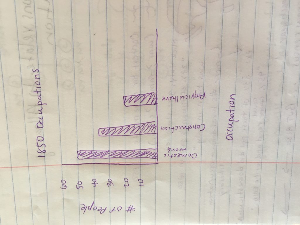
I would also like to show the information about people once they were in Albany such as literacy and occupation. I will probably do this using a graph to show different occupations and literacy rates. I think I will use both absolute numbers as well as percentages for this information, as well as the birthplaces of individuals.
There will be some essay text included. This will serve to add historical context to the movements of people to Albany from their birthplace. For example, political or social conflicts in certain regions in certain years.
2 Comments
Maeve Kane
Don’t plan to spend too much time on the historical context piece–that could easily be its own separate project. Look back at the American Panorama project and how brief their little context snippets are.
One of your challenges with the map is going to be changing some of the country names to modern countries–places like Bohemia and Prussia are no longer independent countries, so you’ll have to map them somewhere. This can be changed in OpenRefine if you haven’t been working on this already.
Maeve Kane
Also–if you plan to map US states as well as foreign countries, you’ll need to do a “Dual Axis” map–basically you’ll make two separate maps (one of states and one of countries) and then layer them over the top of each other. Grab me in class if the Tableau help section on it isn’t helpful or doesn’t turn up in google for you.