Wireframe: Transatlantic Slave Trade
My project will map and graph the data for the Transatlantic Slave Voyages Database and feature several interactive pieces that will work in tandem to provide context to different time periods and individual voyages. It will consist of a map section, text and filter options, and a timeline.
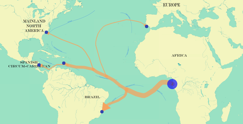
The map section will be the centerpiece of the project, showcasing the extent of Transatlantic voyages between Africa, Europe, and the Americas. While similar mapping projects exist, I will be including a filter option as well as an integrated timeline to allow users to sort voyages over time, region, and voyage composition.
The graph/map section will be a timeline that shows the numbers of voyages in distinct 25-year periods. The user will be able to select different periods that will display voyages within that range on the map.
The other major piece of the project will be a retractable text/essay area that will include a summary of the period as well as the individual voyages by filters. While it is a massive, long-term project, the most basic information that will be included is the voyage info already archived in the Transatlantic Slave Voyages Database.
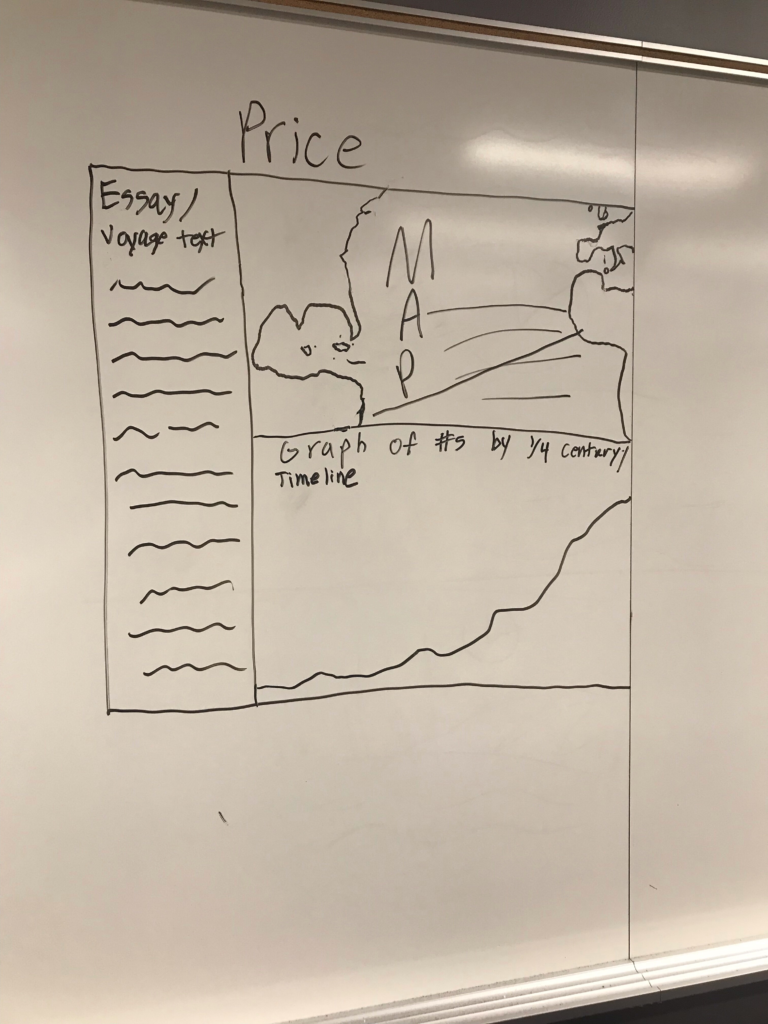
Each piece of the project will work in tandem, similar to the American Panorama Project. For example, users looking to track all departures from Kingston Harbor within a specific 25-year period will be able to select both filters, view the extent of the voyages on the map, and look through a list of individual voyages that meet those criteria. This might also include information on voyages in the database that have instances of resistance and other unique features.
One Comment
Maeve Kane
If you haven’t already, investigate tableau’s bin function for your 25 year periods.
What’s the plan for “summaries of individual voyages”? I’m not clear from your description here.