Project Critiques
-
Coins. A Review.
by Joshua Porter
COINS: A journey through a rich cultural collection. https://uclab.fh-potsdam.de/coins/. Created and Maintained by Münzkabinett of the Staatliche Museen zu Berlin. Reviewed February 1-4, 2019.
When I was a kid, my neighbor kept a large jug in which he would put his loose coins into everyday, until the fateful day when he would tip it over and let all the coins fall out so he could sort them, roll them, and then take them to the bank. The COINS project at Münzkabinett of the Staatliche Museen zu Berlin is the digital representation of tipping over the proverbial jug and letting the coins scatter on the digital carpet. While novel in approach, the use of the project seems stymied by how unwieldy the piles become and results in the same frustration of trying to sort through hundreds of coins on the real physical carpet.
The project opens with a massive pile of coins in the middle of your screen, however if you click on one single coin it “picks” that single coin up and details what exactly it is along with a link to the full detail page on the museums database.
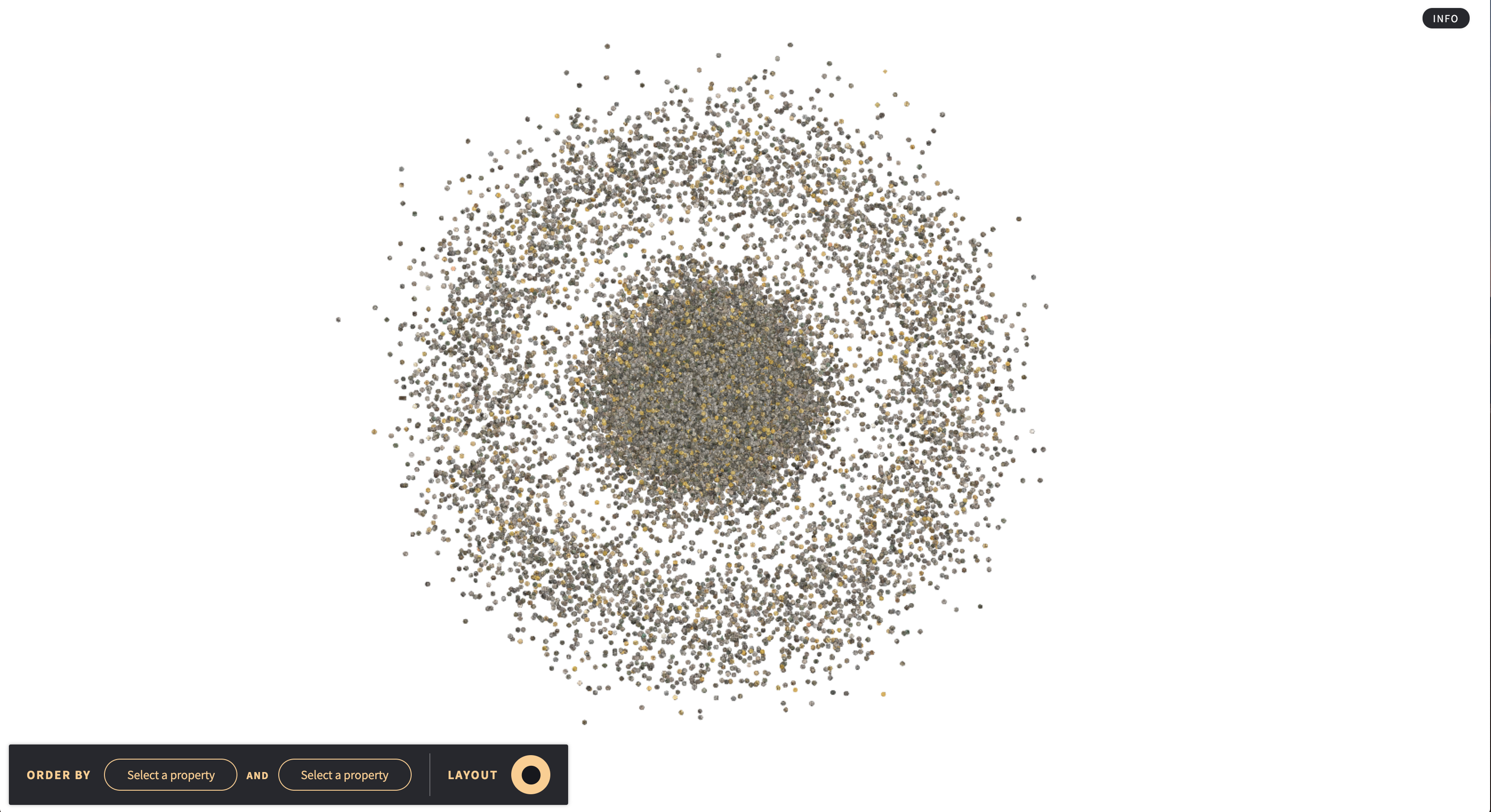
A beautiful pile of coins. -
Pox Americana. http://usg.maps.arcgis.com/apps/webappviewer/index.html?id=2c94e981a6c6485ab0e26bb680e0b063. Claudio Saunt and Elizabeth Fenn. [Landing Page contains About Us information]. 04 February 2019.
This is a digital narrative using GIS mapping software to present a mappable range of smallpox cases during the New World epidemic of the disease between 1775 and 1782 (coinciding with the War of the American Revolution). Presented on the eHistory hosting site, the map is the result of the data complied from written primary sources by Elizabeth Fenn for her book Pox Americana being placed into GIS. In the words of Elizabeth Fenn, the creator, “GIS…displayed my data visually, across space and time. As a researcher, I found this technology transformative.”
There are two visual displays of the data based on zoom. Further out, colours on the map denote location of cases and density of the cases. At the bottom of the page, is a clock icon where one can view the progress of the disease over time.

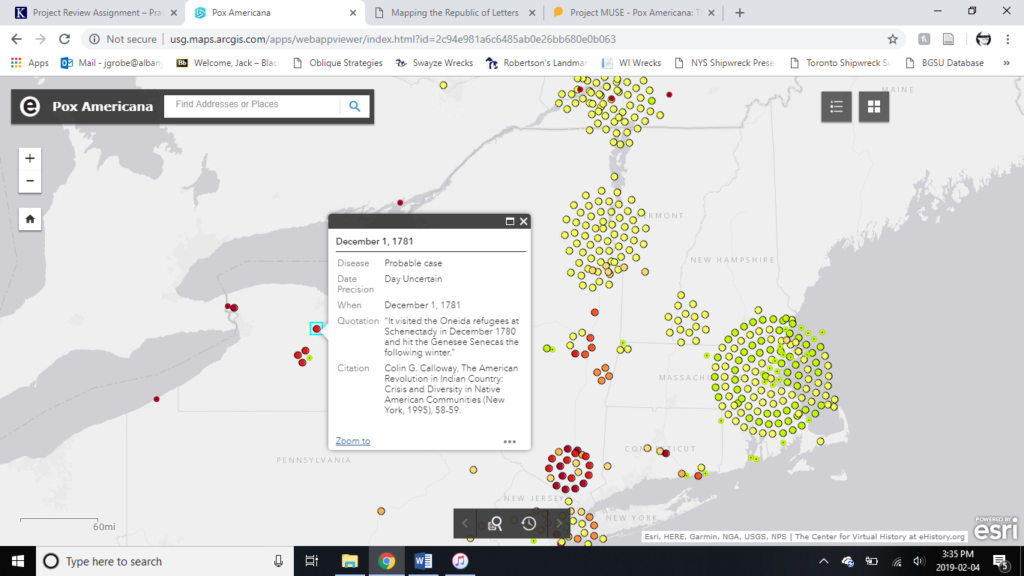
Once sufficiently zoomed in, the cases are presented as ten different types of coloured dots on the map, with the colour denoting when the case occurred. The cases which share a geographic location and arranged in a circle round a central pole. A time lapse is not viewable on this level of zoom.
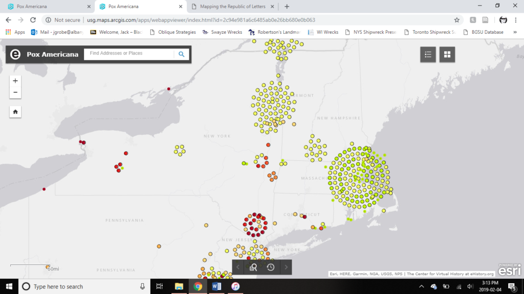
The dots are clickable and provide a modicum of information about the case in question including the date, source, and a small excerpt of the written source.
The navigation of the site is fairly straightforward. The main actions are zooming in and out across the two zoom views, moving laterally across space, clicking on dots for more information, and watching the time lapse. Apart from the ability to change the map background and jumping to a location, that is the extent of the site. It is simple to operate and simple in its presentation. However, this simplicity can leave the viewer wanting more. One of the most interesting things about Fenn’s book Pox Americana was how she tied the 1775-82 Epidemic into the wider history of the war, Native-European relations, and westward expansion. Here a lot of the data is at risk of just being there, without any tie-in to the larger narrative of the time. There is little in the way of argument other than there was a very large smallpox epidemic at the time.
Apart from the time lapse available on the wider view, there is little contextualization of the data. As such, this almost feels more like a data source for projects, rather than a teaching tool. Another annoyance is the way the GSI sets the dots with a spiral of cases around the location of the shared cases, because of the haphazard way the circles are organized.
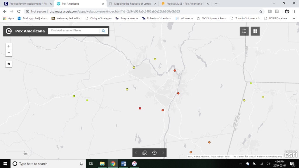
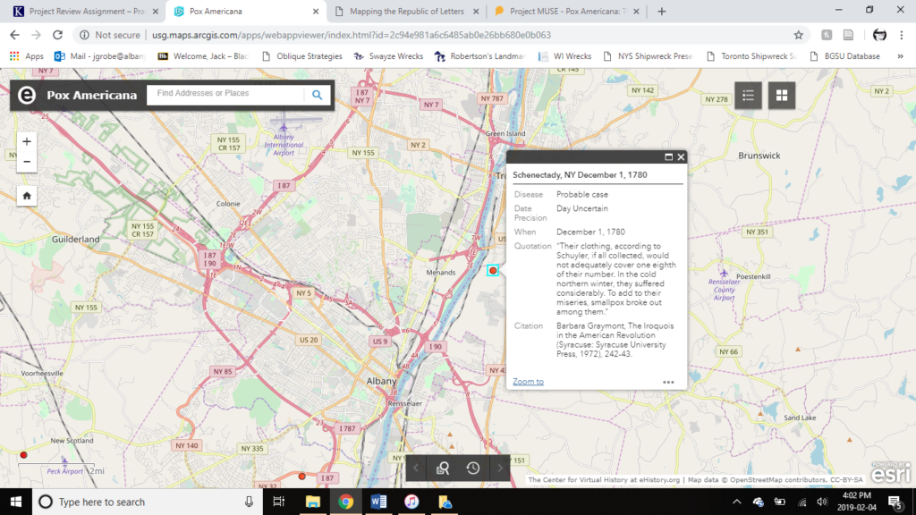
Taking the cases around Albany as an example, one can see the Schenectady cases are positioned on the east side of the city, despite Schenectady being west of Albany. Given the imprecise placement of the dots, what is the point of having the option to give more map data in the background. Why would a street view of the cases matter, if the dots are only accurate to within ~10-20 miles? An example is given below:
Ultimately, the site is a great map of visualizing the spread of the smallpox epidemic. But it needs some more precise map plotting as well as more discussion or demonstration of how these cases and how this epidemic plays into the wider history of the time, aka the book Pox Americana. Given the all this, I believe the site is best at providing information for academics about individual cases and areas of the epidemic with the map acting as an easy organizing factor. For a wider public, the time lapse of the epidemic is the most applicable function. Apart from the time lapse and the point and click for cases, this project could have been possible in a paper format.
-
Review: Foreign-Born Population, 1850-2010
Review: Foreign-Born Population, 1850-2010
Foreign-Born Population, 1850-2010. https://dsl.richmond.edu/panorama/foreignborn/#decade=2010. Created and maintained by the Digital Scholarship Lab at the University of Richmond, https://dsl.richmond.edu/panorama/. Reviewed February 3, 2019.
Foreign-Born Population, a segment of the American Panorama project created by the Digital Scholarship Lab at the University of Richmond, is a project centered around an interactive map documenting migration and settlement of foreign-born peoples across the United States. The data, gathered from the Minnesota Population Center’s National Historical Geographic Information System, is displayed for every county of every state in the nation spanning each decade from 1850 to 2010.
-
Review: Virtual St. Paul’s Cathedral Project
Virtual St. Paul’s Cathedral Project
Virtual St. Paul’s Cathedral Project: A Digital Re-Creation of Worship and Preaching at St. Paul’s Cathedral in Early Modern London. https://vpcp.chass.ncsu.edu/. Created and maintained by various departments at North Carolina State University. https://vpcp.chass.ncsu.edu/project/production-team/. Reviewed Feb. 3, 2019.
The goal of the Virtual St. Paul’s Cathedral Project, as outlined in its purpose statement, is to explore public preaching in early modern London through the experience of the Paul’s Cross sermon. Using architectural modeling, acoustic simulation, artistic renditions of the sermons, and contemporary accounts of John Donne’s preaching style and structure, this project attempts to recreate the experience of witnessing one of the many public sermons given at St. Paul’s in the early 17th century.
-
[RE] ACTIVATE Mama Pina’s Cookbook
[Re] Activate Mama Pina’s Cookbook. http://www.criticalmediartstudio.com/RemediatingMamaPina/index.html. Created and maintained by Gabriela Aceves Sepúlveda. Reviewed Feb. 3, 2019.
The purpose of [Re] Activate Mama Pina’s Cookbook is to center domestic practices as something worthy of study but is rarely found in the archives. The creator wants to show how these records are a part of history, tell a story and that people today can relate and interact with it. She uses both the artifact and art to highlight the importance of women as agents and creators of history. So, while it centers on this particular cookbook, its larger aim is to address the absence of women and traditionally women’s domestic roles in archives. It was originally an installation which was then turned into a webpage.
-
Pox Americana
Pox Americana. SmallPox Epidemic (1775-1782). Search Tool. http://usg.maps.arcgis.com/apps/webappviewer/index.html?id=2c94e981a6c6485ab0e26bb680e0b063. Created by Elizabeth Fenn at the University of Georgia, https://ehistory.org/. Reviewed Feb. 3, 2019.
Beginning in 1775, North America experienced a smallpox epidemic. It was the “single experience that most Americans shared,” regardless of where they lived. Pox Americana was designed by Elizabeth Fenn as a tool to help her visualize the progress of smallpox across North America, while writing her book titled, Pox Americana: The Great Smallpox Epidemic of 1775-82. She input data gathered during her research into a Geographic Information System (GIS) called ArcGIS . The program allowed Fenn to visually see where and how the disease moved across space and time. This led to further questions and ultimately a better understanding how people moved and interacted across the continent during this period.
-
Last Seen Review
Last Seen: Finding Family After Slavery.
http://informationwanted.org/ . Created and maintained by the Department of History at Villanova University in collaboration with Mother Bethel AME Church.http://informationwanted.org/about-us . Reviewed on February 3, 2019. -
Digital Harlem Review
Digital Harlem: Everyday Life 1915-1930.
http://digitalharlem.org/ . Created and maintained by Damien Evans, Ian Johnson, and Andrew Wilson of the ArtseResearch unit of the University of Sydney, https://digitalharlemblog.wordpress.com/about/about-the-researchers/ Reviewed February 3, 2019. -
Project Review Assignment
Due: Tuesday February 5
Undergrad: Approx. 300-500 words each (1 post per person)
Grad: Approx. 500-750 words each (2 posts per person)
Project critiques should be addressed to an audience of historians, not digital specialists. Think of it as a book review of a digital project. The Journal of American History has guidelines for reviewing the three most common types of digital projects: