Uncategorized
-
-
Wire Frame International Pirate Trials
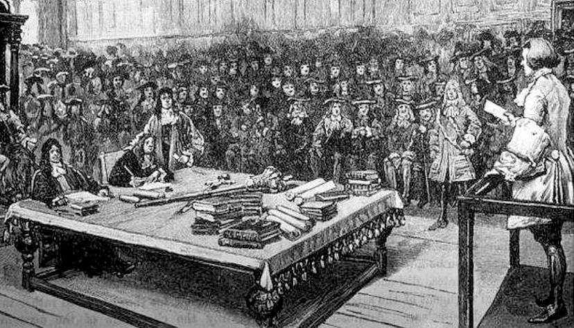
Image of the trial of Captain Kidd, 1701. Retrieved from bluebird-electric.net -
Jack’s Shipwreck Project
Introduction
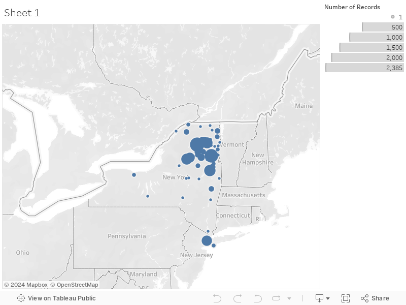
This dataset is a collection of data on shipwrecks in the Great Lakes. My project proposal is to complete a Tableau map and data analysis of the wrecks in Lake Ontario. So far, there are 313 wrecks in the dataset for Lake Ontario, with data on each along 76 different columns of information. Currently, I am data cleaning rows to update the information and add in LAT/LON information for mapping, there are about 20 rows left to clean. Along the way, more wrecks might yet be added to the Lake Ontario dataset as I consult updates to sources. I have already had to take out some wrecks that were erroneously recorded as in Lake Ontario, but which actually occurred elsewhere (F. A. Georger)…
-
Final Project Proposal: Internal Salve Trade
By Jesse Aragona
Data Critique- My project begins with a tweak in my initial Data Critique, analyzing how best to interpret and use the data provided for my research needs. Revisiting the issues with the data set will provide a clear and concise lens through which I can view the rest of the project.
Data Cleaning- The main focus as far as cleaning is two fold for this project, narrowing the scope of the data set excluding information irrelevant to the United States and using the original formatting to decipher categories lost in translation to Google sheets is absolutely necessary for the completion of this project.
Secondary Bibliography-
1)The Chattel Principle: Internal Slave Trades in the Americas by Walter Johnson
2)Quantitative Estimates of the United States Interregional Slave Trade, 1820-1860
3)Hidden in Plain Sight: Centering the Domestic Slave Trade in American Public History
4)Slave Trading in a New World: The Strategies of North American Slave Traders in the Age of Abolition
How closely can we trace the route from Africa to arrival at U.S. ports, and with how much accuracy can we find the final destinations of the enslaved? Did certain ships stick to certain routes, and if so how close can we come to obtaining national origins for the enslaved and their ancestors. How accurately can we map those journeys?
Goals- A map of voyages, hopefully expanding out from the initial port to separate destinations if possible. A cleaned representation of the data used, sheets provided representing the journeys and individuals shown on the map. Ideally the map will allow the reader to trace routes of individual voyages from the nation of origin to the point of departure, and further if more data can be adapted and used for that purpose. The project will also provide a significant explanation of the Internal United States Slave trade, including policies and methods.
Timeline- March 30th, Isolation of Data to be used as well as completed cleaning of said Data. April 3rd, rough draft of map as well as final data set exclusions and inclusions. April 9th, Rough Map of Voyages completed
-
Final Project: The Evert Wendell Files
Evert Wendell: The Man with No Eyebrows Data Critique
The Evert Wendell account book data details the “fur” trade between Wendell and Canadians/Native Americans. The dates range from the late 1690s to the early 18th century. Trade ranges from Canadians to people in the Catskill region in lower New York. This includes a variety of Native Americans such as the Seneca and Mohawk. It cannot describe the trade other than the details written down in Wendell’s account book. Those features, when translated into the spreadsheet, are as follows: name, male, female, gender, tribe, affiliation, date, trade good, fur, town, and the amount of fur/guilders received. This particular dataset includes about 1600 entries. Many of the names given are offered in relation to another person (i.e. mother of D’caiendanharij). This dataset was taken from Wendell’s account books and translated into a spreadsheet by Dr. Kane. It is divided for clarity, including three rows regarding gender. If this were my only source, I would lack the context of the trade itself that a secondary source could provide. Additionally, I might be lost on the geographic location of the trade, who Evert Wendell was, or what a marten was.
-
Text Analysis
Voyant allows us to compare the frequency of the appearance of specific terms in text, for example time, place, night, morning, and place. For instance below is shown the appearance of time, while all the other terms fit within time it doesn’t mean they necessarily correlate in text. Viewing the data in regards to how often a term shows up allows us to make inferences based on patterns appearing in the text.
The graph below represents the appearance of the term night, showing the ups and downs of the terms appearance. While by itself we can see trends in the usage of a particular word, by adding other similar terms we can compare the usage of those terms. While comparing times of days isn’t necessarily useful to make inferences about the past itself it serves as a control that demonstrates the functionality of Voyant, here we can see how these terms compare and applied to other terms trends will prop up for analysis.
The last graph, the comparison of frequency of use highlights the utility of the tool itself. Comparing all of these terms that fit into one category allows us to establish the appearance of patterns of use. In this case day, night, and morning can show us when things happen, and while that can’t tell us about thoughts and ideas it can establish the patterns of behavior, when things happened and how day, night, and morning played into the lives of those represented in the documents. The more a term appears, the more frequently events described took place during that time. Using place, the only term not related to time establishes a sort of control group, also analyzing patterns of usage but without representing any true correlation with other terms.
-
-
Networks Assignment
How does the network change over time as you add more years? Who are the major connectors who bring small sub-networks into connection?
As more years are added, the number of connections increases as more individuals are brought into the network. This results in an increase in not only the number of connections that exist but also in an increased visual complexity of the relationships between individuals. Initially, there are smaller, independent networks that exist in proximity to one another. As years are added, these separate networks are brought within the larger network as new relationship connections are added. As this occurs, certain individuals emerge as major connectors. By as early as 1736, Anna Clement, Thomas Sewatsese, Aron Oseragighte, and Esras Sr. can be identified as significant points of interconnection within this social network. As more years are added to the network, additional individuals emerge as major connectors, such as Mary Quackenbus or William Prentop Jr. Of these initial people, some remain central to the network throughout the years while others, such as Thomas Sewatsese are overtaken as major connectors by other individuals.
-
Networks (pre-Facebook edition)
Over time more networks are connecting people to each other. The people who connect small sub-networks include Aron Oseragighte, Cornelius Thanighwanege, and our chick Anna Clement.
-